Ecommerce banners often get a bad rap for being irritating. However, when implemented correctly, they can be a powerful tool for boosting conversions. Sumome says 9.2% of website visitors convert with email pop-ups or banners. That’s roughly 1000 emails for a website visited by 10,000 people monthly, all from just one pop-up campaign. This article will explore the different types and triggers of pop-up forms and guide you on strategically using them.
What exactly are ecommerce banners?
Pop-up forms or Ecommerce banners seem annoying to some users. However, the real issue arises when they are poorly implemented. By understanding their purpose and implementing them well, pop-up forms can be an effective marketing tool for your ecommerce store.
Types of ecommerce banners
There are several types of pop-up forms that you can use on your ecommerce website, each with its unique characteristics and uses. Here's a rundown of the most common formats:
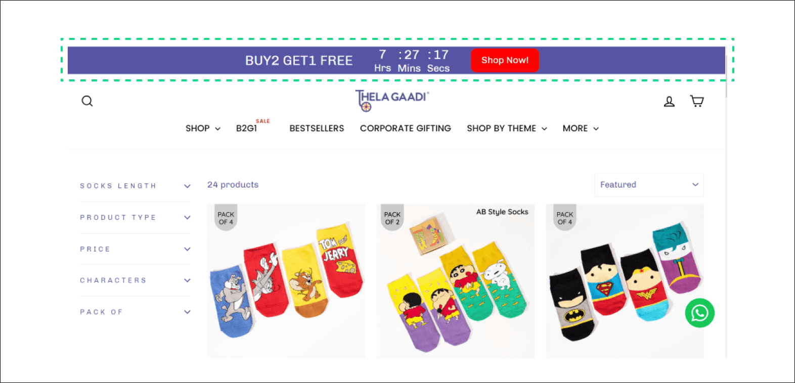
1. Banner: This type of pop-up form appears as a banner to visitors after a few seconds. It can showcase triggers like new products, discounts, or special offers.

2. Slide-in: This form slides in from the side or corner of the screen as users browse the website. It's less intrusive than a full-screen pop-up and can highlight specific products or offers.
 3. Sticky bar: The sticky bar format makes the pop-up visible as a bar banner. It can promote ongoing sales or remind visitors about free shipping.

Pop-up form triggers
You can control when and how your pop-up forms activate or trigger. Here are some common trigger types you can use:
On load: The form pops up when the page loads.
Exit intent: The form pops up when a visitor is about to leave the page.
On scroll: The form pops up when a visitor scrolls or swipes down the page.
On click: The form pops up when a link or button is clicked.
Dwell intent: The form pops up when the user is on the checkout, carts, or product pages for over 5 seconds.
Strategy #1: Trigger pop-up at the right time
Timing is everything when it comes to pop-up forms. You don’t want to frustrate your visitors by showing the form too soon or lose potential leads by displaying it too late.
Tip: Pop-ups delayed for at least 8 seconds convert better.
Strategy #2: Use minimum fields
Less is more when it comes to form fields. Having too many fields can overwhelm visitors and lead to site abandonment. Prioritize essential fields and eliminate the rest.
Fact: Pop-ups with only one input field had the highest CVR of 3.20%.
Here's how conversion rates vary based on the number of input fields, according to a study by Drip:
Five input fields: 0.81%
Four input fields: 0.90%
Three input fields: 1.08%
Two input fields: 3.31%
One input field: 3.20%
How brands are doing it?
For instance, the Shopify Devnaagri clothing store asks for just an email to update customers on new collections in their pop-up form.

Strategy #3: Include opt-out buttons
An opt-out button offers visitors a simple way to decline, making them evaluate the cost of rejecting your offer. This can increase engagement and conversion rates.
Hack: Opt-out buttons can boost popup CTR by 14.34%.
How brands are doing it?
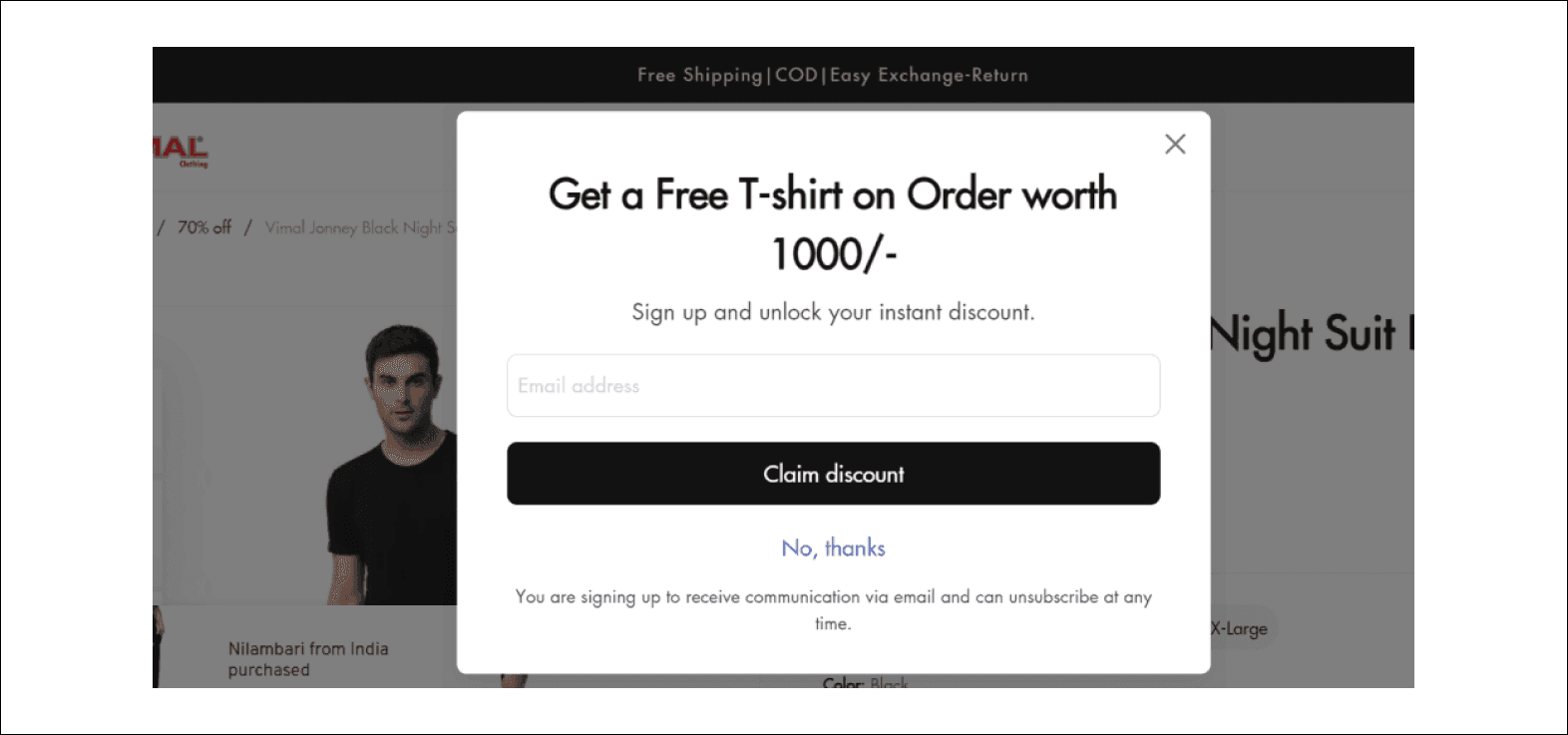
Vimal Clothing Store, for example, offers a free t-shirt on orders over 1000/- with opt-in and opt-out buttons in their pop-up form.

Strategy #4: Use countdown timers
Countdown timers create a sense of urgency, compelling visitors to respond to limited-time offers quickly.
Stat: The average conversion rate for pop-ups with a countdown timer is 14.41%. - Optinmonk
How brands are doing it?
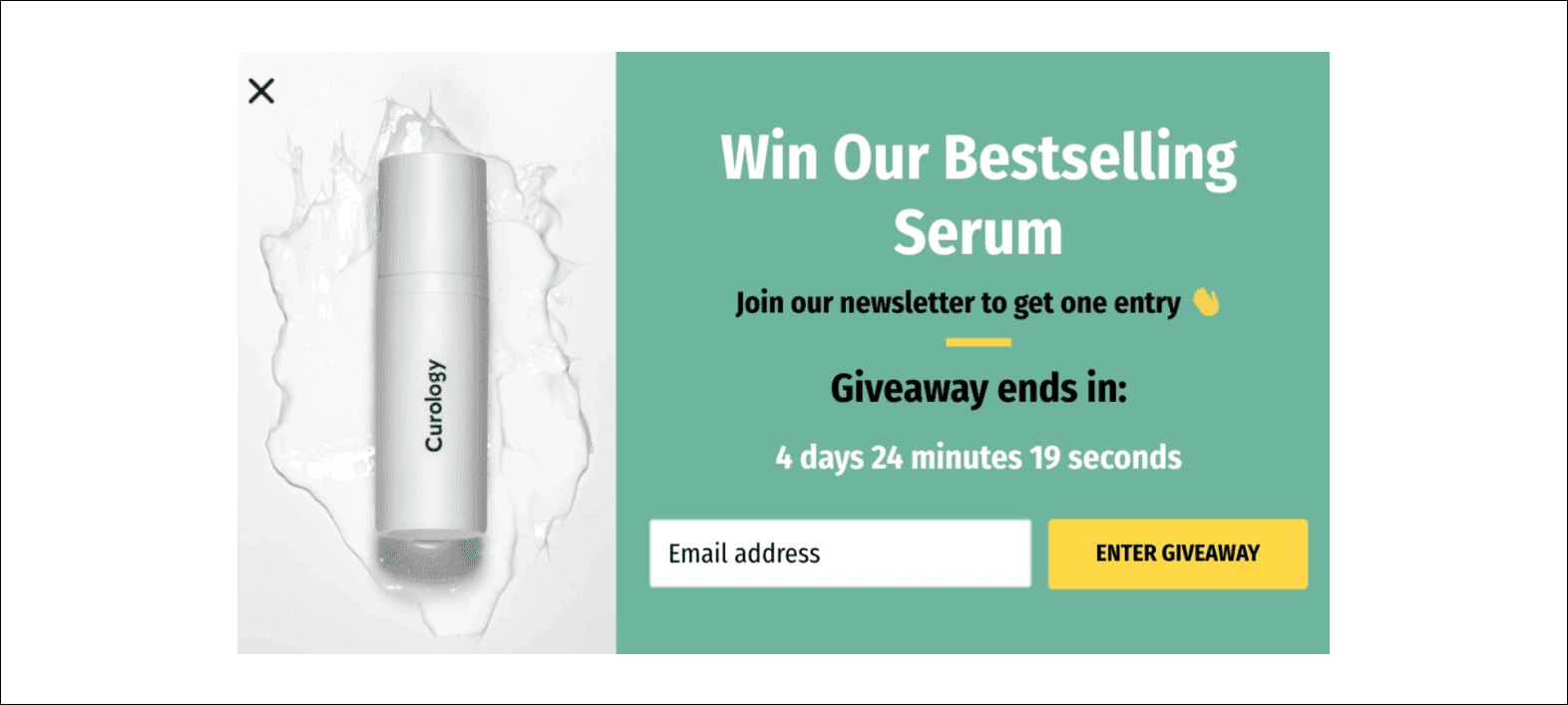
Curology, for example, uses a countdown timer in their pop-up form, urging visitors to subscribe to their newsletter to receive a free bestselling serum.

Strategy #5: Advertise bestsellers
Promoting best-selling products in pop-up forms can grab visitors' attention and boost sales. The Organic Chics store, for instance, reveals product recommendations in a pop-up with a 'Shop Now' button.

Image source - Optimonk
Strategy #6: Gamify pop-up forms
Introducing games in pop-up forms can make them visually appealing and engaging. Offering a discount or reward for participation can further incentivize visitors to provide the information they need.
Insight: Gamification pop-ups perform 13.23% better than other types.
How brands are doing it?
Here’s an example:

Image source: Optimonk
Having gathered visitor emails through engaging pop-ups, your store is poised to deliver what they've subscribed for. Utilizing email automation is key, whether it's a discount code, freebies, or notifications about sales and price drops. Trigger emails can be employed for discount codes, sending out tailored messages containing the codes.
For freebies, sending congratulatory emails along with instructions on how to claim them is effective. Additionally, for seasonal sales alerts, price drop notifications, and announcements of new arrivals, employing email flows ensures timely and relevant communication with your audience.
Types of email automation
There are several types of email automation that an ecommerce store can utilize. The two most effective are the New Arrivals and Sale/Price Drop email sequences. These sequences are designed to inform subscribers about new product launches and sales, respectively, and drive them toward making a purchase.
New arrivals' email sequence
The New Arrivals email sequence aims to:
Inform customers about a new product launch
Create a buzz around the newly launched products
Encourage customers to make a purchase

This sequence typically involves four to five emails spread over a week. The first email announces the new arrival, highlighting its key features or benefits. This is followed by an email providing further information, such as behind-the-scenes content or detailed guides on the product's usage. An early bird offer is then sent out, emphasizing its exclusivity. The sequence concludes with a nudge email, reminding subscribers of the limited offer and creating a sense of urgency.
Sale/Price drop email sequence
The Sale/Price Drop email sequence aims to:
Re-engage leads and customers
Drive conversions

This sequence generally consists of 2 to 3 emails over a week. The first email announces the sale or price drop, followed by a reminder email for those who have yet to engage with the first one. The sequence ends with a final call email, sent a day or two before the sale ends, to create a sense of urgency.
Implementing the Email Sequences
To set up these sequences, you'll need to use an Email Service Provider (ESP) like Mailmodo, Klaviyo, or Omnisend, which allows you to build and customize your email flows.
For instance, if you're a Mailmodo user, you can leverage its features to create interactive emails that drive higher engagement and sales. You can also use its pre-built automation, customized with your brand assets, to set up these email flows in minutes.
Moreover, Mailmodo also offers the ability to add SMS nodes in the same email flow, enhancing your communication strategy.
In addition to the current features, Mailmodo is soon launching a Pop-Ups Builder for websites and ecommerce stores. This feature will further enhance your ability to capture visitor emails and drive them towards the desired action.
Wrap Up
Pop-up forms are a powerful tool in the ecommerce world, but they must be used strategically and thoughtfully. By understanding the different types of pop-up forms and implementing best practices, you can leverage their potential to boost your conversions and grow your customer base. Experiment, test, and refine your pop-up forms to find the winning combination that works best for your ecommerce business.
Drive 2X more sales
with interactive emails

Create beautiful emails in no time with AI

Increase repeat purchases with interactive emails

Trigger pre-built sequences for any customer activity
1000+ marketers grew with Mailmodo, including


