What is CRO for mobile?
Conversion Rate Optimization (CRO) for mobile is about improving a mobile website or app to increase the number of visitors who take desired actions, like buying a product or signing up for a service.
It focuses on making the mobile experience better by optimizing site speed, navigation, layout, and usability. The goal is to make it easier and more enjoyable for users to engage with your app or website on their mobiles, so more of them complete the actions you want.
Significance of CRO for mobile
CRO for mobile enhances user experience by identifying and fixing friction points, ensuring seamless interactions. For example, research shows that 53% of mobile users abandon sites that take longer than three seconds to load (Google).
Optimizing mobile journeys not only boosts conversions and average order value (AOV) but also cuts down on how much it costs to win over new customers. Plus, it helps websites rank higher in searches, making sure more people find and engage with them.
10 CRO strategies for elevating mobile experience
Mobile users appreciate seamless experiences because their interactions are often quick and on-the-go. This necessitates optimizing every aspect of the mobile user journey—from initial interaction to conversion.
Now, let’s discuss 10 key mobile CRO techniques you can implement:
1. Optimize navigation with a mobile-friendly approach
Smartphones have transformed how we live, from entertainment to health and wellness. According to Adobe, 83% of consumers worldwide engage in multiscreen browsing, simultaneously using an average of 2.23 devices. This can be entertaining and productive but also distracting. As attention spans shrink, smartphone users favour well-designed content. Therefore, content must be optimized for multiscreen consumption, especially for mobile visitors.
There are three UX design strategies for a mobile-centric world:
 Source- Interaction design foundation
1. Mobile-first: Design for small screens first, then adapt to larger ones. Focus on what makes sense in the context of movement, limited time, and attention.
2. Task-first: This approach centers on helping users complete their primary tasks quickly and easily, reducing the mental effort required. It's ideal for mobile devices since users often need to accomplish tasks swiftly while on the move.
3. Content-first: Begin with what the user wants or needs and design the content around those desires, adding other UX elements afterward.
2. Streamline the checkout process for mobile users
In case of ecommerce stores, a smooth, hassle-free checkout process is critical for mobile users. Complicated forms and multiple steps can cause cart abandonment. Something as simple as offering users multiple payment options can significantly boost your conversion rates.
 Source- Lvivity
You can simplify the checkout process by:
- Reducing the number of fields required.
- Using pop-ups instead of new pages for entering details to keep users on the current page.
- Offering a guest checkout option prominently to avoid losing customers who do not want to create an account.
- Integrating mobile payment options like Apple Pay, Google Wallet, and PayPal for quicker checkouts.
3. Employ mobile-friendly pop-ups wisely
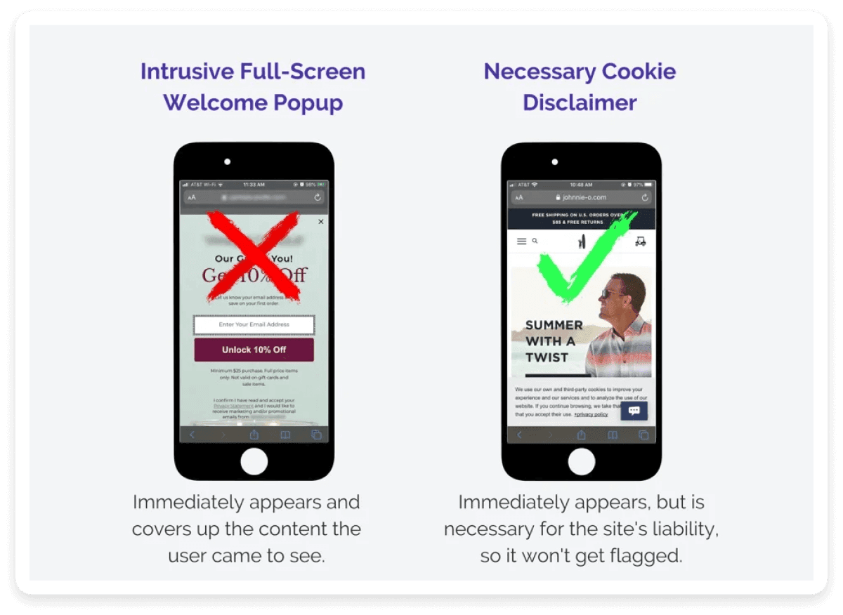
Pop-ups on mobile devices can be tricky. They often disrupt the user experience and can be difficult to close on small screens. However, when used wisely, they can be effective tools for capturing leads and promoting offers.
Here’s an example of a mobile pop-up done right:
 Source-
Your mobile pop-ups should:
1. Focus on user intent: Trigger pop-ups based on specific user actions to avoid being intrusive.
2. Easy to close: Ensure pop-ups can be closed easily with a tap or swipe.
3. Maintain context: Darken the background and keep the pop-up window smaller than the screen to visually indicate that users are on the same page.
4. Well-timed: Time your pop-ups strategically, ensuring they don’t appear immediately after a user lands on your page.
You can learn more about adding pop-us in our detailed guide below.
💡 Related guide: 9 Mobile Popup Best Practices for Higher Conversion
4. Design with the mobile user's thumb zone in mind
Understanding the thumb zone—the area of the screen easily reachable with a thumb—can enhance usability significantly. Most users navigate their phones with one hand, making certain areas of the screen more accessible than others.
The thumb zone (image below) shows the reachability range for a user's thumb when using their phone one-handed. It helps determine if primary interactions will be user-friendly or frustrating.
 Source- uptodown
Place important buttons and CTAs within the thumb zone to make interaction seamless. Use bottom navigation bars for key controls like menu, search, cart, and account access to enhance usability.
5. Implement clear and convincing call-to-actions
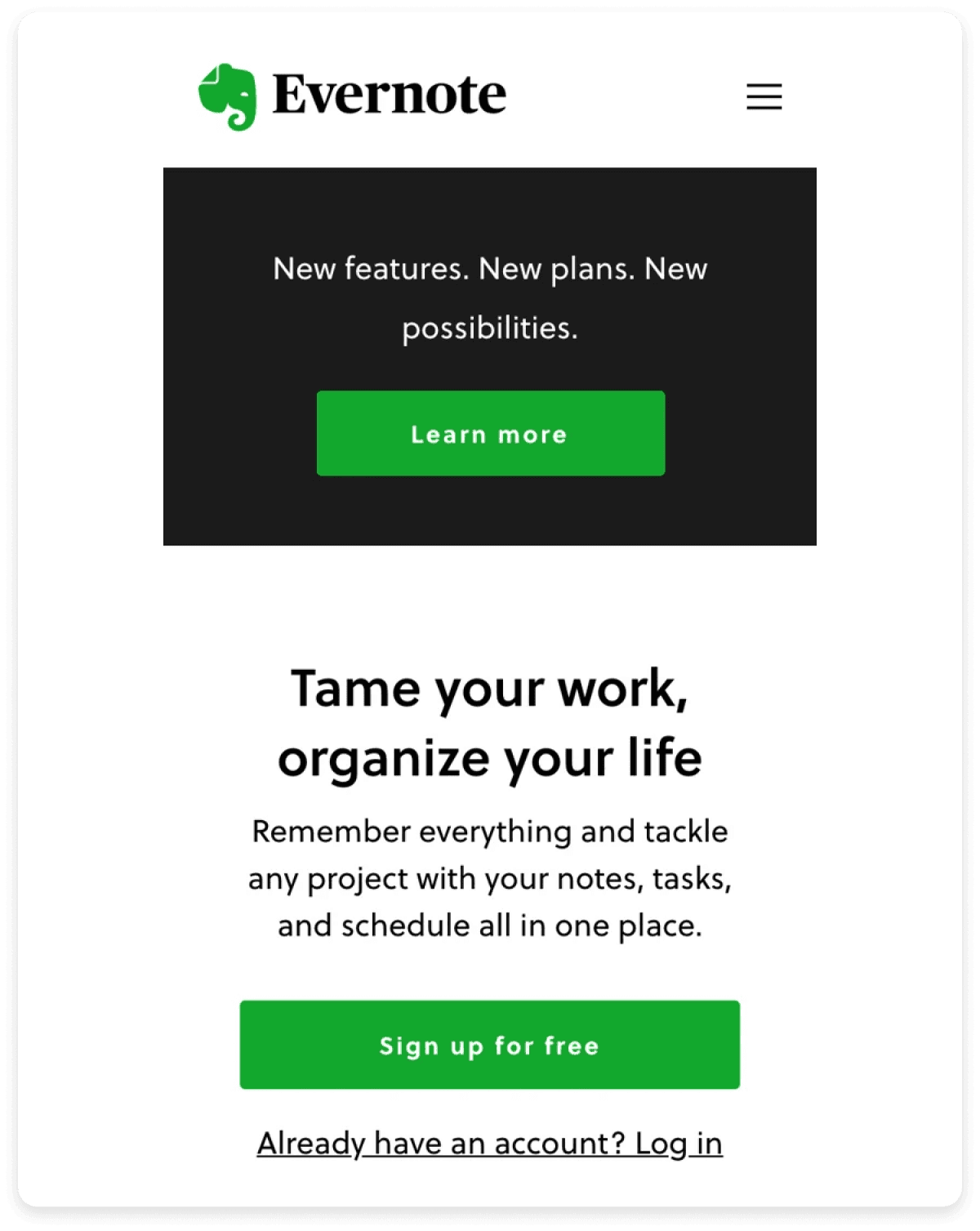
CTAs are the driving force behind conversions. On mobiles, they need to be particularly prominent and compelling. Use contrasting colors to make CTAs stand out and ensure that the CTA copy is concise and action-oriented- encouraging immediate action. Phrases like “Buy Now,” “Sign Up Today,” or “Get Started” are direct and effective.
Evernote, for instance, has done a good job of keeping the design clean and making the conversion path obvious with their CTA.
 Source-
Position CTAs strategically, such as after a compelling piece of content or product description, to guide users toward taking the desired action. You can also use sticky bars to keep the primary CTA in view as users scroll.
Forms are an integral part of any conversion process, whether it’s for capturing leads or signing up users. So, optimizing these forms for mobile input is crucial.
Plaumsail reduced the number of fields to the bare essential to improve the conversion rate of their forms.
 Source-
Here are a few factors to keep in mind while designing your form for mobile CRO:
- Use single-column layouts for ease of use.
- Label fields clearly and use input types that match the data required, such as numerical keyboards for phone numbers.
- Minimize the number of fields.
- Use smart autofill options to reduce user effort.
- Break longer forms into multi-step processes to avoid overwhelming users.
- Provide real-time feedback on form fields to help users correct errors instantly.
7. Implement responsive web design
Responsive web design ensures your website looks and functions well on any device, adjusting layouts and elements to fit various screen sizes. This is crucial for mobile users who expect a seamless experience.
Here’s an example showing how a non-responsive mobile site design can hurt user experience and increase bounce rates:
 Source- cybertoothIndia
Additionally, adapt visuals and media for mobile screens by using scalable images and ensuring videos are compatible with mobile playback. Your images and videos should be optimized for faster loading on mobile devices without sacrificing quality.
8. Prioritize content hierarchy for better information flow
Content hierarchy is about structuring your content so the most important information is seen first. On mobile, this means placing critical content in the first fold itself, where users see it immediately without scrolling.
In her blog post on Shopify UX, Gillian Massel explains how the lack of a clear content hierarchy initially led to user confusion and increased bounce rates in the two-step authentication setup process.
The primary issues were:
Assumption of user knowledge: She assumed all users were familiar with two-step authentication and wanted to enable it, leading to insufficient explanatory content.
Misplaced emphasis: Secondary decisions, such as choosing the type of two-step authentication, were given more visual weight than the primary decision of whether to enable it at all.
To address these issues, she made the following changes:
 Source- medium
Reordered content: She prioritized the primary decision (whether to enable two-step authentication) and provided necessary explanatory information upfront.
Clearer information: Added detailed explanations about the benefits and workings of two-step authentication before presenting options for types of authentication.
These changes resulted in a 62% increase in users enabling two-step authentication, showcasing the impact of a well-structured content hierarchy on user engagement and conversion.
9. Employ notifications to your advantage
Utilize push notifications and pop-ups judiciously to engage users without overwhelming them. Push notifications can re-engage users who have opted in, offering timely updates or promotions.
Here are a few push notifications types:
- Welcome notifications
- Cart abandonment notifications
- Promotional notifications
 Source- goodbarber
Use push notifications to remind users about abandoned carts, special offers, and important updates. Make sure to personalize notifications and pop-ups based on user behavior and preferences. You can use analytics to understand user behavior and identify areas for improvement for better effectiveness of your push notifications.
10. Implement image search for better user experience
Image search functionality can significantly enhance the mobile user experience, particularly within apps. By allowing users to search using images rather than text, you simplify the search process and cater to those who may find it easier to use visuals.
Here’s an example of how users use image search to shop for products:
 Source- bizjournals
This is especially useful in ecommerce, where users can take a photo of a product they are interested in and find similar items on your app or website.
You can learn more about conversion rate optimization in our related guide below.
💡 Related guide: Your One-Stop Guide to Conversion Rate Optimization in 2024
Success stories of mobile CRO implementation
CRO for mobile isn't easy; it involves a cycle of hypothesis, trial, and error to find what works best for each unique audience. However, when done correctly, the results can be transformative for a business.
Here are some successful case studies of mobile conversion rate optimization (CRO) implementation:
Case Study 1: Gaiam
Problem:
Gaiam was struggling with a high rate of shopping cart abandonment.
What they did:
- Investigated user journey to find why carts were being abandoned.
- Designed a behavior-sensitive pop-up to keep users focused on checkout.
- Tested the pop-up with triggers like adding items to the cart, closing the cart but continuing shopping, and scrolling on product pages.
- Made the pop-up visually appealing and highlighted product scarcity.
Result:
The pop-up led to a 13% increase in ecommerce conversion rate (CVR).
Case Study 2: Moonmagic.com
Problem:
Moonmagic.com wanted to increase revenue per user (ARPU) by boosting the conversion rate (CR) and average order value (AOV).
What they did:
- Conducted user behavior analysis to identify purchase patterns.
- Discovered that users were buying multiple variations of the same product.
- Hypothesized that prominently displaying customization options would encourage more purchases of product variations.
- Implemented sticky buttons in the thumb zone on mobile PDPs to select size, metal, and gemstone.
Result:
- 6.9% increase in ARPU
- 7.1% increase in CR
- 10.6% increase in AOV
- 5.7% increase in average units per transaction
Several tools and platforms are out there that can help you analyze mobile user behavior and track key metrics:
Google Analytics: Provides comprehensive insights into mobile traffic, user behavior, and conversion rates. Use the mobile-specific reports to track metrics such as bounce rate, session duration, and pages per session.
Mobilizer: Delivers device-level mobile metrics such as bounce rate and session length, aiding in identifying performance variations across devices.
Omniture: Offers enterprise-level analytics with detailed reports on mobile device performance and geo-location data.
Survey Monkey: Conducts online surveys to gather customer feedback and insights, crucial for understanding mobile user preferences.
Qualaroo: Targets mobile users with device-specific survey questions, enhancing understanding of mobile-specific conversion barriers.
Crazy Egg: Generates heat maps to visualize mobile user interactions and optimize design elements for improved engagement.
Google Flows: Analyzes the flow of mobile users through your site, identifying drop-off points and helping you optimize conversion funnels.
UserTesting.com: Provides real-time feedback from mobile users through moderated and unmoderated testing, ensuring user-centric design.
Think with Google: Offers industry insights and best practices based on research, aiding in mobile UX innovation and optimization.
Optimizely: Allows you to conduct A/B and multivariate testing to experiment with mobile site variations to implement winning conversion strategies.
Ready to increase mobile conversions?
CRO for mobile is not tweaking a few design elements; it’s creating a seamless and engaging experience that caters to the unique behaviors and needs of mobile users.
From optimizing navigation and checkout processes to leveraging analytics and avoiding common pitfalls, each step plays a crucial role in driving conversions. By implementing the mobile conversion optimization strategies discussed in this guide, you can transform your mobile site into a powerful tool for attracting, engaging, and converting users, ultimately boosting your business’s success in the digital landscape.


 Source-
  Source-
  Source-
  Source-
  Source-
  Source-
  Source-
  Source-
  Source-
  Source-


