What is CSS in email?
The Cascading Style Sheet(CSS) is a stylesheet language that describes a document's look and formatting in HTML or XML. CSS in email is a design blueprint of how HTML elements, such as the color, headers, tables, photos, etc., will line up and display on the page.
Some clients, like web-based ones (Gmail, Yahoo Mail), support modern CSS features, while others, like older versions of Outlook, do not. Email designers often combine CSS and inline styles to ensure consistent rendering across different email platforms (CSS directly applied to HTML elements).
Why is CSS important in emails?
Email design relies heavily on CSS for several reasons:
Visual appeal: It enhances the visual appeal of emails by controlling fonts, colors, spacing, and other design elements. It also helps create visually attractive and engaging emails , increasing user interest and interaction.
Responsive Design: It enables the creation of responsive email templates that adapt to different devices and screen sizes. This ensures that emails display correctly on desktops, smartphones, and tablets, providing a consistent user experience across devices.
Brand Consistency: It allows marketers to maintain consistent branding across emails. By defining standardized styles, such as colors and fonts, CSS ensures that every email aligns with the brand's visual identity, reinforcing brand recognition.
Interactive Elements: CSS can create interactive elements within emails, such as buttons and hover effects. These interactive features can improve user engagement and drive desired actions like clicking links or purchasing.
Efficiency: Designers can directly apply styles to specific email components using CSS inline or define styles in the style tag within the head section of the email's HTML through embedded stylesheets. This simplifies the design process and ensures that styles are applied consistently across different parts of the email content.
Types of CSS
There are 3 types of CSS: inline CSS, embedded CSS and external CSS. Let’s take a look at how they compare:
| Feature |
Inline CSS |
Embedded CSS |
External CSS |
| Where is it applied? |
This is used to style specific individual elements in the HTML document. |
This is used within the <head> section of an HTML document. |
This is stored in a separate file, for eg, styles.css, and linked to the HTML documents using the <link> element. |
| Usage |
Ideal for specific, one-off styles like styling individual elements. |
Suitable for defining styles for a single HTML document or webpage. |
Best for maintaining consistent styles across multiple HTML documents or entire websites. |
| Flexibility |
Limited flexibility; overrides other styles. |
More flexible than inline but can be overridden externally. |
Highly flexible, can be easily modified. |
| Maintainability |
Difficult to maintain, scattered in HTML |
Easier to maintain, contained within the document |
Easy to maintain, centralized styles |
| Load Time |
Instantly applied, increases HTML size |
Instantly applied, increases HTML size |
Separate file, cached for faster loading |
| Performance |
Can impact rendering speed due to scattered code |
Mild impact;styles are grouped but still present in the HTML file |
Optimal performance, external file caching |
Now, let’s take a look how each of them look like in code:
1. Inline CSS
Using inline CSS to style a table in HTML involves applying CSS properties directly within the HTML _ table_ and related elements using the style attribute.
There can be various examples depending on the varied number of elements that can be coded using inline CSS. Here, we've taken an example of inserting a table in our email :
<table>

 <tr style="background-color: #f2f2f2;">


    <th style="border: 1px solid #dddddd; text-align: left; padding: 8px;">Header 1</th>

    <th style="border: 1px solid #dddddd; text-align: left; padding: 8px;">Header 2</th>

    </tr>

    <tr style="background-color: #ffffff;">

    <td style="border: 1px solid #dddddd; text-align: left; padding: 8px;">Row 1, Cell 1</td>

    <td style="border: 1px solid #dddddd; text-align: left; padding: 8px;">Row 1, Cell 2</td>

    </tr>

    <tr style="background-color: #f2f2f2;">

    <td style="border: 1px solid #dddddd; text-align: left; padding: 8px;">Row 2, Cell 1</td>

    <td style="border: 1px solid #dddddd; text-align: left; padding: 8px;">Row 2, Cell 2</td>

    </tr>

    </table>
2. Embedded CSS
It is also known as internal CSS or style CSS, is placed directly within the HTML document. It is defined within the style element, usually in the document's head section. Here's how it looks:
<!DOCTYPE html>


    <html>

    <head>

    <style>

    body {

    background-color: lightblue;

    }

    h1 {

    color: navy;

    margin-left: 20px;

    }

    </style>

    </head>

    <body>


    <h1>This is a Heading</h1>

    <p>This is a paragraph.</p>


    </body>

    </html>
3. External CSS
External CSS refers to the practice of storing CSS rules in a separate file and linking it to an HTML document. Here's how you link an external CSS file to an HTML document:
body {

    background-color: lightblue;

    font-family: Arial, sans-serif;

    }


    h1 {

    color: navy;

    }
<!DOCTYPE html>

    <html lang="en">

    <head>

    <meta charset="UTF-8">

    <meta name="viewport" content="width=device-width, initial-scale=1.0">

    <title>My Website</title>

    <link rel="stylesheet" href="styles.css">

    </head>

    <body>

    <h1>Welcome to My Website</h1>

    <p>This is a paragraph.</p>

    </body>

    </html>
6 Best practices for CSS in emails
CSS support varies across different email clients and platforms which may cause issues such as cross-browser incompatibility, problems with responsive email design and impacts performance and accessibility.
Email clients frequently lack the robust and consistent CSS rendering capabilities in modern web browsers. Unlike browsers offering extensive support for contemporary CSS properties and features, email clients often provide limited, and; here are six best practices for CSS in emails:
1. Utilise inline CSS styles.
Email clients commonly employ a secure default mode to safeguard against potential security risks. In this mode, certain CSS properties or attributes, like styles based on JavaScript or external CSS files, are often restricted or omitted. This precautionary measure aims to prevent malicious code execution and maintain email security.
Inline CSS styles are applied directly within an HTML element's style attribute, offering a way to style specific elements individually. To utilize inline CSS styles:
<<div style="color: blue; font-size: 16px;">This is a blue text with a font size of 16px.</div>
Their specificity helps override external and internal styles for the targeted element.
Media queries in emails facilitate responsive design, ensuring adaptability across various devices and screen sizes. This allows the application of specific CSS styles based on the viewing environment, typically device or screen width.
By employing media queries, email developers can tailor CSS styles to match the unique attributes of the viewer's environment. This adaptability enables emails to adjust layout, typography, and other design elements, providing subscribers with a consistent and user-friendly experience, regardless of their device.
They not only help with mobile responsiveness but also for coding emails in dark mode. Utilizing 'prefers-color-scheme: dark' within media queries enables customization of email styling to align with the user's preferred color scheme.
</div>

<div class="highlight-gray">

<p> <strong>
💡Related guide:</strong> <a href="https://www.mailmodo.com/guides/email-media-queries/">All about email media queries</a></p>

</div>
3. Take a mobile-first approach to HTML email development
Traditionally, emails were crafted with a desktop-first approach, constructing the desktop version initially and then adjusting it for mobile devices using media queries.
However, we advocate for a mobile-first strategy as most users view their emails on their phones. Begin by designing a simple, mobile-optimized layout for your email. Subsequently, enhance this design for desktop users.
In short, you need to switch from max-width media queries, which tell the browser to initiate this code if the size is less than x, to min-width media queries.
4. Stick to a single-column layout
Opting for a single-column layout significantly enhances email readability on mobile devices. This approach prioritizes crucial content, ensuring easy scanning for users. To further enhance readability, you can try:
Vertical Stacking: Arrange elements vertically on smaller screens to establish a clear content hierarchy.
Prominent CTA: Ensure the primary call-to-action (CTA) is prominently displayed and easily clickable, enhancing user engagement.
5. Size text and buttons appropriately
The limited screen space on mobile devices makes it important to prioritize the necessary content. Ensure the main call-to-action (CTA) is prominently showcased and easily accessible for clicks.
Nothing is more frustrating to your recipients than trying to interact with your emails but struggling to click buttons or being unable to read text due to improper scaling.
6. Extensive email testing
Extensive testing is paramount to ensure that emails are displayed correctly across various email clients and devices, as CSS behaves differently with different email clients, leading to inconsistent layouts.
You can conduct extensive email testing in the following ways:
Test emails across multiple email clients (such as Gmail, Outlook, and Apple Mail) to ensure consistent rendering of CSS styles.
Verify that responsive CSS styles appropriately adapt to the email layout on desktop and mobile devices.
Maintain a balanced image-to-text ratio by prioritizing text over images for critical information can be used to control the layout and positioning of text and images, ensuring a harmonious balance between the two.
Test the functionality and appearance of CTA buttons.
Limitations of CSS
Using CSS in emails presents several challenges due to varying support across email clients. Key challenges include:
Email clients interpret CSS differently, leading to inconsistent rendering of emails across email platforms.
Many email clients, especially older versions, have limited CSS properties and selectors support. Some styles might not be rendered as intended or might get completely ignored.
Some email clients block images by default, and CSS for background images might not work as expected. This affects the overall layout and visual appeal of the email.
Inline styles make creating complex layouts with CSS in emails difficult. Especially in large and intricate email templates, inline CSS can become cumbersome and difficult to manage.
An alternative to CSS - Mailmodo
ESPs like Mailmodo help do CSS code through the drag-and-drop editors. You can incorporate rich text and media design capabilities with live preview.
To further streamline email design, Mailmodo also offers AI Template Generator that automatically create fully styled email templates in seconds. Simply type your content needs or select a pre-written prompt and the AI Template Generator instantly produces a responsive, brand-consistent email ready to send.

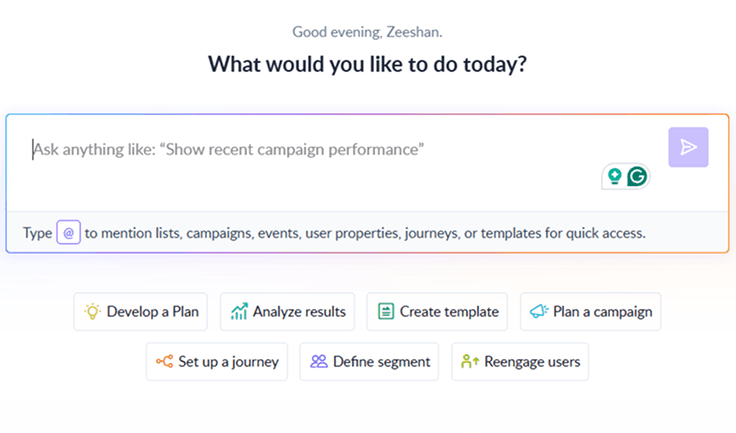
Your AI Assistant for Everything Email Marketing
Final takeaway
CSS gives emails a visual edge, makes them interactive, and is more user-friendly, even though different email clients support CSS differently. Despite the challenges posed by varying levels of support across different email clients, CSS brings life to emails in crucial ways for modern marketing strategies. While overcoming the hurdles of inconsistent rendering, email designers and marketers continue to harness the potential of CSS, employing innovative techniques to create compelling email campaigns.


