What is an email banner?
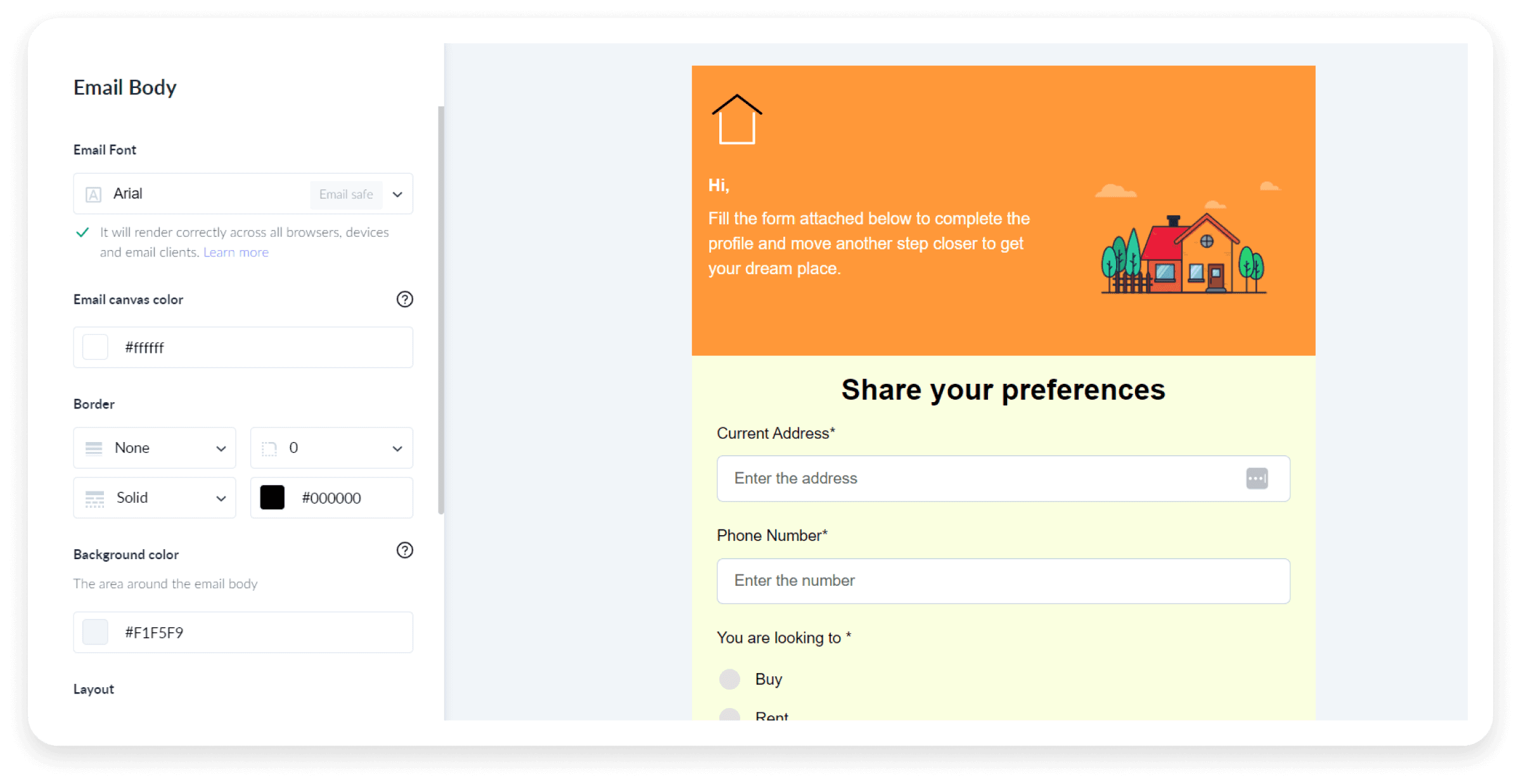
An email banner is a visual element located at the top of an email, usually within the header section. It often features branding elements like a logo, company name, tagline, and occasionally promotional messages or images.
Its main purpose is to capture the recipient's attention, reinforce brand identity, and deliver key information or announcements right from the start.
Types of email banners
Email banners are essential for creating effective emails, and they serve different purposes depending on their type. Here are the types of email banners that you'll commonly get to see:

The email header banner is the first element recipients see in an email, typically featuring the company logo, the email's main heading, or the key topic. It sets the tone for the rest of the message and is crucial for branding and grabbing attention immediately.
Body banner
The email body banner appears within the main content of the email. It is typically used to highlight promotions, key messages, products, or services. It draws attention to important information and engages recipients with the core content of the email or newsletter.
The email footer banner is located at the end of the email. It often includes contact information, social media links, unsubscribe options, offers, and calls to action (CTAs). Footer banners can also offer compliance with anti-spam laws by providing more detailed sender information and giving your email an organized and professional look.
What is the ideal email banner size?
When designing email banners, choosing the right size is essential to make your emails visually appealing, improve your email's functionality, and allow proper rendering across different devices and email services. Some common sizes and guidelines are below to help you get it right:

Desktop: The width should be between 650px and 700px while the height should range from 90px to 200px. This means that the banner should be 17.19 cm to 18.52 cm wide and 2.38 cm to 5.29 cm high.
Mobile: You can use a width of 350px and a height of up to 100px, that is 9.36 cm wide and upto 2.64 high.
Email body banner size

Desktop: The ideal dimensions are 650px to 700px in width and 350px to 500px in height. This means the banner should be 17.19 cm to 18.52 cm wide and 9.26 cm to 13.23 cm high.
Mobile: For smaller screens, aim for a width of 350px and a height of around 200px, that is 9.26 cm wide and 5.29 cm high.

Desktop: The width should be between 650px and 700px, that is, between 17.19 cm and 18.52 cm, with a height of up to 150px, that is, 3.96 cm.
Mobile: A width of 350px and a height of 100px, that is, 9.26 cm wide and 2.64 cm high, works well.
Email signature banner size
- The width should be 650 px, and the height should be between 90px and 150px. This means that the signature banner should be 17.19 cm wide and 2.38 cm to 3.97 cm high.
General guidelines for email banner size
Width: There’s no one-size-fits-all rule. Your banner width should match the overall width of your email, which typically ranges from 600px to 900px. Popular sizes include 600px, 700px, 800px, and 900px.
Mobile considerations: For mobile, aim for a width of 200px to 320px. Banners should be responsive and adjust to various devices. If the device’s screen size is 100px then it should resize according to that.
Height: Height is flexible and should fit your content needs. Generally, keeping the banner within the first fold of the screen or half of it is best practice. For eCommerce emails, consider extending the height to one and a half or two folds to better showcase products.
Why does the email banner size matter?
Getting the email banner size right is more than just a design choice. It's a crucial factor that directly impacts the effectiveness of your email marketing campaigns. Here’s why:
Impact on load time: A large banner can slow down email loading times, especially on mobile devices. This leads to higher bounce rates as recipients may exit before the email fully loads.
Visual appeal and responsiveness: An improperly sized banner might appear distorted or fail to adapt to different screen sizes, resulting in a poor user experience. A correctly sized banner makes your email look professional and appealing across all devices.
Email client compatibility: Email clients may render banners differently. Choosing the correct size provides better compatibility. This further reduces the risk of your banner appearing incorrectly in certain clients.
Engagement and click-through rates: A well-sized banner with clear, crisp visuals is more likely to grab attention. This leads to higher engagement and click-through rates. Banners that are too small or too large can detract from the message, reducing effectiveness.
How to create the perfect email banner with Mailmodo
Times are changing, and so is email marketing. To stay ahead, consider using advanced email marketing platforms like Mailmodo that can help you craft visually compelling banners that make an impact. Here’s how to create the perfect email banner with our platform:
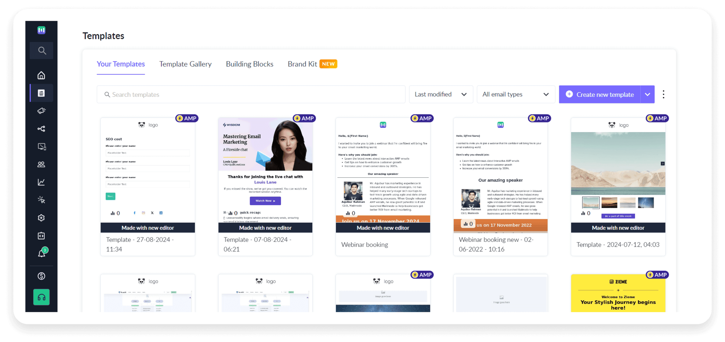
- Access the templates tab: Start by navigating to the Templates tab and selecting "Create New Template."

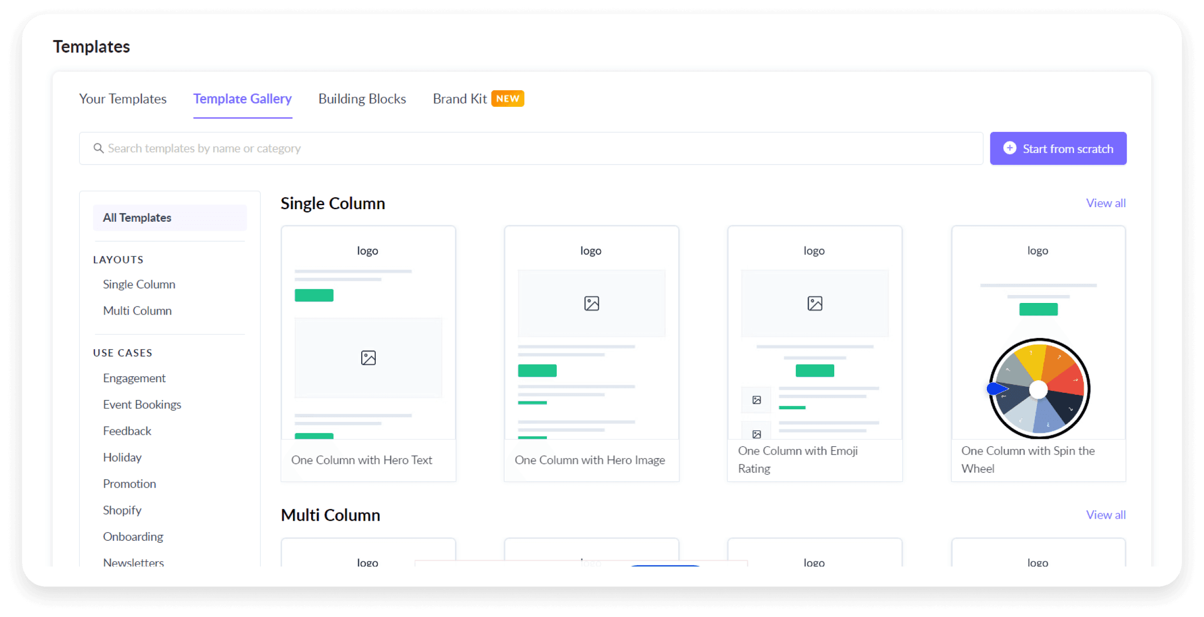
- Choose your starting point: Either edit an existing template's banner or begin with a fresh design by creating a new email template.

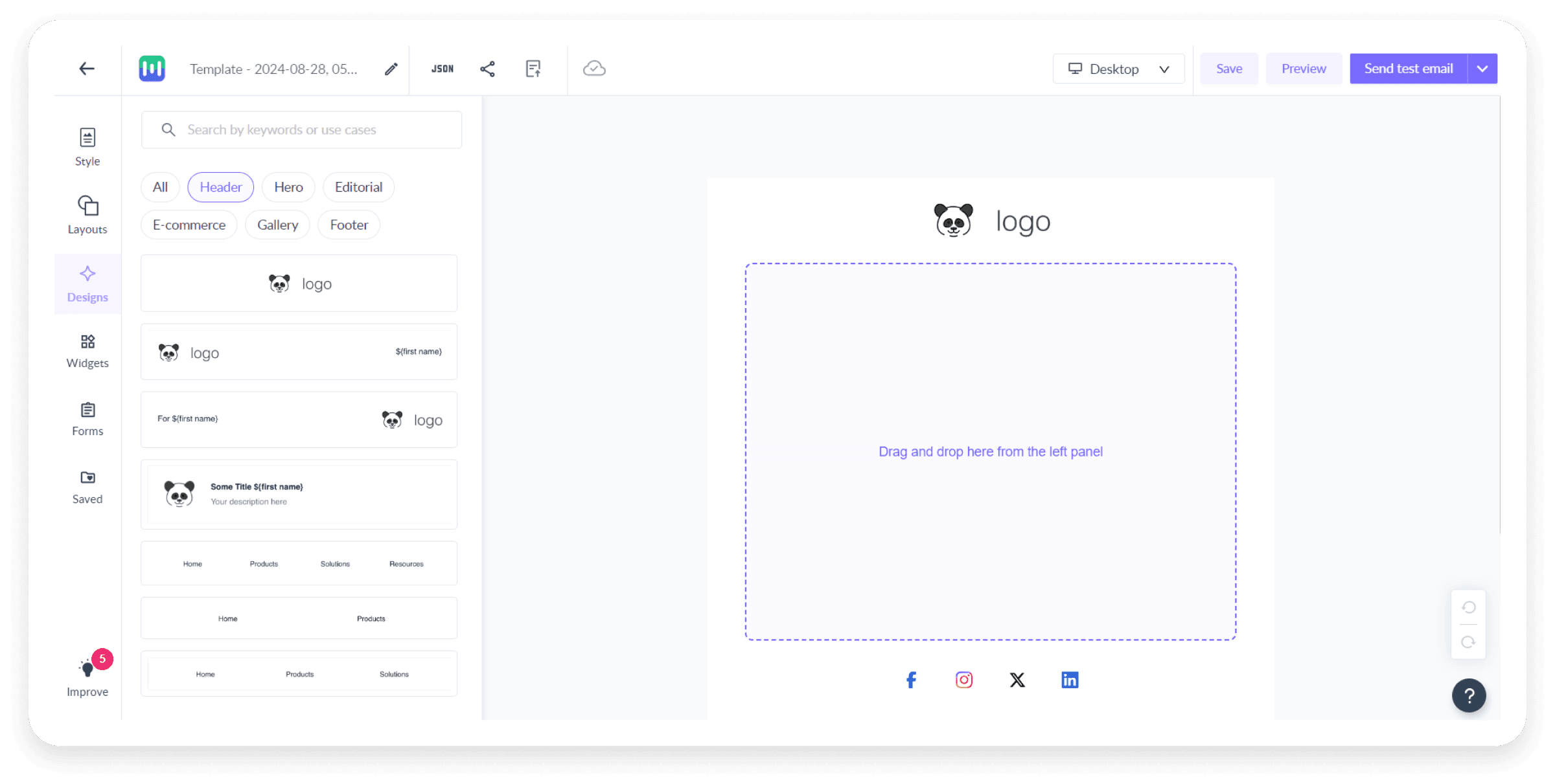
- Design your header: In the Design tab, go to the Header section and pick a header template that fits your needs.

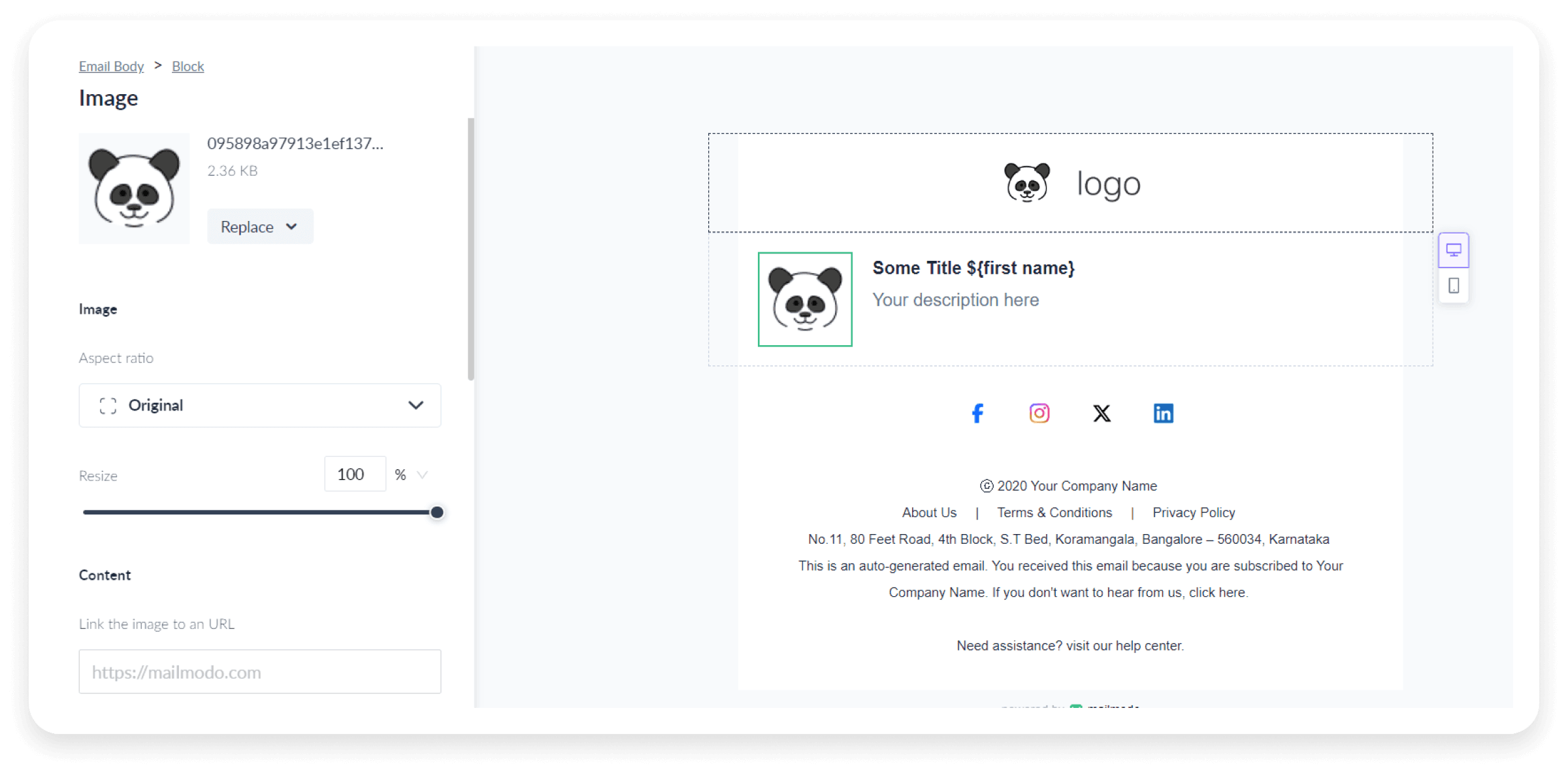
- Customize your banner: Customize your banner by adjusting images, text, and background to align with your brand and message.

- Finalize your template: Complete your email body by incorporating additional interactive elements as needed. Save the template, and you’re ready to use it for sending emails through Mailmodo.

Create an email banner in minutes
Best practices to create a perfect email banner
Designing an effective email banner goes beyond size. It’s about crafting a visual element that grabs attention and drives results. You can follow the best practices to create a perfect email banner given below:
1. Choose the right dimensions
Start by aligning your banner size with the width of your email. Depending on your email layout, common widths are 600px, 700px, and 900px. For mobile devices, ensure the banner scales properly, with widths ranging from 200px to 320px.
2. Optimize for file size and quality
Balance image quality with file size to avoid slow loading times. Aim for file formats like PNG, JPEG and GIF. Keep the file size under 1MB for fast delivery without compromising visual appeal.
3. Design for visual impact
Use high-contrast colors and clear text to make your banner stand out. It should align with your brand’s visual identity and include a clear call to action. A well-designed banner should capture the viewer’s attention and communicate your message effectively.
4. Test and iterate
Before finalizing your banner, test it across different devices and email clients to check if it displays correctly on the preview. Make adjustments based on feedback and performance to optimize its effectiveness.
Busting 4 email banner size myths
Certain beliefs about email banner sizes can mislead your email design decisions. Let's debunk these common myths to help you create effective and engaging banners for your email campaigns.
Myth 1: Bigger banners lead to better engagement
Larger banners don't automatically mean better engagement. While a big banner may catch the eye, it can also slow down loading times and disrupt the email's flow. Instead, focus on a size that fits well within your email design and maintains performance.
Myth 2: One size fits all (debunking the 600px rule)
The 600px width rule is not a one-size-fits-all solution. While 600px is a common width, the ideal size for your banner should match your email’s layout and specific design needs. Consider your audience and the content of your email to choose the best dimensions.
Myth 3: Disappearing background colors
It is believed that background colors disappear in banners wider than 640px, especially in popular email clients like Gmail and Microsoft Outlook. In reality, many marketers successfully use banners up to 800px wide with their background colors intact. The key is to test your designs across different clients to ensure consistent display.
Myth 4: Banners aren't important for mobile users
Ignoring mobile users in banner design is a major mistake. With 46% of emails opened on mobile devices, your banner must be responsive and look great on all screens. Optimize for both desktop and mobile so that your email maintains its visual appeal everywhere.
5 Email banner design examples to inspire you
Below are some inspiring examples to help you create eye-catching email banners that stand out.
In this email body banner example, the email’s purpose is immediately clear. The design is minimalistic, yet it effectively guides subscribers toward taking action with a well-defined CTA.

2. Forever 21
This email body banner perfectly demonstrates the effective use of contrasting colors. It also includes a menu for users who want to navigate to specific content. The message is clear and direct, while the CTA button stands out as both noticeable and clickable.

3. Uber Eats
This email banner is simple yet effective, conveying the deal clearly without unnecessary details. The bold color choices and striking imagery make it impossible to overlook.
The offer ("Enjoy 30% off produce every Fresh Tuesday") is straightforward. It builds anticipation for recurring deals, motivating me to come back each week to save on fresh fruits and vegetables.

4. Shopify
We love this email header banner for its gradient colors and fun visual elements. The headline and tagline are perfectly crafted, while the CTA feels inviting without being overly aggressive.

5. PayPal
This email header banner is effective due to its bold contrast, clear messaging, and strong branding. The bright yellow background enhances readability, while the concise headline quickly communicates value.
The PayPal logo and color scheme align with the brand, reinforcing trust and recognition. The prominent CTA stands out, encouraging action, and the minimalist design keeps the focus on the message without unnecessary distractions.

Bottom line
Follow the best practices and learn from the myths that we've busted to create perfect email banners for your email campaigns. The right email banner size can make or break your email campaign. It ensures your message is clear, visually appealing, and optimized for all devices, enhancing user experience and engagement.
So, don’t let a poorly sized banner undermine your efforts. Use the email template builder by Mailmodo to create perfectly sized banners that captivate and convert your audience. If you want to learn more about designing emails, check out our resource below.


