2. Know your recipients' email clients
It's crucial to know how different email clients render emails. Also, know the main workarounds from email client to email client so you can prepare for and deal with the issues that your email might face for each email client.
When developing an email, keep in mind the distribution of email clients across the list you are sending to. Avoid spending time developing for difficult clients that have small user bases and instead focus on the ones with the largest user bases. Build for older, less capable clients first, then enhance to provide more features for newer clients who can handle them.
3. Personalize your emails with dynamic content
Dynamic content is a way to take personalization to the next level. It is when you change entire portions of your email content to make the email campaign more relatable and appealing to the recipients.
The more you know your subscribers, the more targeted, relevant and customized your emails can be.
In a survey conducted by SmarterHQ, it was found that almost 72% of consumers online engage with content only if they are personalized and related to their interests or needs.
For example, in this email campaign, Adidas shows their men's products to the male subscribers while showing the women's products to female subscribers.

4. Choose an appropriate email layout
The layout of an email is crucial as it determines the flow that guides readers through the content. A well-structured layout ensures that key messages are easily digestible and that recipients engage with the email as intended.
Additionally, the layout may vary based on the email’s purpose. For example, if you are sending an email to promote your product, but you put the photos below the text, you might not get the desired amount of conversions. However, if you started the email by showcasing the picture followed by a description and then the CTA button, it would provide better conversion.
It's up to you to choose what type of layout is appropriate for your email. It can be an inverted pyramid layout, a zigzag layout, or even a two-column layout.
A single-column email, for instance, can be easier to read and more responsive across devices. Whereas, a zig-zag email layout makes your eyes travel through the email and shows you clearly what to focus on. You can use this layout to change things up and keep your emails interesting.
If you are choosing a more complex layout, make sure to thoroughly test the email across devices to prevent any possible responsiveness issues.

5. Write a clear email copy
When you are writing an email copy, make sure to keep it short for better readability. People should understand what you are talking about by reading the first sentence itself.
Make sure to use one or a maximum of two fonts when you write the email. This helps keep the email cohesive and readable. If you use web fonts, have a few system fonts set as default fallback fonts if the email client cannot show your font.
You can also make use of AI email writers to write personalized email copies for every use case.
6. Avoid sending all-image emails
Avoid sending emails that contain only images. It's a bad practice that leaves readers confused if the images fail to load for any reason. Also, it makes emails not accessible for people who have disabilities and use screen readers.
Try to keep the image-to-text ratio at 40:60 and avoid image-based text. If you can't, then provide a fallback with alt text so the email is still clear if the images don’t load.
An email with a width of 600-640 px is optimal to make sure it looks good on all devices. So keep it in mind when adding images and creating the email template.
7. Optimize the email design to be responsive for all devices
People usually check their emails on the phone when they are not using a laptop. So you need to design emails that are responsive so they can get a good reading experience regardless of the device. To make your email design responsive, keep the copy of the email short and legible so people can read it on the go.
You can also design it in a way that the links and CTAs are within thumb reach. If your message is lengthy, consider repeating the primary CTA at the end of the copy to save your reader's scrolling time.

8. Use white space
White space is the blank spaces around your sentences, images, and CTA buttons. It is a crucial component of design. It helps separate elements visually from other elements in your email.
It also helps increase the legibility of your email and improves the reader’s ability to look over the email as a whole. Make sure your email copy and CTA button, and other related elements are separated but close enough for readers to know they’re related.
Use distinct color and whitespace around the call-to-action button such that the viewer can easily see and click on it.
The placement of the CTA buttons are also important to ensure that they’re clearly visible. You can even use the CTA in the header or at the end of the email; it depends on how long the email is.

10. Use GIFs rather than videos
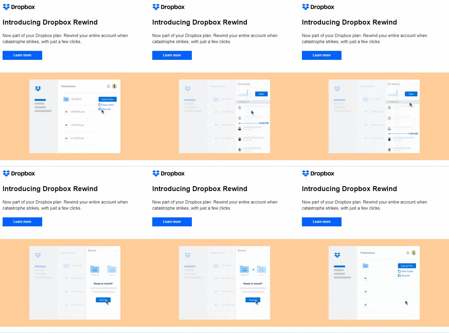
When you have a choice between video and GIFs, always choose GIFs. Because only a few email clients allow embedded videos, embedding videos in your emails can make your emails end up in the spam folder.
So it's better to use GIFs in the email instead of videos as they are short, expressive, and take less time to load. Make sure the GIF you use is compressed and is not a large file; this will also help with the email deliverability.

The footer of the email is an important part of it as it provides crucial information about you to your readers. Here are some things that you must have in your email footer.
Unsubscribe link
If people can’t find a place to unsubscribe from your emails, they’re likely to mark your emails as spam. Design your unsubscribe link to be more visible. You might lose some subscribers, but you will also lose some spam reports and it’ll only make your email list cleaner.
You can link your socials in the footer of the email to give your audience access to more of your content.
Choose and link relevant and most frequently used social media platform by your organization. This will help you to grow your following on multiple social media platforms.
Support
Provide a ‘contact us’ option in your email footer. It can be an email address, a support link or even a contact number along with the address and other information of your company so they can reach out to you without any issues.
12. Conduct A/B tests
Testing emails is an iterative process. It means you will have to continuously test and retest to make sure your emails are rendering correctly.
You can A/B test several components like CTAs, responsiveness, layout, etc, and see how people engage with different versions of the same email. You can then understand what’s resonating with your recipients and use that information for future email campaigns.
13. Optimize your design for dark mode
Almost 80% of people use dark mode on their devices. So it's important your email design works well with it.
Make sure that the font shifts to a light color on the dark background and that all the visual components are properly visible for both dark and light background.

14. Keep the overall email design minimal
When you go over the final review of the email, make sure you remove any redundant or unnecessary information or design elements that make your email look cluttered.
When designing the email, stick to the concept of less is more, as a long and cluttered email only discourages the readers from taking time to read your content. Present the information you want to present in a short, clean, and organized way.
Wrapping up
To design an effective email, you can follow the email design best practices mentioned above, or you can check out this amazing guide about email design system, where we talk about every element that goes into an email and how should it be designed precisely. While it's completely fine to create a design and stick to it, it can be a good idea to change things up in either the design or content to perk your readers’ interest every once in a while.
If you are just starting with email design and don't want to create a template from scratch, then you can use email service providers like Mailmodo. Mailmodo provides a lot of pre-made email templates for you to choose from, and you can do everything from creating, testing, and sending out the emails using Mailmodo itself.
Design and send emails within minutes


