What is an email layout?
An email layout is the arrangement of images, content, CTA buttons, etc., in an email in order to guide the viewer through the email and show them what they should see in order.
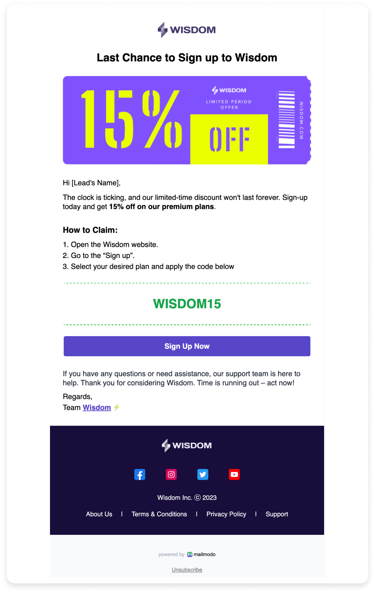
Let's take the email below as an example. All the information in the email is placed in a readable way, and the call-to-action is clear. This orderly placement of information in an email is known as the email layout.

Why is an email layout important?
Email layout is extremely important to improve your email user experience. There are various reasons why using a layout in your email design will always be beneficial:
✅ Structures and segregates content
A clear layout ensures that content is presented in a logical order, making it easy to scan while breaking up sections for better readability. It keeps users engaged and helps them consume information without feeling overwhelmed.
✅ Enhances readability
A good email layout enables quick scanning through headlines and images, ensuring users grasp key details at a glance. This maintains attention and smoothly guides them toward the CTA.
✅ Optimizes user actions
Different layouts can be tailored to drive specific actions—whether encouraging full email reads in newsletters or boosting conversions in e-commerce emails.
What are some commonly used email layouts?
Here, we have broken down the different layouts used, how they work for different types of emails, and their end goals.
1. Single-column email layout
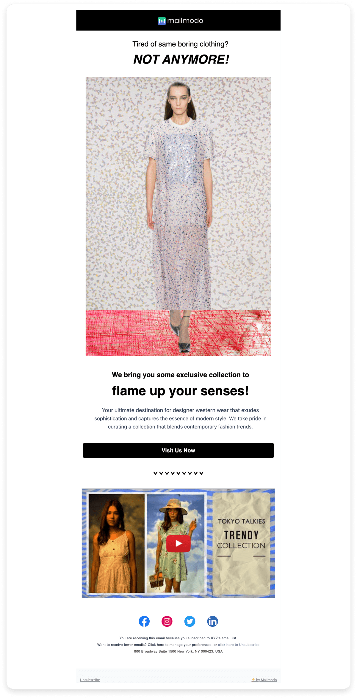
Single-column emails present content in a single vertical column, making them simple and easy to navigate. This layout is a default choice for many because of its straightforward structure.
Typically, these emails feature one main visual element—such as an image or illustration—followed by the content. However, the hierarchy of information isn't inherent to the layout and must be intentionally designed using font sizes, images, and spacing. Some single-column emails may not even include a CTA, especially in informational newsletters.

An example of single column email layout:

A single-column email layout is best suited for:
- Newsletters (since the objective is reading, not clicking on CTAs)
- Welcome emails
- Transactional emails
However, it may not be ideal for:
- Re-engagement emails and promotional emails, as it tends to be plain and text-heavy, making it less effective for conversion-focused campaigns.
Pros:
- Works well on both desktop and mobile.
- A simple, distraction-free format makes it easy to read.
Cons:
- Requires scrolling to access all information.
- May lack strong visual hierarchy unless deliberately designed.
2. Multiple-column email layout
Multiple-column layout in emails is when images in the email are placed side by side next to each other in two or more columns, followed by the email copy. This email layout is often used by brands that focus mainly on using imagery in their emails.

Here's an example of multiple column email layout:

Multiple-column email layouts can be used for:
Pros
It is perfect for an email that showcases options to compare side by side or display multiple pieces of content at once.
Cons
It is not optimized for mobile devices because the columns get stacked one after another rather than side by side.
3. Hybrid email layout
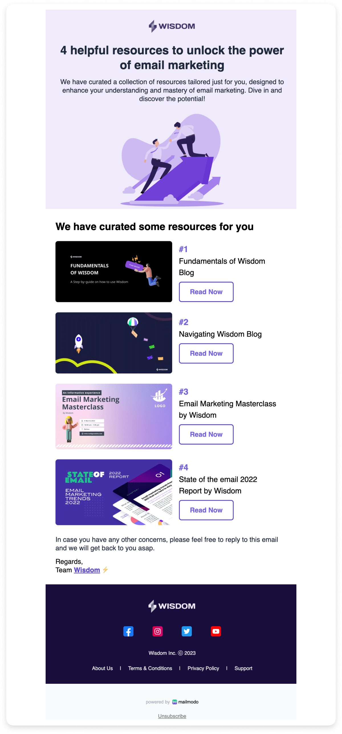
The hybrid layout combines a broad, single-column header that highlights the main offer or product, followed by multiple blocks arranged in a two-column format. This layout is highly versatile and is now the most commonly used email design among our survey respondents, according to the State of Email 2024.

Here's an email template example for hybrid email layout:

Hybrid layouts are ideal for:
- Offer emails
- Onboarding emails
- Product-heavy emails (e.g., showcasing a menu or multiple product categories)
- Announcement emails
- Weekly update emails
- Promotional emails
Pros:
It is perfect for showcasing the primary content with a call-to-action followed by additional information with multiple calls-to-action.
Cons:
It might have limits regarding the maximum width of the elements in it as it has to work for both desktop and mobile devices.

4. Inverted pyramid email layout
The inverted pyramid layout structures the elements of the email campaigns to work together to lure people in, convey the campaign's key message, and make them click through. In this layout, every part of the email is meant to support the call-to-action and eliminate any distractions, so they have nothing to do but click the CTA button.

Here's what an inverted email layout looks like in a template.

The inverted pyramid layout can be used for:
Onboarding emails
Promotional emails
Welcome emails
Pros:
It helps minimize distractions and maintain focus on the call to action.
Cons:
It is not useful for emails without a call to action like newsletters.
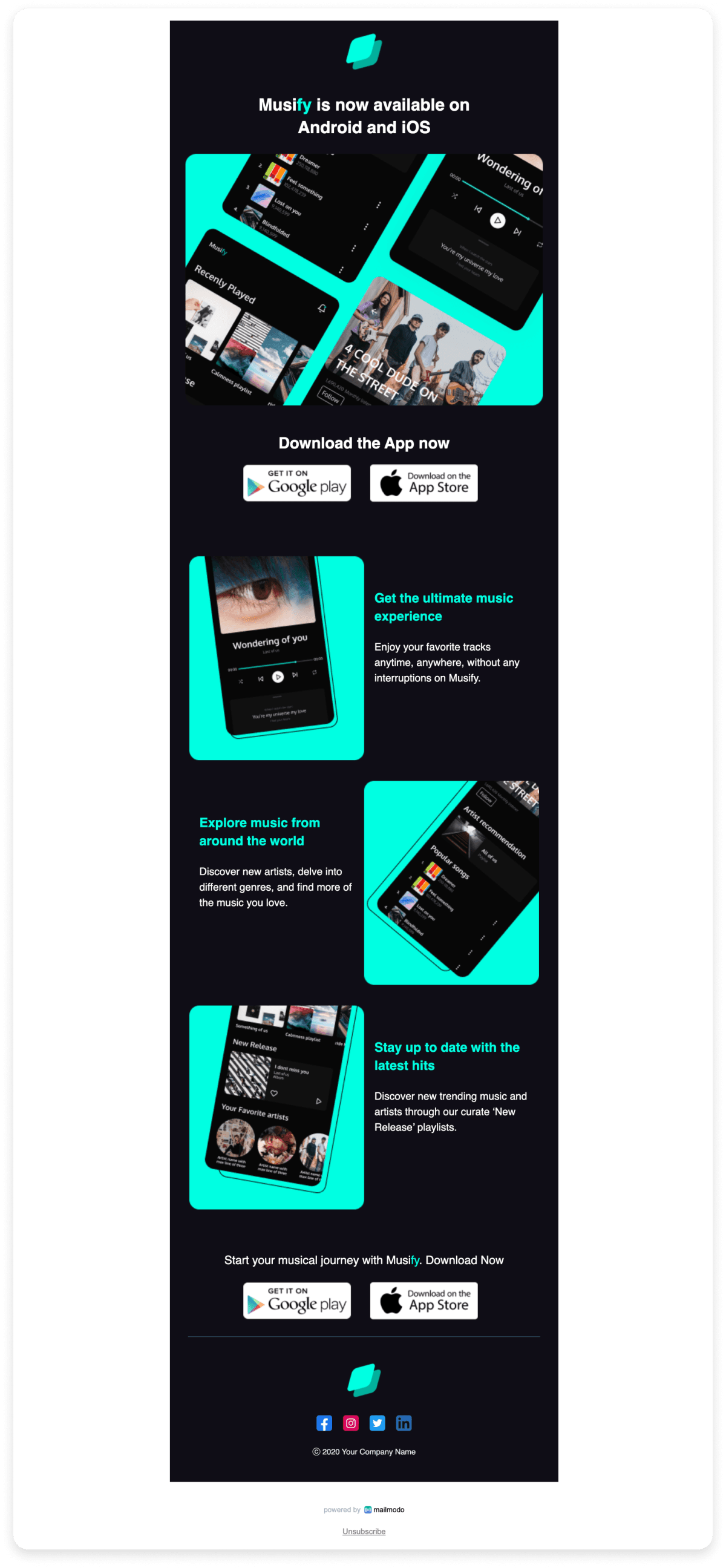
5. Zig-Zag email layout
The zigzag layout is an angular layout that uses angles to create an enticing email design that is also functional and easy to read while containing many important information and graphics. This type of email layout is perfect when you want to showcase your products and want to add multiple CTA buttons or blocks of text.

Here's an example of zigzag email layout:

The zigzag layout can be used for:
Pros:
Cons:
It is not optimal for mobile devices and has to be optimized by the sender to be a responsive design.
It has limited application areas and can't be used to send different types of emails like welcome emails, newsletters, etc.
How to choose the right email layout?
Choosing your email layout is an art that can be mastered once you consider the purpose of your email and your user. If you are confused about what type of email layout would be perfect for you. Let us make it easy for you! Think about:
- Type of marketing campaigns – Identify whether the email is for promotions, onboarding, newsletters, transactional updates, or re-engagement.
- Email content – Consider the amount of text, use of images, CTAs, and overall design complexity.
- Device compatibility – Ensure the layout is optimized for mobile, tablet, and desktop viewing.
As an email marketer, you can always try and test various email layouts and understand which one works best for your audience.
Best practices for email layout
Here are some best practices to consider while designing your email layout:
- Responsive email: The email design must be responsive, meaning it adapts well to various devices.
- Brand guidelines: Ensure you follow your brand identity throughout the email by consistently using the brand color scheme, fonts, and logos.
- Fonts: The font size should be between 14-16px for body text in order to make it readable and visually compelling for the user.
- Readability: Ensure the white space is used properly and there is a good contrast between the text and background for readability.
- Alt text: Ensure using alt text in your emails to maintain accessibility for all types of users.
- Test and optimize: Always test and optimize your email newsletter design through A/B testing to see what works best for your target audience.
Create your email layout on Mailmodo
Now, all you’ve got to do is speculate what layout is best for the type of email you want to send and create a template with the layout; if you still need some more insights, it is highly recommended that you go through our well-researched e-book on an email design system. If you don't want to create your template from scratch, you can find great html email templates and html email editor to edit those templates.
If you want to see how these email layouts are used in real life, check out our guide on email design examples.


