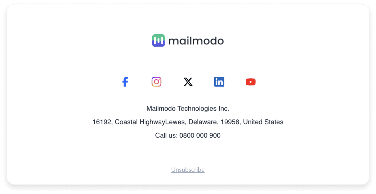
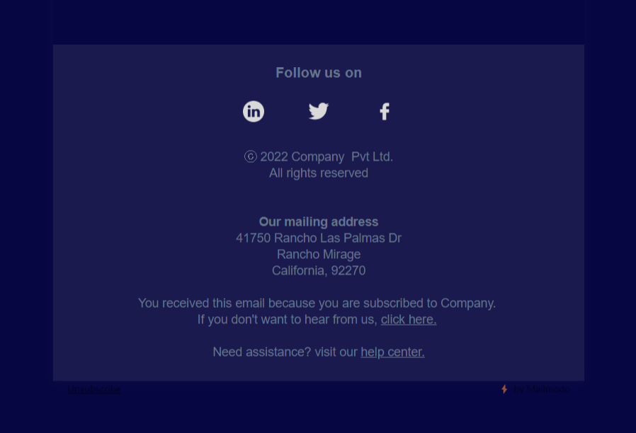
The email's footer is a section at the very bottom that follows the entire email, including the email signature. It typically contains important information like contact details, social media links, legal disclaimers, the company's address, and an unsubscribe link.

There are multiple reasons why using an email footer will always be useful for you:
- You can tell people about your brand objectives and motto.
- Subscribers can find a way to contact you or visit your website.
- Provides more information about the brand and even yourself.
- Subscribers can update their preferences and get emails about topics they want to know more about.
Many beginners in email marketing confuse both email footer and email signature. But they both serve different purposes. Email signatures contain more personal information about a person sending an email, like their name, job role, contact details, etc.
The email footer is included mostly in a company's marketing communications, including information about the company, legal content, contact details, ways to unsubscribe from the email, and more.
Here is a list of elements you can add to your footer. Some of it should be there, and some can be added to make it more engaging/interesting for the subscribers.
1. Unsubscribe and preferences option
The unsubscribe option should be present on your marketing emails to adhere to the privacy laws, and it is also a best practice to improve your email deliverability.
And when people don't want to receive a certain type of email from your brand, they search for the preferences center. So always make sure to include the unsubscribe and preferences option in the footer of your email.
Here's an example from Aleyda's SEOFOMO newsletter:

Next comes the information about your company, its business structure (Sole proprietorship, Limited liability company LLC, private limited company Pvt Ltd, etc) and the legal policies. Adding these details helps subscribers know about the privacy policies and the contact details to reach out to you.
Here's an example of a compliant email footer with contact and legal info:

3. Logo and brand motto
Adding your logo to the email's footer can help increase your brand awareness. And the brand's motto will tie it all together to be cohesive overall. You can even mention your brand's value or missions in the footer of the email.
The logo also works as a BIMI (Brand Indicators for Message Identification) as it helps people recognize your brand identity and trust the emails you send.
Here, Semrush includes its logo and purpose in the footer; it helps its audience better understand the company and its tools.

4. Thank you note
The footer is the perfect place to include a thoughtful sign-off in the email. Thanking your subscribers for their time can help strengthen your relationship with them, just like the Inktober team did in their footer.

5. Lead magnet
If you have a lead magnet, you can link it at the end of email message and passively promote it. Ebooks, guides, checklists, webinars, cheat sheets, etc., are some of the most common lead magnets that are successful and provide value to your potential clients.
You can use emails to push traffic to your social media by adding social media icons to the footer of your email. Instagram, Facebook, LinkedIn, and Twitter are some social platforms you can add to the footer.

7. App install option
If your organization has an app, then you can link it so that people can directly download it from the link. Make sure you provide separate links for Android and Apple devices if necessary.

8. Rating option
You can offer rating options in each email to get feedback on which type of email your subscribers like to receive. You can even provide a choice for readers to whitelist you so that your emails always reach their inboxes and never go to spam.

Creating a visually appealing footer design is easier with Mailmodo. You can use our HTML email template maker to create the email design without coding.
You just have to sign up for Mailmodo, use the pre-made email templates with the footer, customize the footer based on your needs, and start sending the campaign. You can also upload your custom template or create one from scratch using our template builder.

It's that simple to create a stunning email footer with Mailmodo.
Design your email footer today
When designing email footers, it's important to consider how they can enhance the overall user experience and ensure compliance with regulations. A well-crafted footer not only provides essential information but also reinforces your brand identity. Here are some best practices to keep in mind:
When it comes to email footers, simplicity is key. Avoid cluttered designs and focus on essential information. Keep it clean and easy to read, with clear contact details and relevant links. A minimalist approach ensures a professional and streamlined appearance, enhancing the overall email experience for recipients.
2. Keep the unsubscribe link accessible and easy to find
When designing an email footer, prioritize accessibility and make sure the unsubscribe link is prominently displayed and easy to find. This best practice ensures compliance with regulations and allows recipients to manage their email preferences effortlessly. By keeping the unsubscribe option accessible, you foster transparency and respect for your audience's choices, building trust and maintaining a positive email marketing reputation.
3. Differentiate the footer from the body of the email
Differentiating the email footer from the body is crucial for effective design. Use visual cues like color, font, or layout to create a clear distinction. Opt for a consistent design that complements the email's overall theme while maintaining a separate identity for the footer. This distinction ensures that important information and actions in the footer, such as contact details or unsubscribe links, are easily noticeable and accessible to the recipient.
To enhance legibility, incorporate ample spacing in your email footer design. Add sufficient padding and margins around text and elements, allowing the information to breathe and appear visually pleasing. Avoid cramming too much content together, as it can make the footer appear cluttered and difficult to read. By utilizing space effectively, you improve readability and ensure that the essential information in the footer is easily accessible to recipients.
Optimizing the email footer for mobile devices is crucial. Ensure the footer is responsive and adapts to different screen sizes. Use a mobile-friendly layout, scalable fonts, and appropriately sized buttons or links. Simplify the design to fit smaller screens, making it easy to navigate and interact with the footer content. Test the footer across various mobile devices to ensure a seamless user experience, promoting engagement and effectiveness of your email marketing campaigns.
Conclusion
Email footers can really enhance your email communication. You can use any email footer design tool or in-built template builder of your ESP to create the footer that grabs users' attention.
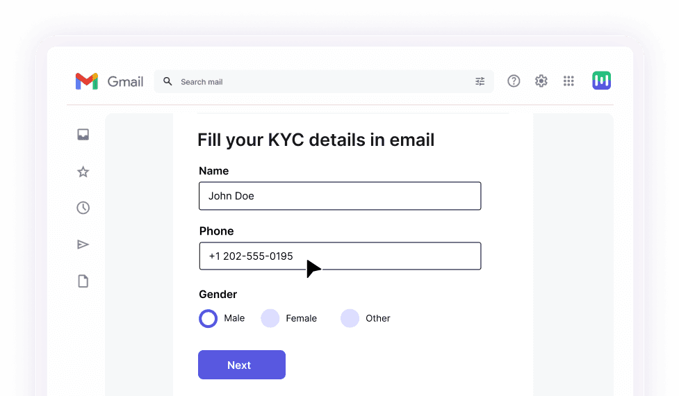
Mailmodo offers interactive emails that help you get more conversions. You can use Mailmodo to create your email footer with all the above-said elements within minutes. Sign up now to try it for yourself.


