How to choose the correct email image size
There’s no single "correct" size for email images because it depends on how you use them in your email design.
However, we can provide some standard email image sizes based on common practices to help guide you. Using insights from industry standards and our experience with numerous clients at Mailmodo, we’ve put together a list of recommended sizes for different types of images. These sizes are specifically for desktop view. Below is a detailed breakdown of email image sizes based on these considerations.
| Image Type |
Ideal Width |
Ideal Height |
| Banners |
600px to 900px (matching email body width) |
Adjustable; typically 300px to 500px |
| First-fold images (popular in e-commerce) |
600px to 900px (matching email body width) |
Depends on the design/content of the image |
| Logos or headshots |
Standard - 100px |
Can be adjusted as per requirement |
| Icons |
50px to 100px |
Depends on the shape of the icon |
| Column images (maximum email width: 600px) |
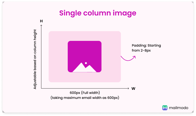
Single Column: 600px
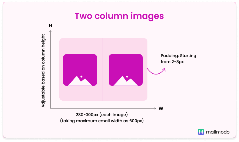
Two Columns: 280-300px
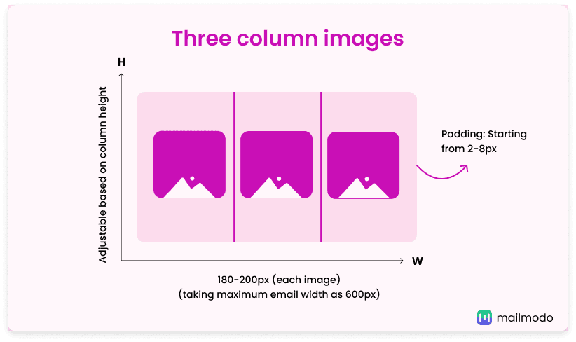
Three Columns: 180-200px
Four Columns: 130-150px |
Adjustable based on column height |
| Content blocks |
Text-Heavy: 150-250px
Image-Dominant: 600-1200px
Mixed: Max 50-60% of block size |
Adjustable based on block size |
1. Banners
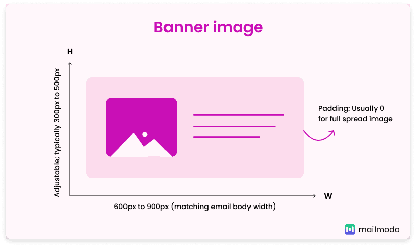 Your banner width should match the overall width of your email, which typically ranges from 600px to 900px. Popular sizes include 600px, 700px, 800px, and 900px. You can adjust the dimensions of email banner images based on your banner and email layout to strike a balance between visual impact and readability.
Padding size: Usually 0px if you want a full-spread image. Otherwise, it can vary as per design, usually starting from 8px and increasing in multiples of 8px.
2. First-fold images
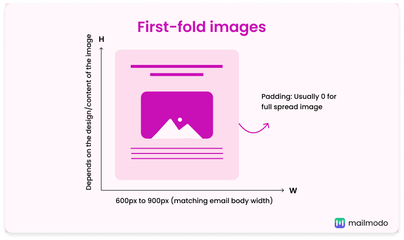 First-fold images, often seen in e-commerce emails, should match the width of your email body, usually between 600px and 900px. The height can vary depending on your design, but it’s often proportional to the width, aiming for a balanced, attention-grabbing layout. These images are visible immediately when the email is opened, so they should be high-quality and relevant to make a strong impression.
Padding size: Usually 0px if you want a full-spread image. Otherwise, it can vary as per design, usually starting from 8px and increasing in multiples of 8px.
3. Logos or headshots
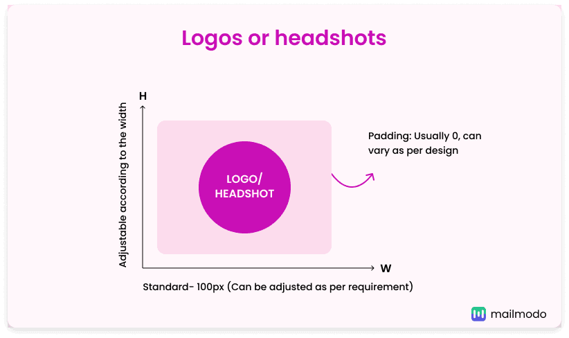 Logos and headshots are small but essential parts of your email design. Logos come in various shapes and sizes, with 100x100 pixels being a common choice. For instance, Mailmodo uses a 64x64 pixels logo. Similarly, headshots usually follow a size of 100x100 pixels to ensure they look clear and professional. The key is to keep both logos and headshots clear, easily recognizable, and consistent with your brand’s image.
Padding size: Usually 0px but can vary depending on design.
4. Icons
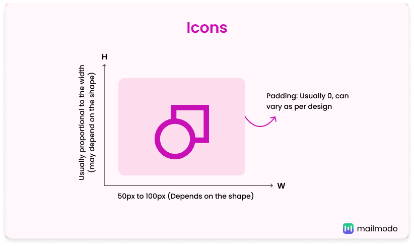 Icons are typically smaller, around 50-100 pixels wide with matching height. These visuals are often used in columns or alongside text to maintain a clean layout.
Padding size: Usually 0px but can vary depending on design.
5. Column images
When using images within columns, you can adjust the width and height of your images based on the layout.
For instance, if your email's maximum width is 600px, here are some general width guidelines to consider:
- Single Column: Full width, 600px in this case.
- Two Columns: Images should be 280-300px wide.
- Three Columns: Use images around 180-200px wide.
- Four Columns: Images should be 130-150px wide and so on.
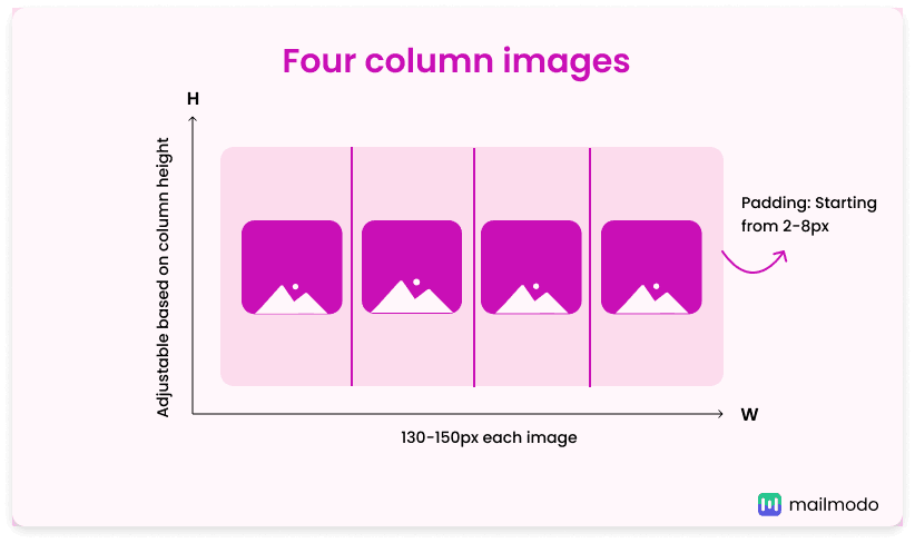
Padding size: Can vary as per design, usually starting from 2-8px and increasing in multiples of 8px.
Adjust the height according to the height of your column. Always test these layouts and image sizes across different devices to ensure responsiveness and proper rendering without breaking your design.
6. Content blocks and image sizes
Content blocks in your email can house text, images, or both, with image sizes varying based on their role:
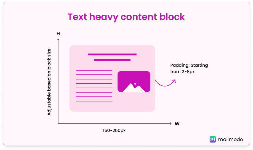
- Text-heavy content blocks: When you have text-heavy content blocks, you can use smaller images (150-250 pixels wide) that complement the text without overpowering it.
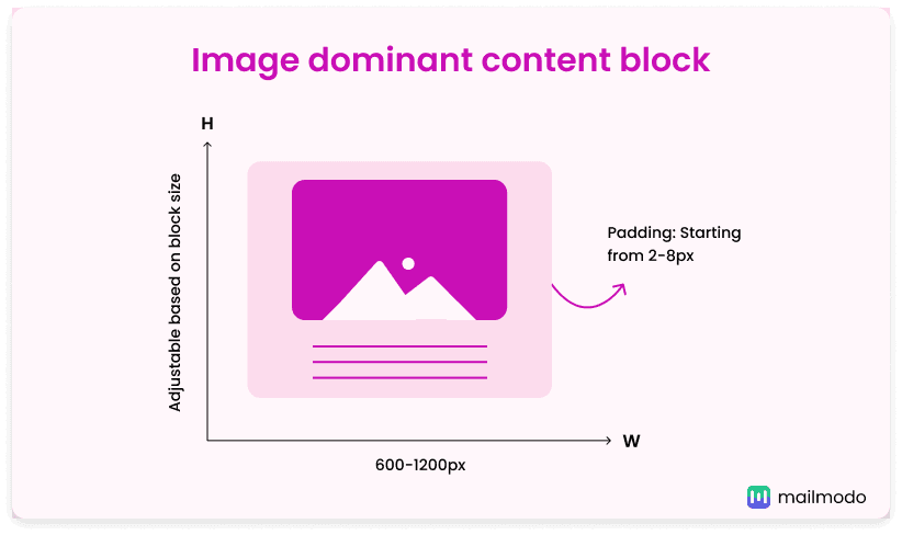
- Image-dominant content blocks: For blocks where images are the focus (like product showcases or banners), larger images (600-1200 pixels) can maximize visual impact.
- Mixed content blocks: When combining text and images, the image should not occupy more than 50-60% of the content block to maintain text flow.
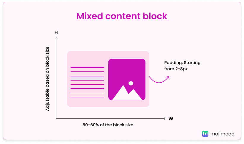
Padding size: Can vary as per the design of the content block, usually starting from 2-8px and increasing in multiples of 8px.
Different images in various content blocks may also vary in size depending on their design hierarchy. For instance, a hero image at the top of the email can be larger to capture attention, while secondary images in subsequent blocks should be smaller for a clean and organized layout.
Optimizing email images for responsive design for mobile devices
For desktops, you’ve seen various email image sizes, but these may not always work well on mobile devices due to different screen sizes and image scaling issues.
To ensure your emails look great on any device, it’s important to use responsive design techniques for your images. Optimizing images for responsiveness means they’ll maintain quality and readability across different screens. Here's how you can achieve this:
1. Ensure images scale properly
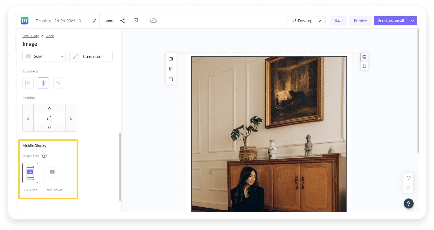 One key factor in responsive design is making sure images scale properly without pixelation or distortion. When images are set to 100% width, they’ll scale down on smaller devices, but it’s also vital that they maintain their clarity. This is where high-resolution images (with a size limit, usually under 500KB) come in handy. These allow for scaling without losing quality, ensuring they look sharp across devices.
2. Ensure images and content blocks stack properly
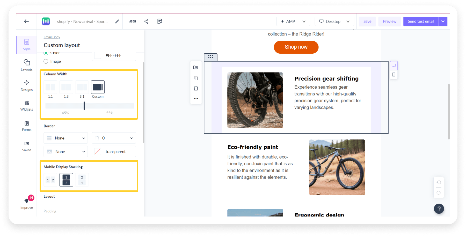 When using multi-column layouts, such as three columns, make sure images stack vertically on mobile screens to avoid clutter. For content blocks that mix images and text, ensure images fit well within their blocks without disrupting the design. Always test your images on different devices to keep your email looking great on both mobile and desktop.
When you are coding an email or using HTML email template designer, it is important to adjust image sizes based on the device your email is being viewed on. By using CSS media queries, you can control how your images resize and behave on smaller screens. For example, on a mobile device, you may want to reduce the image width to fit within the screen or scale down large images to get fast loading and proper display.
Best practices for email image size
To ensure your email images look professional and load efficiently, follow the best practices given below:
Keep your image low-weight (under 1MB)
To balance image quality and performance, keep your email images under 1MB. Although larger files can slow loading times, you can still maintain high resolution by compressing images without sacrificing clarity. A good practice is to use images under 500KB to get quick load times while keeping them crisp and clear in all the different ways they may appear to your users.
Test emails on multiple devices and email clients
Emails can be rendered differently across devices and email clients. To avoid broken email layouts or misaligned images, always test your emails on a variety of platforms. This will help you identify any potential issues with how images display on mobile devices versus desktops. This will allow a consistent experience for all recipients.
Each format serves a specific purpose, so choose based on your image’s role and desired balance between quality and size. Choosing the right image format is crucial for email performance:
- PNG offers the best quality, especially for logos or transparent images, but it may have a larger file size.
- JPEG is ideal for photos and detailed images because it compresses well, keeping the file size small without compromising too much on quality.
- GIF is best for simple animations or small icons, adding interactivity without significantly increasing the file size.
Final words
With these email image size guidelines, you’re now equipped to make every part of your email message visually striking; whether it’s your banner images, logo, or emojis. Just remember to adjust the image sizes to fit your layout and add the right padding for a clean, eye-catching design. This will not only make your emails look great but also enhance the experience for your readers.
Do you want to improve your email design skills further? Our ebook, made just for beginners, is full of easy tips and tricks to help you create standout emails for your email marketing campaigns. Get your free copy now.


 Your banner width should match the overall width of your email, which typically ranges from 600px to 900px. Popular sizes include 600px, 700px, 800px, and 900px. You can adjust the dimensions of email banner images based on your banner and email layout to strike a balance between visual impact and readability.
 First-fold images, often seen in e-commerce emails, should match the width of your email body, usually between 600px and 900px. The height can vary depending on your design, but it’s often proportional to the width, aiming for a balanced, attention-grabbing layout. These images are visible immediately when the email is opened, so they should be high-quality and relevant to make a strong impression.
 Logos and headshots are small but essential parts of your email design. Logos come in various shapes and sizes, with 100x100 pixels being a common choice. For instance, Mailmodo uses a 64x64 pixels logo. Similarly, headshots usually follow a size of 100x100 pixels to ensure they look clear and professional. The key is to keep both logos and headshots clear, easily recognizable, and consistent with your brand’s image.


 One key factor in
  When using multi-column layouts, such as three columns, make sure images stack vertically on mobile screens to avoid clutter. For content blocks that mix images and text, ensure images fit well within their blocks without disrupting the design. Always test your images on different devices to keep your email looking great on both mobile and desktop.


