Media queries is a cascaded style sheet technique(CSS) introduced in CSS3. It allows the HTML content of a web page to adapt to a device’s type, such as desktop or tablet, or specific parameters, such as screen resolution or viewport, among others.
It uses the @media rule to include a block of CSS properties only if a certain condition is true.
Here is an example of how it is used in the code,
@media only screen and (max-width: 500px) {
body {
background-color: green;
}
}
The code tells you that if the screen, i.e., the browser window is 500px or smaller, the background color will be green.
Email media queries are similar to media queries as it helped make emails more responsive.
Before moving further, let’s understand the syntax of media query 👇
@media screen and (max-width: 600px) {
body {
background-color: light blue;
}
}
A media query code consists of the following components:
- Media type lets you pick your category from all, print, screen and speech.
For instance, for emails, the media type is always screen.
Expressions are, in simple terms, the specific conditions that allow you to target the media query. It tests features such as width, height, and aspect ratio. Most commonly used media features include:
Max and min-width
Max and min-device width
Device pixel ratio
Responsive design is why you use a media query in HTML emails.
1. Scaling down content in different devices
It is common for developers to design desktop-first content with defined width values to your tables, 700 px. Without a media query, content gets scaled down on mobile devices, leading images, and text to break down.
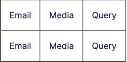
For instance,
<table role=" presentation" border="1px" cellpadding="10" cellspacing="0" maxWidth="700" margin=" auto"

align=" center" class="main-content">

<tr>

<td>Email</td>

<td> Media </td>

<td> Query </td>

</tr>

<tr>

<td>Email</td>

<td> Media </td>

<td> Query </td>

</tr>

</table>
The output of the code looks like this,
 For desktops the content style can be coded like this,
<style type="text/css">

.main-content{

width: 600px;

}

</style>
It is likely that content on mobile devices will be scaled down and cannot be fit on the
whole screen if the same code is applied. A mobile phone's viewport is usually smaller
than 600 px. Thus, media queries are perfect for solving this as you transform them to
suit the screen width of the mobile device easily.
<style type="text/css">

.main-content{

width: 600px;

}


@media screen and (max-width:600px) {

.main-content {

width: 100% !important;

}

}

</style>
Using breakpoints
Using media queries goes beyond resizing to fit different layouts. Instead, you can use it to target different breakpoints. The code below will let you know how to use it to target a wide range of devices.
<style type="text/css">

/* Extra small devices (phones, 600px and down) */

@media only screen and (max-width: 600px) {...}


/* Small devices (portrait tablets and large phones, 600px and up) */

@media only screen and (min-width: 600px) {...}


/* Medium devices (landscape tablets, 768px and up) */

@media only screen and (min-width: 768px) {...}


/* Large devices (laptops/desktops, 992px and up) */

@media only screen and (min-width: 992px) {...}


/* Extra large devices (large laptops and desktops, 1200px and up) */

@media only screen and (min-width: 1200px) {...}

</style>
👆This would help you apply different styles to your tables, fonts, images, or any HTML element with the media query.
Managing content for device Orientation
Media queries can also target device orientation, not just viewport size. Although this is not
always necessary where you can define different styles based on orientation as follows:
<style type="text/css">

@media screen and (orientation: landscape) {

/* your css rules here */

}

</style>
Supporting video in specific email clients
A lot of engaging content simply won’t work with some email clients. Using animations and video in an email is great but ruins the user experience when done poorly.
Webkit-based browsers such as Applemail support video backgrounds, while email clients like Gmail and Outlook don't support the technical requirements to play video inside the email.
The code is shown below, 👇
<style type="text/css">

video[class="video"]{

display: none;

}

@media screen and (-webkit-min-device-pixel-ratio: 0) {

video[class="video"]{

display: block;

}

}

</style>
👆This allows display of elements to supported clients while it hides for everyone else.
Managing Color Schemes during the Rendering Process
Another use case for media queries lies in color schemes. The color scheme is a CSS property that allows an element to indicate which color scheme it can be rendered in. Common choices of color schemes include “dark,” “light,” or a day or night mode.
The prefer-color-scheme CSS media feature helps detect if a user has requested light or dark schemes. This allows email clients to handle color schemes differently, either by completely inverting the colors of the email or by not changing anything so that you can design according to a specific color scheme or keep it dark.
This is how you can implement using media query:
<style type="text/css">

.text{

color: black;

}

@media (prefers-color-scheme: dark ) {

.text{

color: white;

}

}

</style>
Since email developers add inline styles to HTML elements, styles in media queries must use the! important property. With CSS, an email client will use the order of CSS rules to determine which to be rendered as media queries are declared at the top of an HTML document, and any inline styles applied will take precedence.


 For desktops the content style can be coded like this,


