Email marketers know that email popups are a great way to build an email list. Email popups can actively create a subscriber list for your newsletter or email campaigns. However, not all email popups work as expected. Some even come across as irrelevant, intrusive and annoying. We have curated a list of the best email popup examples that you can refer to to create engaging and conversion-focused email popups for your websites.
10 Best Email Popup Examples & Why They Work
10 Best email popup examples
Below, we have curated a list of the best email popups that caught our attention. We believe they’ll inspire you, too.
1. Fashion Nova

Why this works:
This is a simple and effective email popup. The incentive it offers is clearly highlighted and is the first thing that attracts the visitors' attention. The popup also allows for higher engagement by offering interactivity where the visitors can choose their preferences. This makes the visitors feel like they’re in control. The use of ‘I love saving money’ instead of ‘subscribe’ or ‘confirm’ is also an interesting approach and goes with the intent of the popup.
2. Big Tree Farms

Why this works:
Big Tree Farms’ email popup employs the opportunity to win the prize as an incentive to entice visitors to subscribe. The image on the popup, color scheme and font align with the website. It also displays the benefits of their products in the form of symbols like vegan, USDA organic and so on, which will likely interest the brand’s target audience.
3. Haven

Why this works:
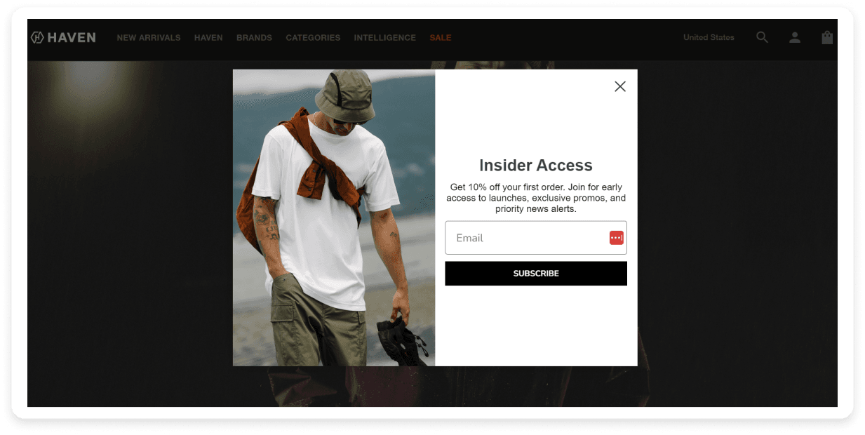
Haven offers special ‘insider access’ in their email popup and then goes on to describe the perks of it. It also offers a discount on the first order, special access to offers, news alerts, etc. The email popup is very simple and to the point.
4. UpNature

Why this works:
UpNature uses a more conversational tone in its email popup to tell the visitors what they will receive outright. Their email popup is very simple and the color scheme and copy formatting aligns well with the main website, making it feel like a part of the website experience.
5. Burrow

Why this works:
Burrow employs a unique technique for visitors to subscribe to their newsletter. It runs a special sale for visitors, but when you visit the page, you’re greeted with an email popup that requires you to enter your email address to access it. The sale is also for a limited time, creating a sense of urgency amongst the visitors. The CTA also matches the intent of the CTA and texts showing discounts of up to 60% provide more motivation to subscribe.
6. Revelry

Why this works:
Revelry uses a very clever pun in the headline of its email popup. It also offers a recurring incentive - a $200 gift card every month instead of a one-time offer. It also asks you to choose if you’re a bride, bridesmaid, etc., to make their emails more relevant and targeted.
7. 100% Pure

Why this works:
100% Pure also offers a chance to win a $500 gift card to their visitors if they sign up for the updates. While the popup is simple and to the point, the headline is the main attraction and the only copy besides the CTA buttons. The color scheme of the popup also aligns well with the rest of the website.
8. Partake Foods

Why this works:
This popup encourages the visitors to sign up by offering a chance to save money. They also offer a digital coupon in exchange. The CTA itself is along the lines of saving. Another unique thing about the popup is that it announces that it can be found in ‘11,000+ retailers,’ which increases its credibility.
9. BLK & Bold

Why this works:
The company sells coffee-related products, and the popup's image goes very well with the website. The incentive is straightforward: offering 15% off on the first order in exchange for the details. We also like that it goes a step further to ask for the visitor’s phone number to send updates over text along with emails.
10. Natori

Why this works:
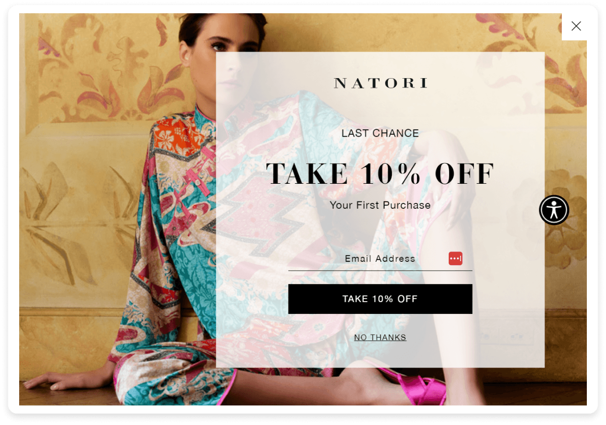
This is a simple, straightforward and powerful popup from Natori. It focuses on the 10% off that it offers. One unique thing about this popup is the ‘last chance’ that makes the offer of 10% more enticing. The CTA also reinforces the offer of 10% off.
💡 Related guide: A Guide to Email Popups: Best Practices & How to Create
Takeaways
Email popups can be a valuable addition to your website to boost your email marketing efforts. These examples highlight the different approaches and techniques that you can use to capture email addresses and grow your subscriber list effectively. Remember, the key to success with email popups is to provide value to your visitors through your popups without deteriorating their experience on your website.
What you should do next
Hey there, thanks for reading till the end. Here are 3 ways we can help you grow your business:
Talk to an email expert. Need someone to take your email marketing to the next level? Mailmodo’s experts are here for you. Schedule a 30-minute email consultation. Don’t worry, it’s on the house. Book a meet here.
Send emails that bring higher conversions. Mailmodo is an ESP that helps you to create and send app-like interactive emails with forms, carts, calendars, games, and other widgets for higher conversions. Get started for free.
Get smarter with our email resources. Explore all our knowledge base here and learn about email marketing, marketing strategies, best practices, growth hacks, case studies, templates, and more. Access guides here.
FAQs
Exit-intent popups are triggered when a user is about to leave the website. They are designed to retain visitors by offering incentives like discounts or free resources, encouraging them to stay and subscribe.
Email popups can be annoying if they are poorly designed or appear too frequently. To avoid this, they must provide value, look appealing and not be too intrusive.
Incentives can include discounts, free ebooks, checklists, templates, access to webinars, exclusive content, and early access to sales or promotions.
What should you do next?
You made it till the end! Here's what you can do next to grow your business:

Get smarter with email resources
Free guides, ebooks, and other resources to master email marketing.

Do interactive email marketing with Mailmodo
Send forms, carts, calendars, games and more within your emails to boost ROI.

Consult an email expert
30-min free email consultation with an expert to fix your email marketing.
You might also like
Enter with an idea.
Exit with a winning email campaign.

Brainstorm email campaign ideas with Mailmodo’s AI assistant

Build precise segments in seconds with AI segmentation

Generate ready-to-use email templates with AI
Experience true AI email marketing automation with Mailmodo
Trusted by 10000+ brands


