What do you mean by email rendering?
Email rendering simply means displaying an email on your recipient's device. It involves interpreting the email's HTML, CSS, and other elements and turning them into a visual format the recipient can see and interact with.
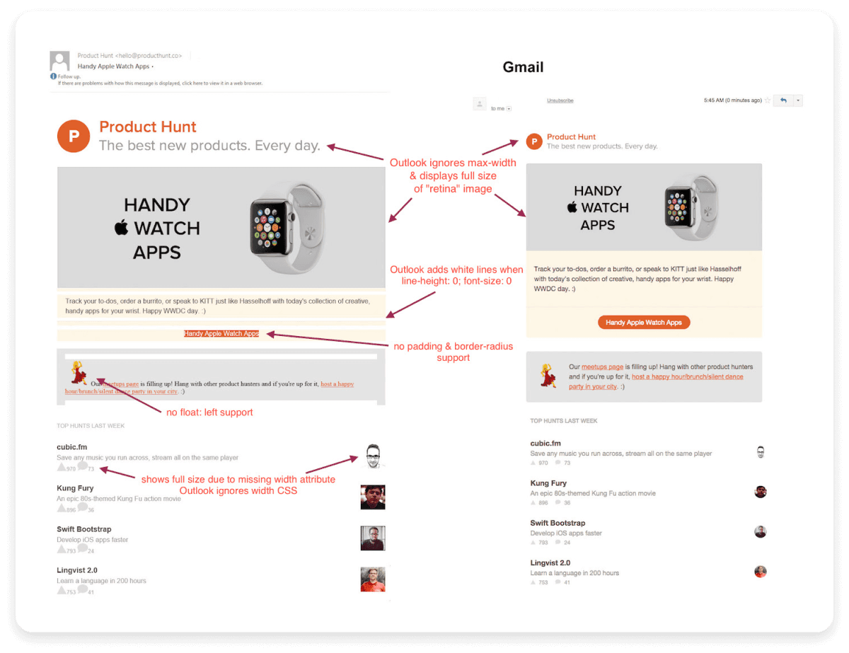
However, this process differs across all email clients (like Gmail or Outlook) or devices (desktop, mobile, tablet). Proper email rendering is crucial because it ensures your emails look exactly how you intended them to when they reach your recipients. If an email isn't rendered properly, it can appear messy, with broken layouts, misaligned images, or unreadable text. Take a look at this example of an email that wasn't rendered correctly:

Common issues that occur during email rendering
Understanding common email rendering issues is the first step to avoiding them. Here are some common problems that can affect how your emails look and function:
1. Image display issues
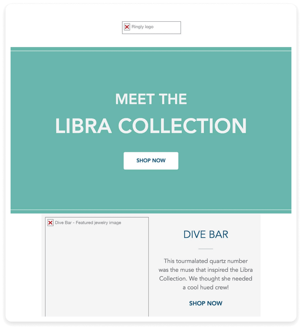
Images may not appear or display incorrectly in your emails. Recipients may see broken image icons and missing visuals. This can happen because of one of the following reasons:
Image blocking by email clients: Many email clients block images by default as a security measure to prevent tracking or loading malicious content.
Limited image format support: Not all image formats are supported across email clients. This can lead to missing or broken images if unsupported file types are used.

2. Font issues
Font issues during email rendering often arise because many email clients only support a limited range of web-safe fonts, such as Arial, Verdana, or Times New Roman. When an email uses a custom font that isn't supported by the client, the email client replaces it with a default font. This substitution can disrupt the overall design of the email, potentially altering the layout or spacing and making the content harder to read. Take a look at this image below which shows an email where the font was replaced by a web safe font which made the email content difficult to read.

3. Layout problems
Sometimes when the recipients open your emails they might find the layout of the email to be misaligned. This refers to misaligned columns, excessive or unwanted spacing, and other visual inconsistencies that disrupt the intended design. As a result, the email may appear cluttered, unprofessional, and difficult to read, negatively impacting user experience and engagement.
4. Whitespace and padding issues
Sometimes there might be the appearance of awkward spaces, which can throw off the balance of your design. This often occurs due to whitespace and padding problems.
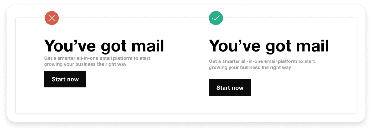
Padding refers to the space between the content of your email and its border. Different email clients may automatically add or adjust padding and margins when rendering the email, leading to inconsistencies. As a result, the email may look different across various platforms, causing design elements to shift and leaving too much or too little space around certain areas. You can see how the rendered email does not have a right amount of space between different blocks:

5. Background rendering issues
Background rendering issues lead to emails not loading the background, resulting in white space where the background image should be.
Emails that rely heavily on background visuals for impact may appear incomplete or dull in such cases. To mitigate this, it's important to use fallback colors, ensuring the email design remains visually appealing even if the background image fails to load. This ensures a more consistent user experience across different platforms.
Email rendering issues with GIFs and videos occur because not all email clients support them. For instance, some email clients only display the first frame of GIFs, and videos often require users to click through to a webpage. This leaves your GIFs to appear as an image as you can see below:
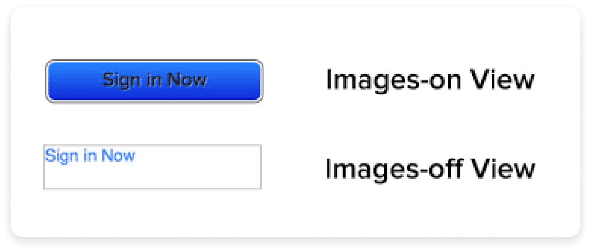
The buttons can appear differently across various email clients. Buttons are essential for enabling action, but if they lose their shape, misalign, or appear distorted, it can reduce the likelihood of clicks. This inconsistency in rendering is often due to differences in how email clients interpret button styles. You can see how the improper rendering of buttons looks like:

8. Size constraints
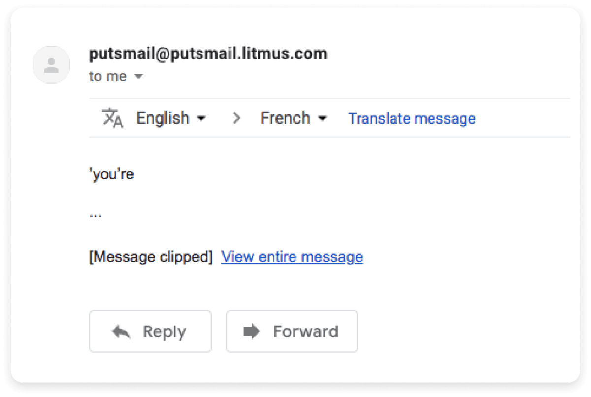
Some email clients clip larger emails. For instance, Gmail clips emails that are larger than 102 KB, hiding important content behind a "view entire message" link. If your email is clipped, your recipients may not see critical information. You can see how a clipped email looks like:

9. Rendering inconsistencies
Every email client has its quirks. An email that looks perfect on one mail client might look terrible on another because of the different ways they render emails. This inconsistency is also true for different devices and can make email design a real challenge, requiring extensive testing and adjustments to get it across all platforms.

Best practices for better email rendering
Here are some best practices for ensuring perfect email rendering:
Use images in universally supported formats like PNG or JPEG. Additionally, always set alt-text for scenarios where images are blocked.
Use web-safe fonts (e.g., Arial, Times New Roman) and provide fallback options for better compatibility.
Test all links to ensure they function correctly on various devices and email clients and that they lead to the intended pages.
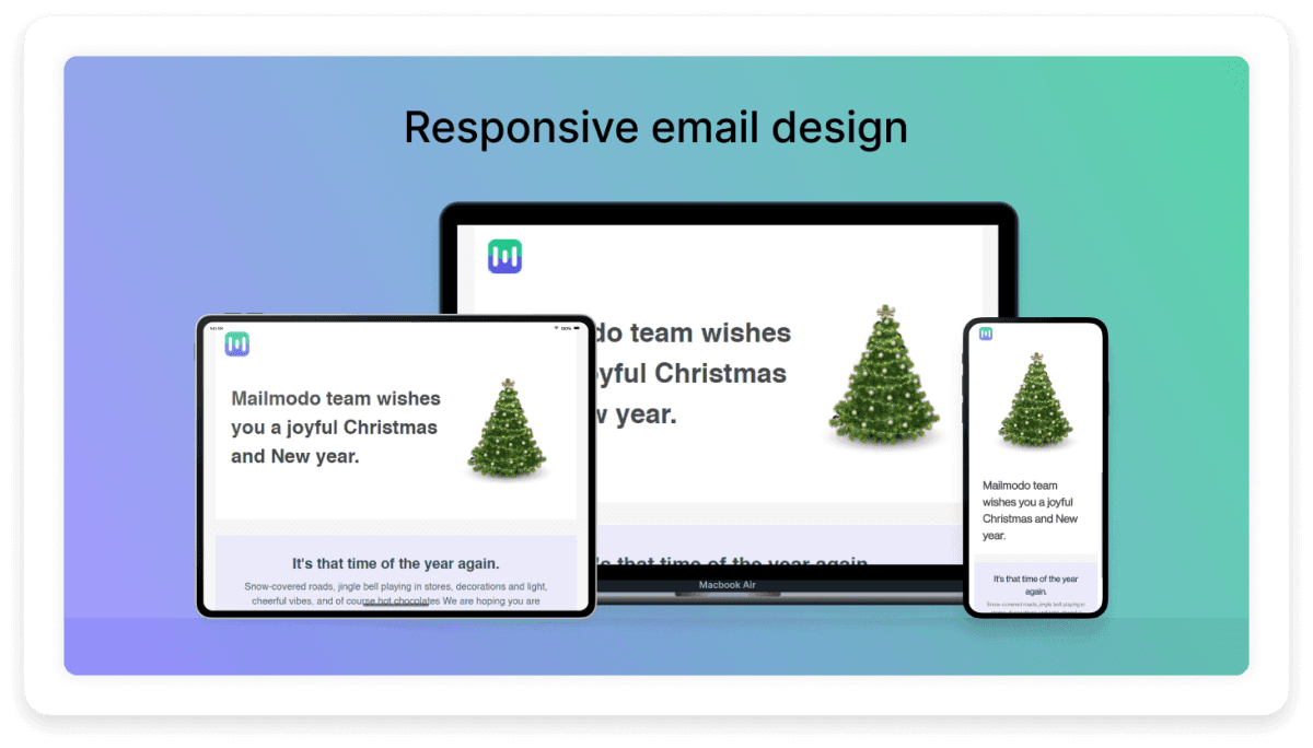
Use responsive design techniques to ensure your email layout adapts to different screen sizes. Keep your email's width between 600 and 800 pixels for optimal rendering across clients.
Design with dark mode in mind. Use transparent images and avoid hardcoded background colors to ensure readability.
Keep your total email size under 102 KB to avoid Gmail clipping.
Use high-contrast colors and avoid cluttered backgrounds to enhance readability for all users, including those with visual impairments.
So, how do you catch these problems before your emails reach your audience? Well, you test how your emails render before you hit send.
What is email rendering testing?
Email rendering testing involves checking how your email will render across different email clients, devices, and operating systems before sending it to your audience, either by using dedicated tools or by sending it to monitored inboxes. This allows you to identify and fix the above mentioned issues, like broken layouts, missing images, and font inconsistencies.
What to check during email rendering testing?
Here are some key areas to focus on during testing:
Device diversity: Test emails across desktops, tablets, and mobile devices to ensure they render correctly on all screen sizes.
Email client variations: Test emails across various email clients to account for differences in how they render emails. Each client, such as Gmail, Outlook, or Apple Mail, may handle HTML and CSS in unique ways.
Operating system differences: Rendering can also vary between operating systems like Windows, Mac, iOS, and Android. Testing on these platforms ensures your emails appear consistent regardless of the recipient's device.
How to do email rendering testing
The easiest way to ensure your emails render correctly is to use a specialized email testing tool. Here are some popular options:
Litmus: Offers real-time rendering previews across 90+ email clients and devices.
Email on Acid: Provides previews, tests, and troubleshooting features to help identify and fix rendering issues.
PreviewMyEmail: A simple tool that provides basic email client rendering previews.
Mailtrap: Focuses on comprehensive email testing, including spam checks and rendering.
PutsMail: Allows free testing of individual emails to see how they'll look in various clients.
SendForensics: Offers both deliverability and rendering testing to ensure emails reach the inbox and look good doing so.
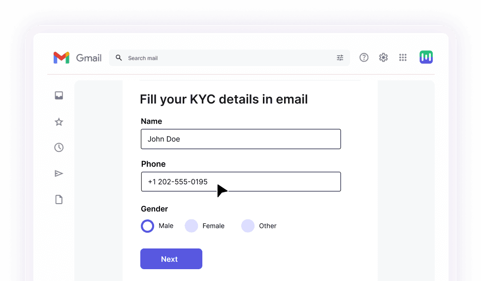
Another way of testing email rendering is to use an email service provider. Many email service providers, like Mailmodo, streamline the testing process by integrating inbox testing services directly into their platforms. Mailmodo offers a WYSIWYG editor that lets you design your emails with pre defined blocks so you can see how your emails look in real time. You can also send test emails to yourself or others to preview your emails across various devices.
Additionally, the platform's smart template suggestion tool not only offers design recommendations but also automatically identifies and corrects potential rendering errors, providing actionable alerts to enhance your email's performance and user experience before sending.
Try out our WYSIWYG editor today
Conclusion
Getting your emails to look perfect across all devices and email clients can take time and effort. Each email client and OS one can interpret your emails differently, leading to various display issues. However, you can avoid most of these pitfalls by following best practices and considering the common issues we've discussed in this article.
The key is anticipating these challenges and thoroughly testing your emails using the right tools. Doing so ensures a consistent and engaging experience for your audience, no matter where they open your email. With some preparation and the right approach, your emails will look great across all platforms.


