What is an email signature?
An email signature is a custom block of text, images, and links that appears at the bottom of your emails. It offers important information such as your name, designation, contact details and logo.
What is the ideal email signature size?
While there's no one perfect size that is going to be right for everybody and every use case, following some tried-and-tested guidelines can help.
Based on industry standards and our experience at Mailmodo, we have given some suggestions below to create a clean, polished email signature for desktop viewing that leaves a lasting impression. There are two things that come into the picture. Let’s take a look at both of them.
Ideal dimensions for the signature as a whole

As a rule of thumb, the width of the email signature as a whole shouldn’t be more than that of the email template or the email you’re sending. The recommended size of the email signatures is:
- Width: It depends on the width of your email template and thus, can be flexible. It is usually between 300-600 pixels. This range ensures your signature looks good on all devices.
- Height: You can go with 150-200 pixels. This height is enough to be noticeable but not too big to be distracting.
Size of the components of an email signature
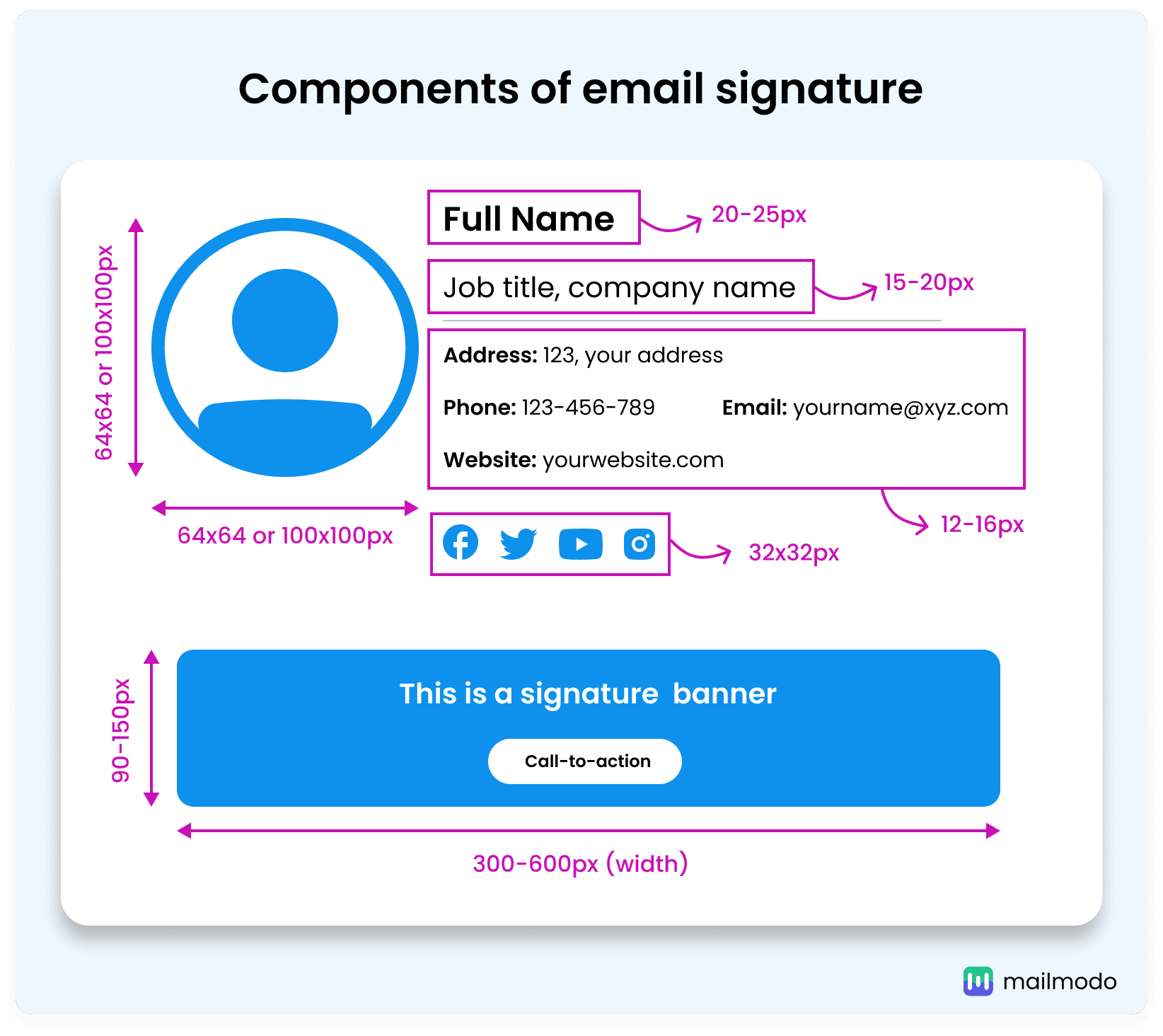
An email signature has multiple components, and the size of these components grows or shrinks based on the overall size of the signature. However, you still want to keep them clearly visible and legible, so you don’t want to make them too small. Take a look at the table below that shows the sizes you can go with for each component.

| Component |
Size |
| Full name text |
20-25px |
| Job details text |
15-20px |
| Contact details text |
12-16px |
| Logo |
Standard size: 100x100px, Recommended size: 64x64px |
| Call-to-action button/text |
Button: Depends on placement, Text: Normal text size (user's choice) |
| Email signature banner |
Width: 300-600px, Height: 90-150px |
| Social media icons |
32x32px |
1. Full name
Your email signature should start with your full professional name, clearly identifying who you are. For instance, using “John Doe” is straightforward and effective. This should be the biggest text in your email signature design and can be around 20-25px to make it stand out and should use a clear, bold font like Arial, Verdana, or Times New Roman.
2. Job details
Clearly state your job title and department, such as "Marketing Manager," to help recipients understand your position within the organization. Use a professional font like Arial, Verdana, or Times New Roman at 15-20px, a little smaller than the size of your name, to keep it readable but secondary to your name.
Make sure to include your contact information like phone number and email address, formatted like this: "Phone: +1 234 567 890 | Email: john.doe@company.com." You can also add your office address and company name if you want. For contact details, opt for fonts like Arial, Verdana, or Times New Roman in size ranging between 12-16px, even smaller than your job details, ensuring it's easy to read without overwhelming them.
4. Important links
Including important links in your email signature is an effective way to direct recipients to valuable resources. This could include links to your company’s website, blog, or relevant professional profiles, such as your LinkedIn page. Aim to keep it concise with a maximum of 3-4 links: one for email, one for LinkedIn, and possibly a link to your website. A good idea is to keep their size similar to contact details or go with a slightly smaller font size. You can also opt for icons of the platforms.
5. Photo or logo
Including a photo or logo in your email signature adds a valuable visual element that reinforces your brand identity. For a professional touch, a company logo or photo is typically sized at 100x100 pixels, which is considered the standard size for email signatures.
Since logos can vary in shape, there isn't a one-size-fits-all solution. So, if you prefer a more compact option, as demonstrated by Mailmodo, a logo size of 64x64 pixels can also be effective. The most important aspect is that the logo is clear and effectively aligns with your brand’s image.
6. Call-to-Action (CTA)
A Call-to-Action (CTA) in your email signature is a powerful tool for driving engagement and prompting recipients to take action. By incorporating a brief and clear statement, such as "Explore our new service" or "Book a meeting with me," you can effectively guide your audience toward the next steps you want them to take. If it is a link, it can be of normal text size as per your preference. It can also be a button, for which, you should test out the placement and size that suits your requirements the best. You can place it either at the bottom of the email or within the signature banner.
7. Email signature banner (optional)
An email signature banner serves to highlight promotions or key messages. It's a great way to draw attention to upcoming events or new products. The best email banner size is 300-600 pixels wide and ranges between 90 and 150 pixels in height.
8. Social channels or icons
Incorporating social channels and icons into your email signature is a smart way to connect recipients with your online presence. By adding small, consistent icons that are ideally sized at 32x32 pixels. These icons link to your professional social media profiles, like LinkedIn or Twitter, inviting others to engage with you beyond email. This helps create a more dynamic interaction while keeping your signature clean and professional.
Final takeaways
With these email signature size recommendations, you’re now ready to create a professional and visually appealing signature for your email messages. Keep in mind the suggested dimensions for each component, including your logo, contact details, and social media icons. A well-sized signature not only enhances your brand image but also improves your recipients' experience. A thoughtfully designed email signature can leave a lasting impression, helping you stand out in your professional communications.


