What is an email wireframe?
An email wireframe is a visual blueprint for your email before you start designing, writing the copy and coding the email. Think of it as a roadmap that shows you where each email part will go, like the header, body, images, and those important call-to-action buttons.
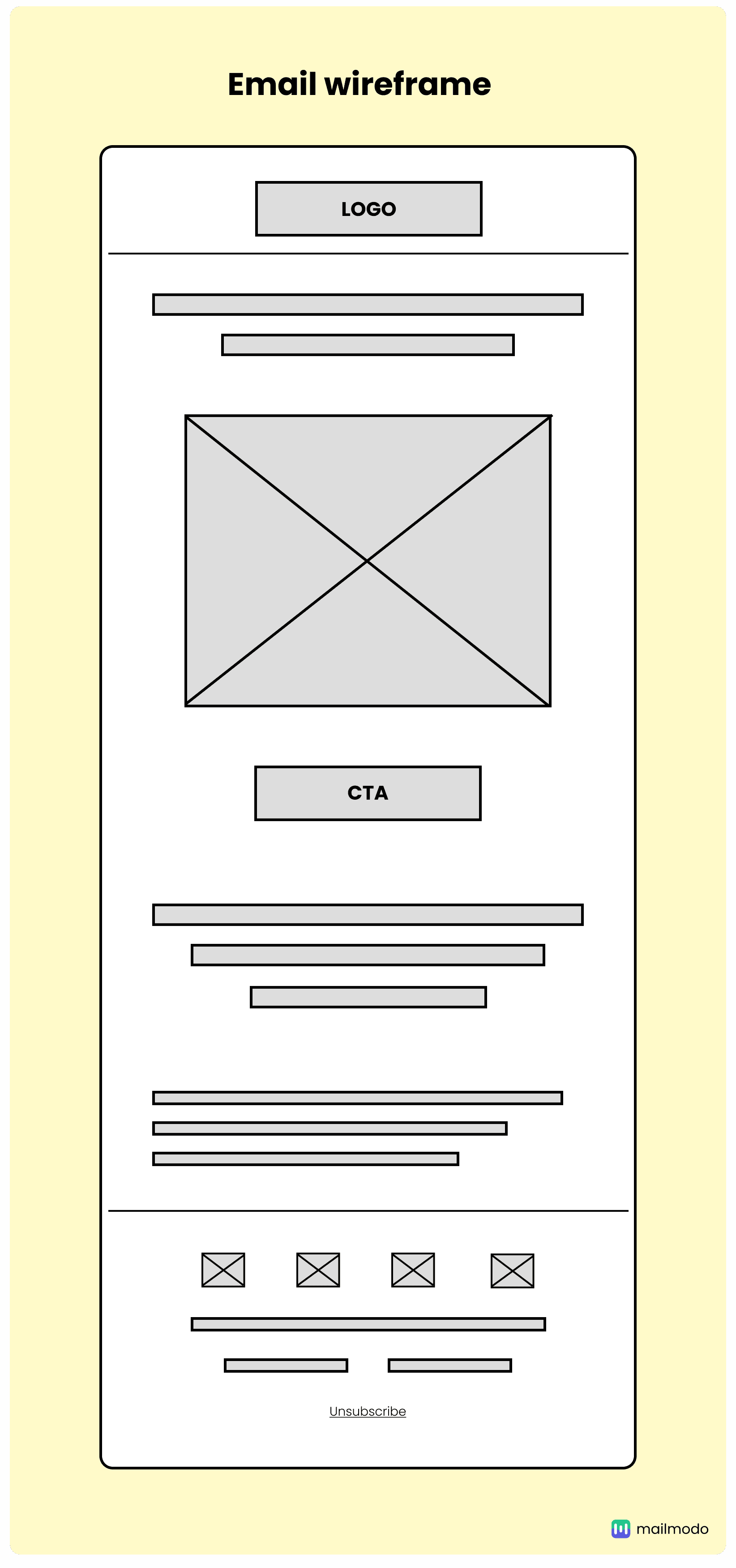
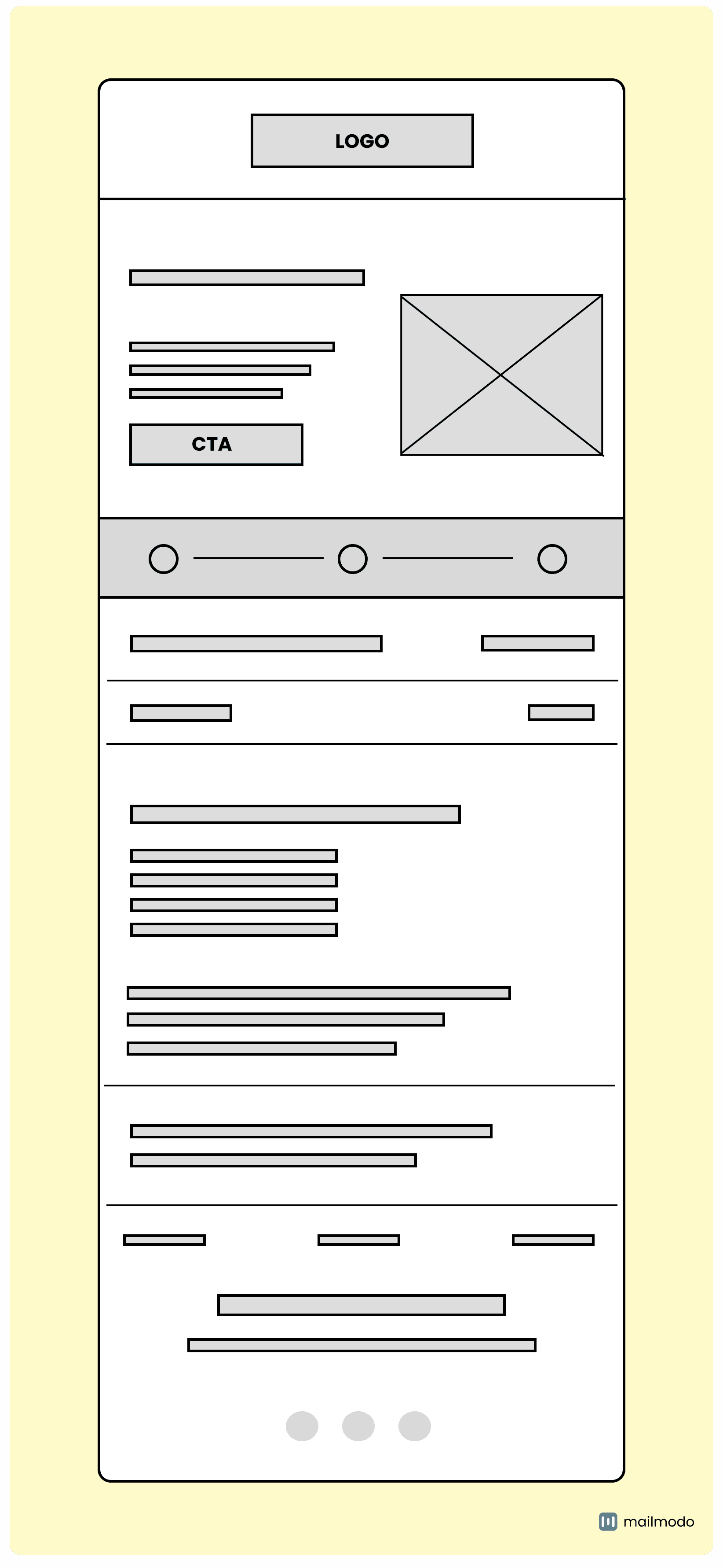
Wireframes are essential in the email design process because they help you focus on functionality and user experience without getting distracted by colors or fancy graphics. By establishing a clear structure, wireframes make sure your email content is organized and easy to read. Plus, they help you and your team collaborate better, allowing for effective feedback and revisions. This all adds up to more engaging and successful email campaigns. The image below shows a sample of the email wireframe.

An email wireframe would usually contain multiple key components. We've listed some common ones in the table below:
| Component |
Details |
| Header |
Branding elements like your logo and navigation links. |
| Hero section |
A visually striking area designed to grab attention. |
| Body |
Contains the main content of the email, such as text, images, etc. |
| Call to action (CTA) |
The buttons or links for users to take action. |
| Footer |
Includes contact info, social media links, and unsubscribe options for easy access. |
In addition to these key elements, you can also include other components like social proofs, key highlights, or promotional banners. These extras can enhance credibility, capture attention, and reinforce your message.
Why are wireframes essential for email design?
An email wireframe plays an important role in email design, and here’s why it is indispensable:
1. Saves time and effort
By laying out the structure of your email beforehand, you can catch layout issues early. This means fewer revisions down the line, helping you meet deadlines with ease and cutting down on unnecessary effort.
2. Enhances communication
Wireframes serve as a common language for communication among your team, removing any language barriers that might hinder collaboration. When everyone is on the same page, sharing feedback and making adjustments becomes a breeze. It’s all about working together to achieve a shared vision.
3. Focuses on functionality
Wireframes let you zero in on what matters most: functionality. By setting aside design distractions like colors and graphics, you can ensure your email is user-friendly, guiding your readers seamlessly through your content.
Types of email wireframes
You can use three primary types of email wireframes, each with its own level of detail and complexity.
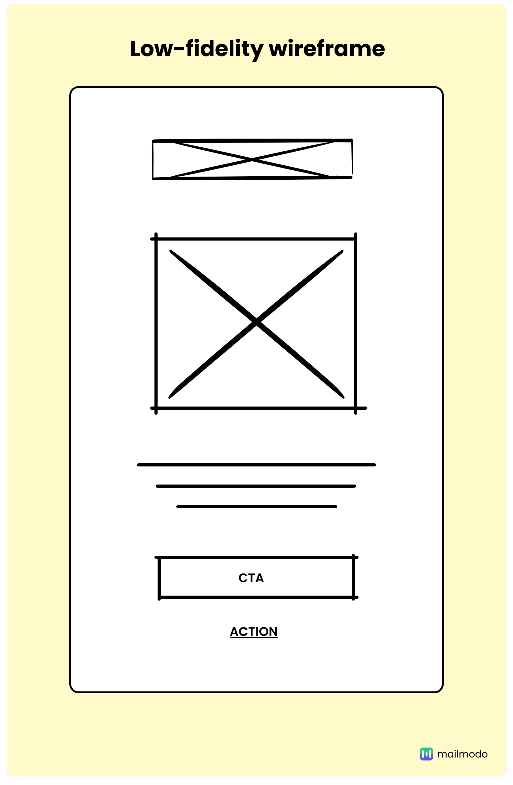
1. Low-fidelity wireframe

Low-fidelity wireframes mark the initial phase of your design process. These basic outlines are often hand-drawn. You’ll typically see block shapes and placeholder text, which allow for collaborative brainstorming and navigation discussions.
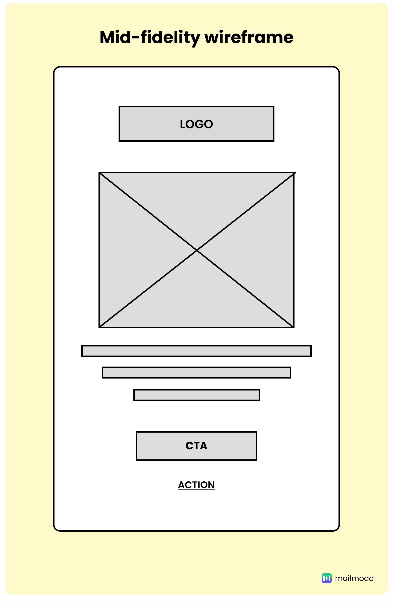
2. Mid-fidelity wireframe

Mid-fidelity wireframes offer a more refined look at your email layout while keeping the focus off colors and imagery. They include clearer representations of headings, buttons, and links, often utilizing shades of gray to indicate hierarchy. This type of wireframe helps clarify component placement and facilitates conversations around functionality and user interaction. Created with specialized software, mid-fidelity wireframes make it easy for you to share and iterate with stakeholders.
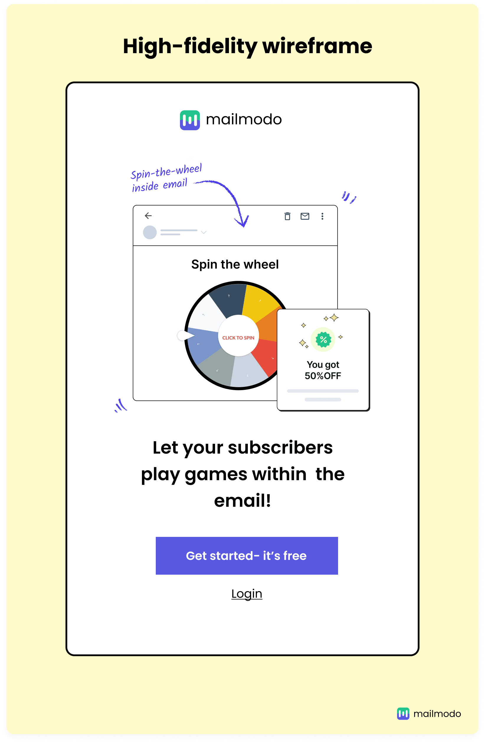
3. High-fidelity wireframe

High-fidelity wireframes provide the most detailed representation, incorporating specific layouts, typography, and even sample images that closely mimic your final email design. They are crucial for exploring complex concepts and ensuring all elements function harmoniously. High-fidelity wireframes showcase your final vision to clients, providing a comprehensive view of the email's appearance and functionality. This step is vital for refining details before you move on to the coding phase.
5 email wireframe examples
These six examples highlight various layouts, from promotional campaigns to transactional emails, each customized to boost engagement and meet specific marketing goals.
Example #1

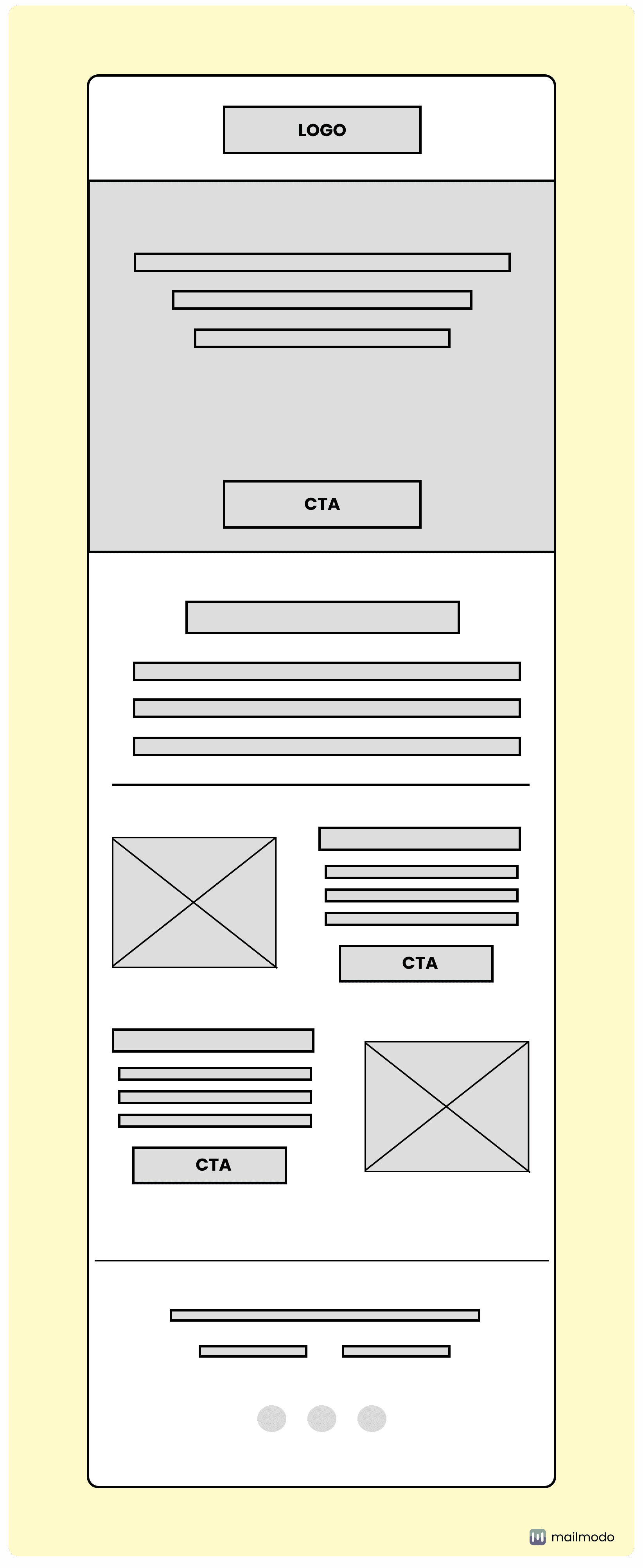
This wireframe is ideal for promotional or newsletter emails. It features a prominent logo, multiple content sections with images and text, and several call-to-action (CTA) buttons throughout. The layout allows for showcasing various products, services, or articles.
Example #2

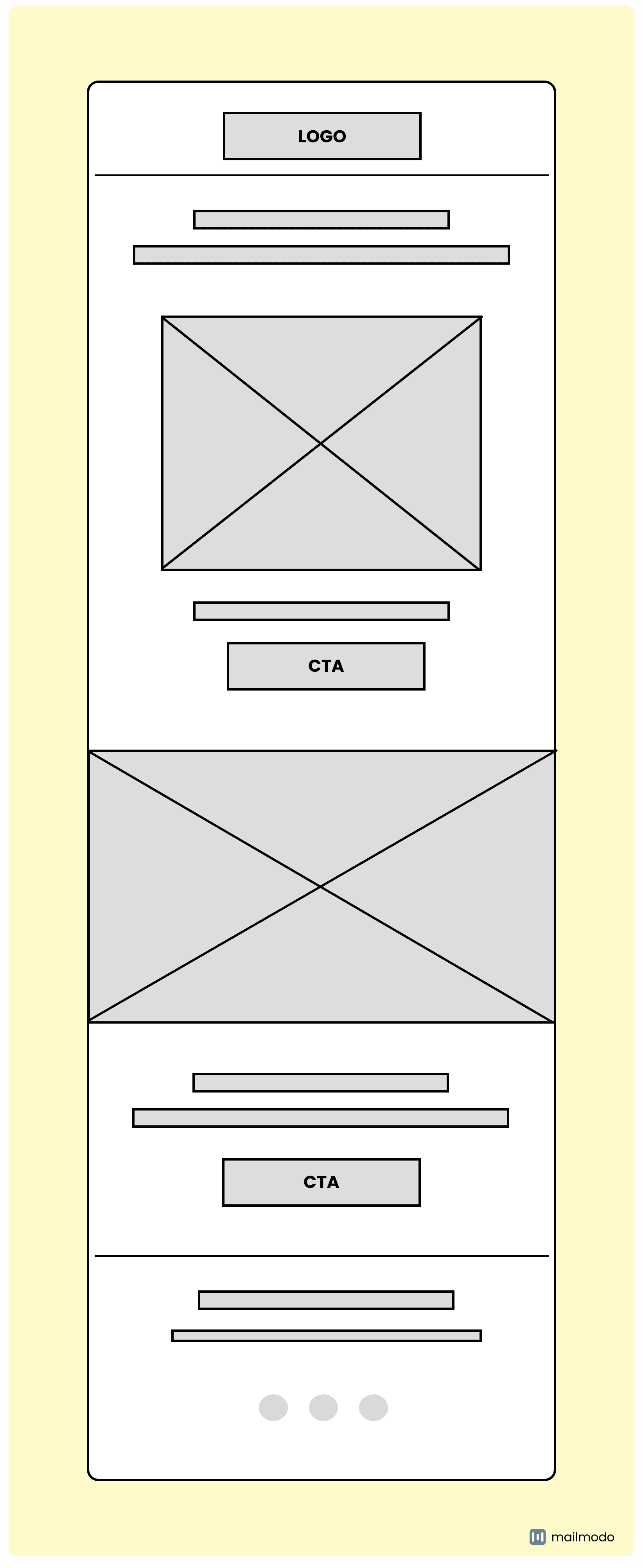
This type of email wireframe is best suited for focused promotional emails or product announcements. It has a clean layout with a logo, headline, and two main content blocks separated by large images. The prominent CTAs make it effective for driving specific actions, such as product launches or limited-time offers.
Example #3

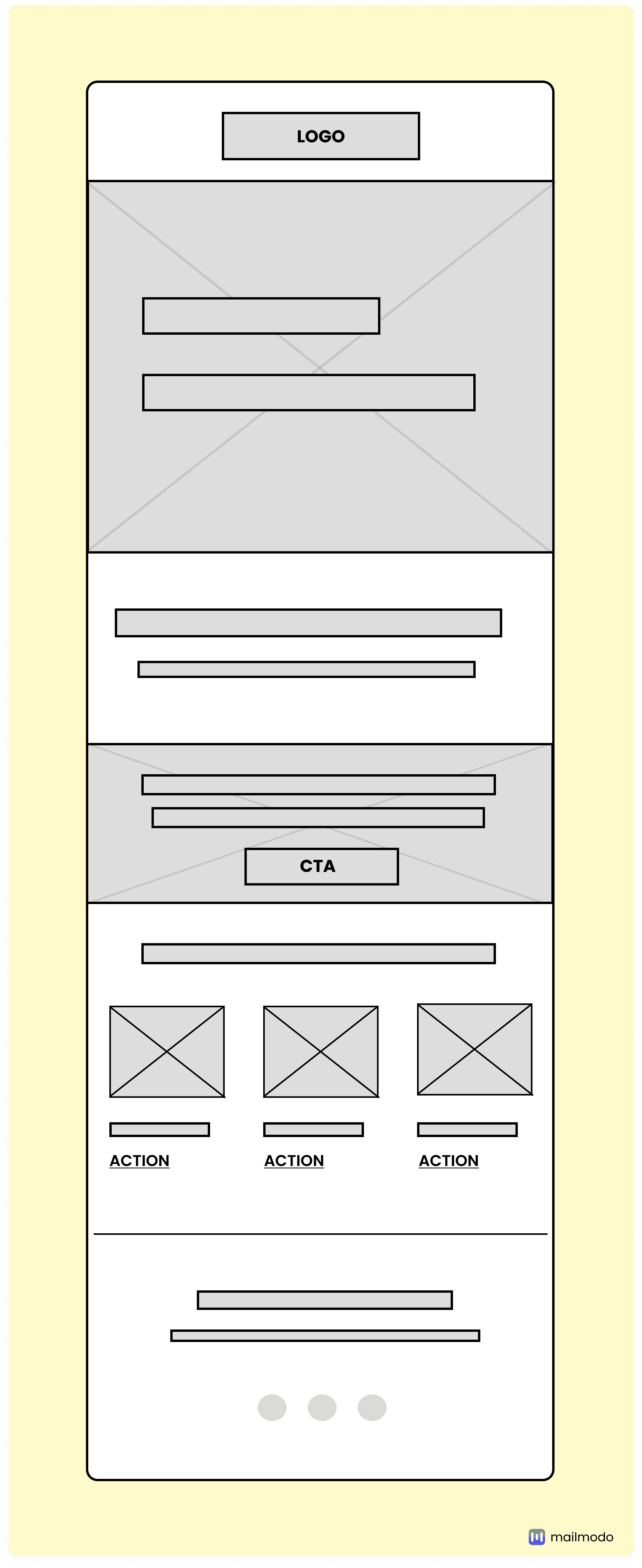
It is well-suited for educational or informational emails. It has a clear hierarchy with a header, a main content area, and a section for multiple actionable items. The layout is perfect for highlighting a primary message or feature, followed by additional resources or related content, making it great for onboarding emails or product updates.
Example #4

This kind of wireframe is excellent for promotional emails with multiple offerings. It features a clean layout with a main header section, followed by alternating text and image blocks. The design allows for showcasing various products or services in a visually appealing way, making it ideal for sales, event promotions, or service highlights.
Example #5

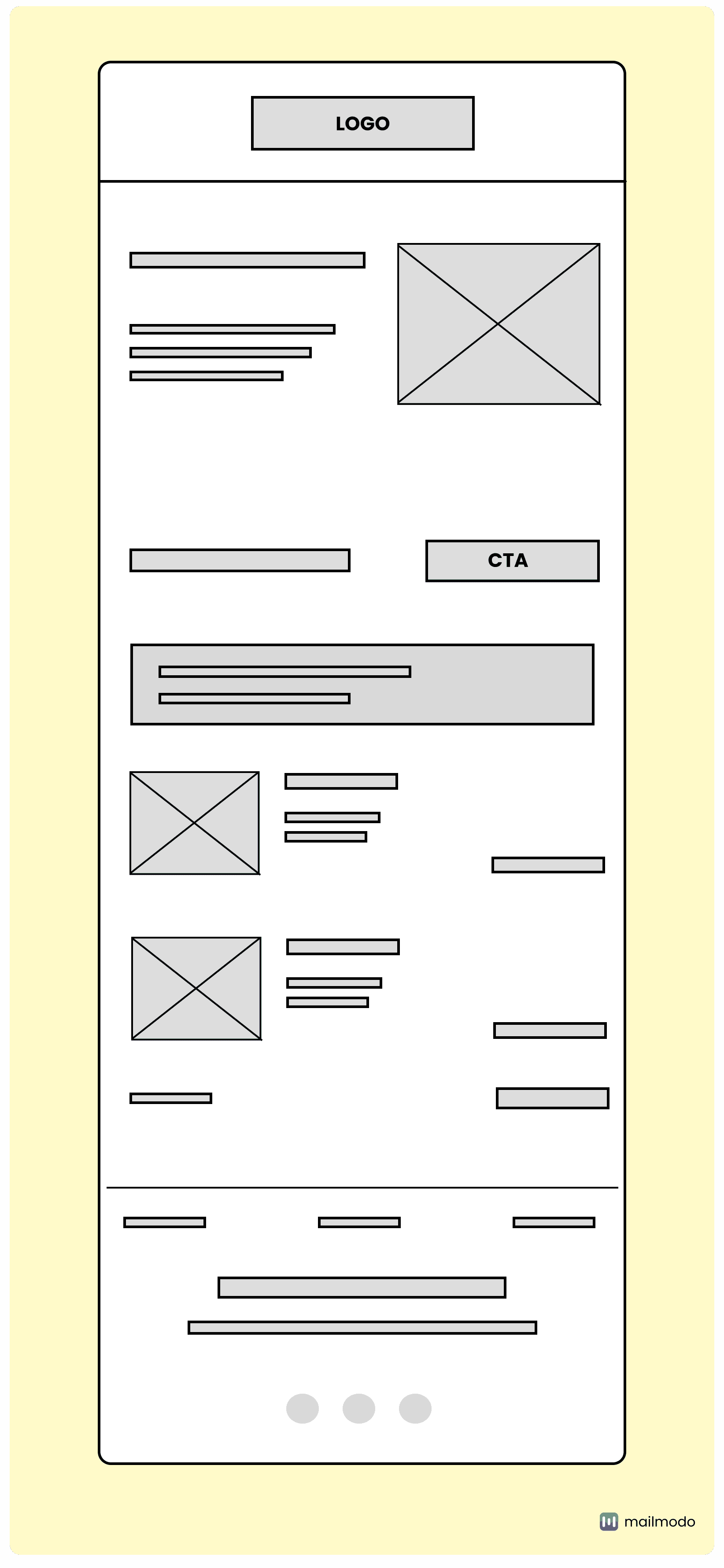
This is ideal for transactional or informational emails that require detailed content presentation. It features a clean, hierarchical layout with a logo, a main content area with an image and CTA, and a progress indicator or timeline element. This makes it suitable for order confirmations or shipping updates. The lower sections allow for additional information, making it versatile for various types of transactional or educational emails.
Choosing the right tool for creating email wireframes can streamline your design process and improve collaboration. Whether you're using a free HTML email builder or a dedicated design tool, having the right platform can make the wireframing process more efficient. Here are some of the top tools that offer a range of features to help you craft effective and visually appealing wireframes.
Whimsical
Whimsical offers an easy-to-use interface for creating low- to high-fidelity wireframes, making collaboration and feedback a breeze. It’s ideal for teams needing quick, visual mockups to streamline the design process.
Figma
Figma is a versatile tool that allows real-time collaboration, making it perfect for teams to create detailed, interactive wireframes. Its cloud-based platform ensures seamless access and sharing for email design projects.
Miro
Miro is a digital whiteboard tool that facilitates brainstorming and sketching out email wireframes in a collaborative environment. It’s excellent for early-stage ideation and organizing thoughts visually.
Sketch
Sketch is a design tool known for its robust vector editing features, allowing designers to create precise, high-fidelity email wireframes. It’s great for more polished mockups that closely resemble the final design.
Moqups
Moqups is an all-in-one design tool for creating wireframes, mockups, and prototypes. It offers an intuitive drag-and-drop interface, making it easy to visually plan and design email layouts, web pages, and mobile apps. Ideal for collaboration, Moqups allows real-time feedback and sharing, streamlining the design process.
Conclusion
Designing email wireframes is more than just a visual exercise; it’s about laying the groundwork for impactful communication. A well-structured wireframe can save you time and streamline collaboration, but don’t be fooled into thinking that aesthetics alone will drive engagement. If your email lacks relevance or fails to address your audience’s needs, even the most polished design can fall flat.
Remember, it's not just about looking good; it's about connecting with your readers and prompting them to take action. So, invest the effort to ensure every element serves a purpose, creating emails that not only attract attention but also resonate and convert.


