Exit intent popups can serve various purposes across different industries and websites. Some common use cases include:
Reducing cart abandonment: By offering discounts, free shipping, or other incentives to visitors who involve in shopping cart abandonment can help recover potential sales.
Lead generation: By collecting email addresses or other contact information in exchange for valuable lead generation resources like newsletters and downloadable content.
Collecting feedback and conducting surveys: By collecting responses from visitors about their preferences and user experience.
Promoting special offers: By displaying exclusive deals, ongoing promotions, and limited-time offers.
Social media engagement: By sharing your social media page and posts for them to follow and engage with.
1. Mailmodo

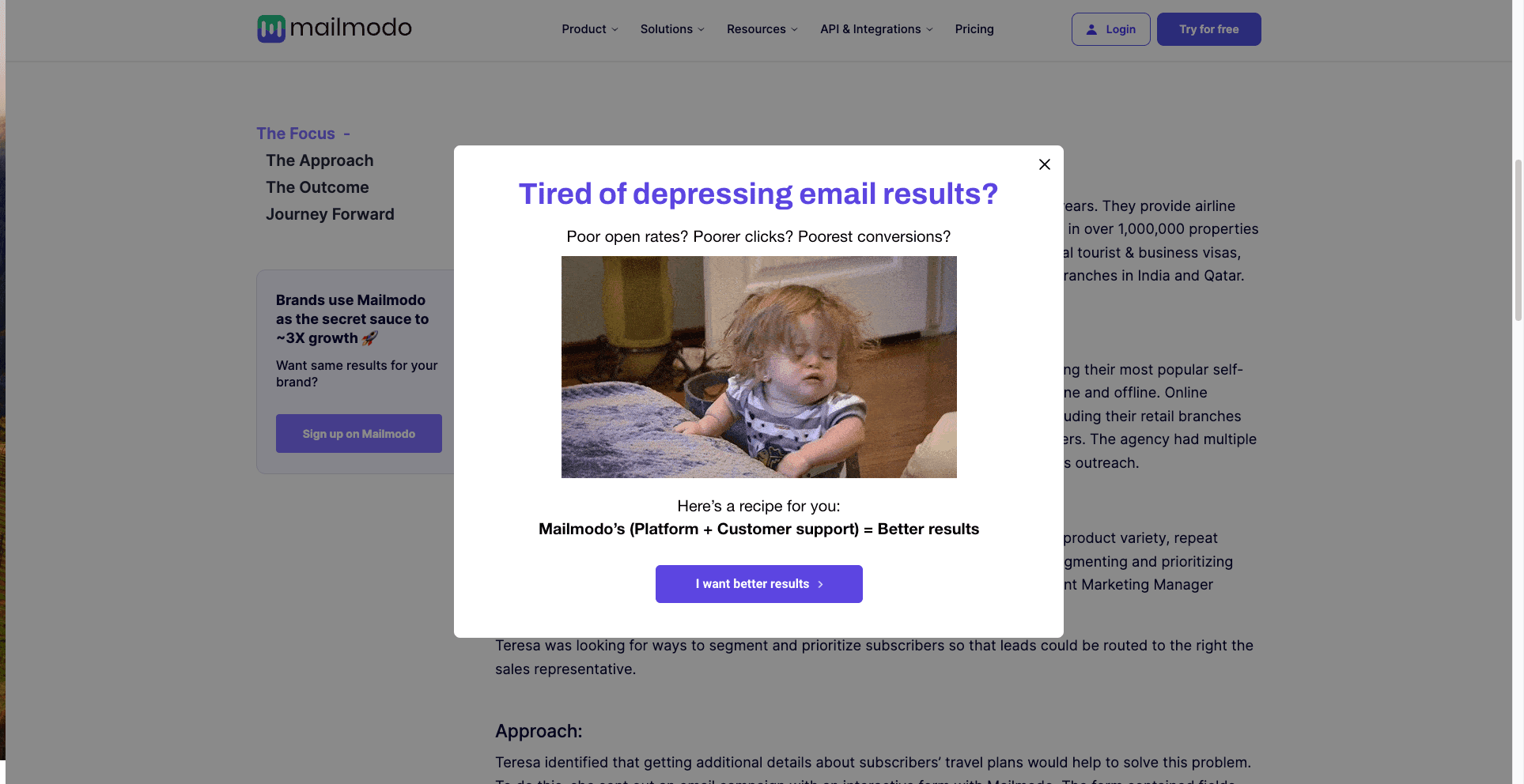
Mailmodo, an end-to-end ESP, grabs users' attention with an exit intent popup that not only engages but taps into the emotions of those absorbed in a case study. The frustration users often encounter while sending emails is brought to life through a blend of a gif and carefully crafted copy.
It begins with a question that automatically grabs your attention. Mailmodo doesn't just stop there; it goes on to address the specific pain points users experience in their email endeavors with more questions.
The popup then provides the solution to all these pain points creatively in the form of a recipe where it promotes its services too. The copy of the CTA ‘I want better results’ is also quite appealing.
 CRAFTD London offers a spin-the-wheel exit intent popup with different prizes to prevent users from leaving their ecommerce website and push them to make a purchase. In exchange, CRAFTD London gathers the email addresses of potential customers on the verge of leaving the site. This allows them to retarget leads through email marketing and provide a discount code to encourage purchases in the interim.
In this exit intent popup, the spin-the-wheel concept is enjoyable and engaging and makes visitors think, "Why not spin to win? I have nothing to lose."
3. Snowface

The toothpaste brand Snowface uses its popup to lure individuals into providing their email addresses in exchange for free stuff. They also mention the actual value of the item that they’re getting for free. Additionally, they create a sense of inclusivity by saying they like free stuff too.
They also clarify the condition that the customer has to pay the shipping fee so that the customers don't feel cheated on the final payment page.
4. Peak Freelance

The exit-intent popup from Peak Freelance effectively resonates with its target audience by addressing their specific pain point. The accompanying cheatsheet exemplifies the Peak Freelance team's strategy of offering key insights in exchange for an email address.
The popup's messaging highlights over 20 solutions to the audience's problem, adding an extra layer of appeal. The clear call-to-action copy featuring the word 'download,' enhances user understanding and prompts a more straightforward action.
5. Crossrope
 Crossrope is a brand specializing in designing and manufacturing weighted jump
ropes. They have implemented a 2-step opt-in exit intent popup throughout their website
to enquire whether the user would be interested in receiving the discount. It not only gauges the visitor’s interest but also encourages micro-commitment.
An important quality of this exit-intent popup is that it provides seamless flow and psychological impact, which enables visitor engagement without being intrusive. The two-step process captures attention and filters those genuinely interested, resulting in a more targeted audience for the coupon offer.
6. Kinobody

Kinobody caters to individuals interested in achieving a lean and aesthetic physique through strategic workout programs and nutrition guidance. Kinobody employs a straightforward yet highly effective exit-intent popup with a discount to address the issue of shopping cart abandonment.
The highlighted 'Wait!' grabs the attention and follows up with a question with no other text to avoid distraction. The popup is clean and stands out with the unique background color choice.
7. Kennedy blue

Kennedy Blue, a brand specializing in bridesmaid dresses, exhibits a strategic use of exit popups by showcasing a survey, challenging the conventional notion that exit popups are solely designed to boost immediate sales.
The brilliance of this approach lies in recognizing that enhancing the overall customer experience can lead to increased conversions and sales. The copy ‘it only takes a minute’ encourages customers to take the survey. This innovative approach gathers valuable insights and showcases a commitment to continuous improvement and genuine customer engagement.
8. Skullcandy
 Skullcandy employs a unique and witty strategy in its exit-intent popup by incorporating a touch of negative language. The inclusion of the phrase "No, I hate saving money" is a deliberate attempt to engage visitors by playfully challenging their resistance to accepting a money-saving offer.
They offer a combination of incentives: inside scoop and 20% off on their first order. The brilliance of Skullcandy's exit-intent popup lies in its ability to turn a typical savings pitch into an entertaining and memorable interaction. By injecting humor, the brand creates a lighthearted atmosphere, making the offer more engaging and increasing the likelihood that visitors will find it amusing rather than intrusive, fostering a positive brand image.
9. Coschedule

The progress bar cleverly suggests to customers that they are halfway to unlocking a reward, creating a sense of completion. It maximizes the impact of their exit-intent popups by leveraging the psychological principle that people are more likely to complete a task they perceive is already in progress. It makes it more compelling and increases the likelihood of visitors taking the desired action.
It also makes the visitors feel in control as they're offered the choice of how frequently they want to receive the emails.
10. Casper

Casper, an online mattress retailer, employs an exit-intent popup strategy that offers a discount in exchange for completing a brief survey.
It also shows you the minimum purchase you need to make to apply the discount so that the terms of the offer are clear. This clever approach addresses potential cart abandonment and engages users by providing them a tangible incentive, creating a win-win scenario. This exit-intent popup's user-friendly and mutually beneficial nature enhances customer loyalty and satisfaction.
11. Booking.com

Booking.com employs a strategic exit-intent popup within the reservation process, dynamically showcasing the number of other users viewing the same offer. This effective method creates a sense of urgency and leverages social proof that tells you the number of people looking at the property. to encourage the desired action.
It also creates a sense of loss by saying that all the details they've entered yet will be lost, which shows a possibility of loss of time and effort. The incorporation of social dynamics through the exit-intent popup contributes to enhancing conversion rates and instills confidence in users, emphasizing Booking.com's commitment to providing a seamless and competitive online reservation platform.
Takeaways
This guide has explored the realm of exit-intent popups through examples, shedding light on their diverse applications and showcasing 11 compelling examples from various industries. Exit-intent popups can reduce cart abandonment, generate leads, collect feedback, or promote special offers. The effectiveness of an exit-intent popup lies not just in its design but in its alignment with your website's goals and the preferences of your target audience. By leveraging these insights, you can craft impactful and engaging exit-intent popups that contribute to a positive user experience and drive desired actions on your website.


 Crossrope is a brand specializing in designing and manufacturing weighted jump
ropes. They have implemented a 2-step opt-in exit intent popup throughout their website
to enquire whether the user would be interested in receiving the discount. It not only gauges the visitor’s interest but also encourages micro-commitment.

 Skullcandy employs a unique and witty strategy in its exit-intent popup by incorporating a touch of negative language. The inclusion of the phrase "No, I hate saving money" is a deliberate attempt to engage visitors by playfully challenging their resistance to accepting a money-saving offer.


