Implementing steps to make your forms user-centered and easy-to-complete can go a long way in increasing form submissions. Here are a few proven strategies that can help you do this and boost your form conversion rate.
Long forms can lead to higher form abandonment rates as they can be tiresome to complete. Therefore, it is vital that you keep your form short, clean, and simple. Make sure that you only include essential fields in your form. Shorter forms ensure that the form is quick and easy to complete.
Additional tip: If you require additional information, you can include them as optional fields so that users can submit the form even without filling them. Do not mark form fields as required unless that information is crucial to your context.
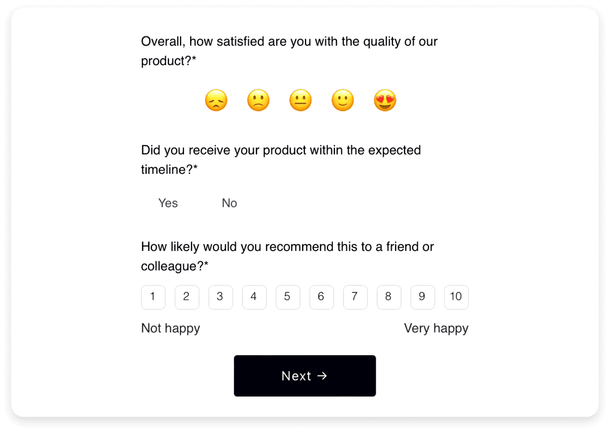
Here is an example of a short and simple feedback form that is easy to complete in a few seconds and has only 3 directly relevant questions:

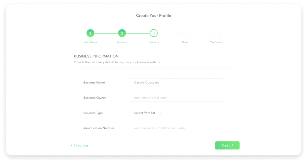
Sometimes, you might need a significant amount of information through a single form. Since putting a large number of fields in a single long form can deter users, you can use a multi-step form.
A multi-step form is an online form split into multiple pages so that users can complete one related set of fields at a time. This makes the form more manageable and easier to complete, thus increasing your form conversion rate.
However, it is vital that you include progress indicators in your multi-step forms. Otherwise, users can feel overwhelmed since the form may seem never-ending. A progress indicator shows the user how far they have completed the form and helps them keep track of their progress.
Additional tip: Optimize the number of steps in your multi-step form and keep your progress indicators simple, such as “Step 2 of 5”.

Always ensure that the embedded forms on your website are placed in a manner that is easily visible to your audience. This makes the form more accessible and increases the likelihood of interaction. You can conduct a/b tests with different form placements to determine the ideal placement for your page.
Additional tip: You can repeat your form at strategic spots for longer pages to give site visitors multiple opportunities to engage with it.
4. Focus on your CTAs
The call-to-action (CTA) in a form is the submit button that the users click after completing the form. Use action-oriented language that clearly conveys the benefit of submitting the form. For instance, instead of using generic phrases such as “Submit,” you can try “Send My Free Guide” or “Start Free Trial” to encourage the user.
Additional tip: Make sure that your CTA is large, visible and uses a contrasting color that stands out from the rest of the form.
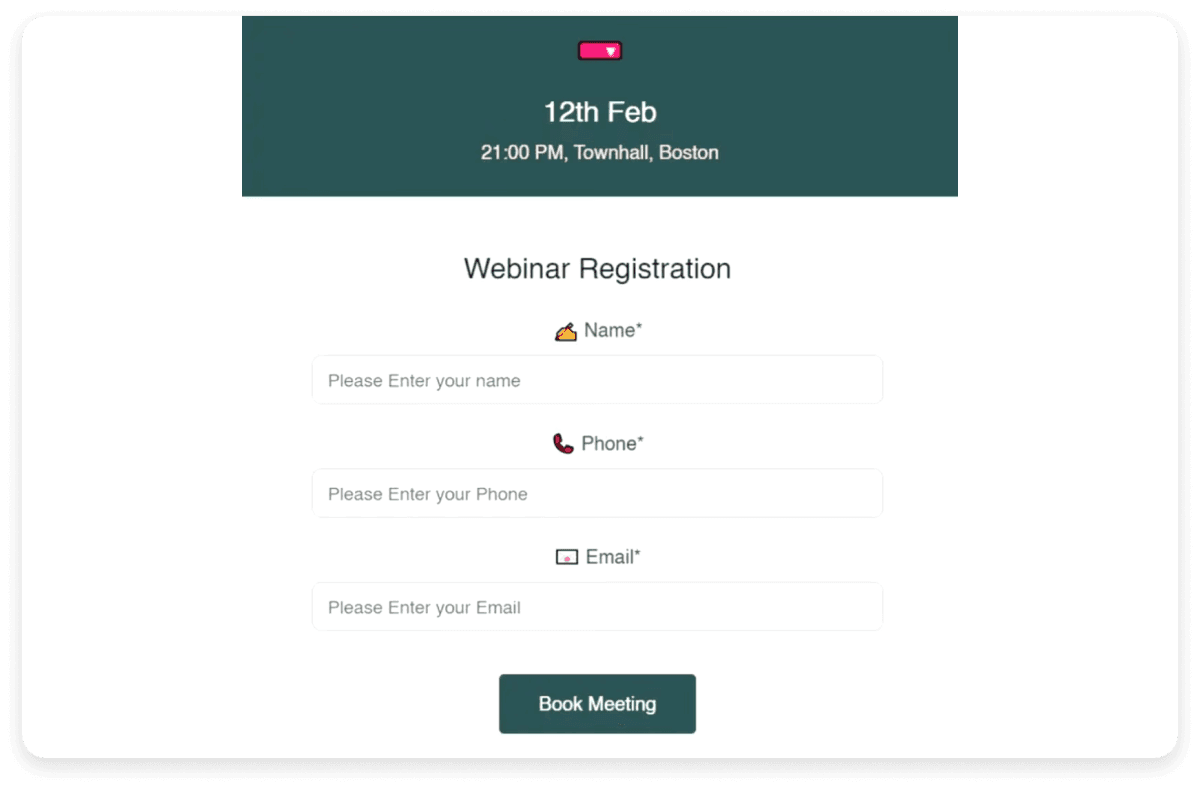
Here is an example of a CTA button that uses a specific phrase that prompts the user to take action:

Email is a highly effective way to encourage form submissions. It helps you target the most relevant audience and personalize your messages accordingly.
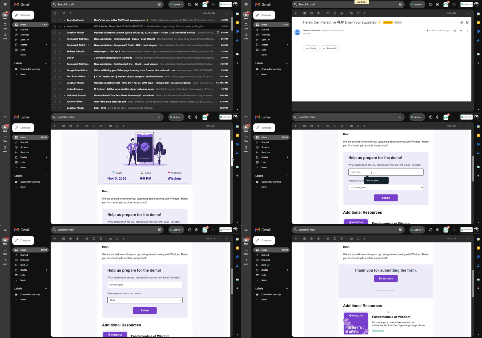
You can use a platform such as Mailmodo to send interactive emails with forms that your recipients can fill out in the email itself. This is a convenient option for users that prompts them to fill out your form. In fact, Razorpay got 257% higher survey responses by sending interactive surveys through Mailmodo.
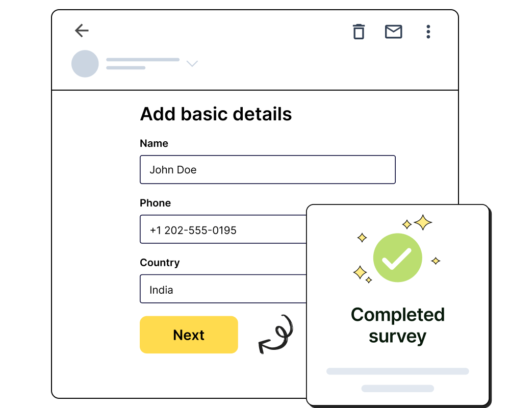
Here is how an interactive form in an email would look like:

6. Improve your UI and UX
A well-designed user interface (UI) and user experience (UX) can significantly improve form submissions by easing the process for the user. Make sure that your UI and UX prioritize the needs of the user over yours.
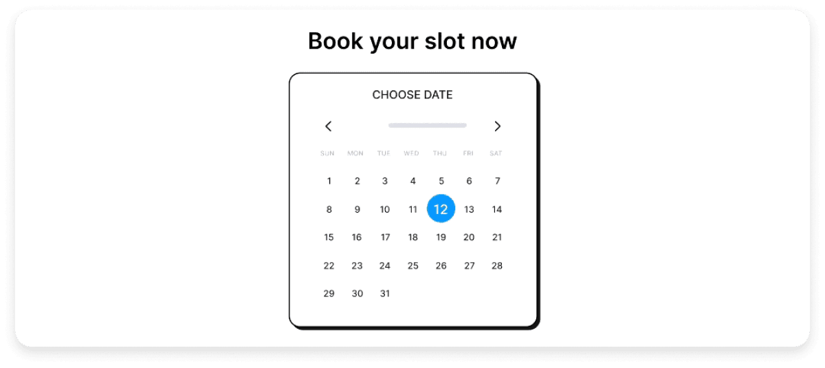
Small improvements in the form interface can go a long way in increasing convenience and providing a better user experience. For example, when asking for a date as input (such as date of birth), make sure that the user can select the date from a calendar and enter the month, date, and year separately instead of using a single text field to collect the data. Another tip is to avoid long drop-down menus that lead the user to scroll through options endlessly.
Here is an example of a date selector that you can include in your forms:

7. Ensure compatibility across devices
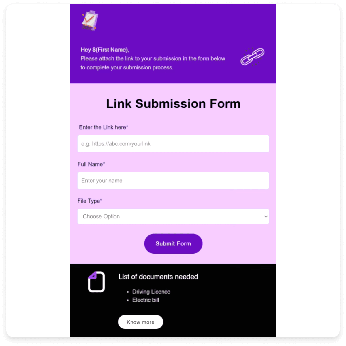
We live in a “mobile-first” world, which means it's crucial that your forms are fully responsive and accessible on all devices. You can ensure this by testing your forms across various screen sizes and orientations so that they work seamlessly on mobile devices, tablets, and desktops.
Additional tip: Use large, easy-to-tap buttons and input fields that work well on smaller screens.
Here is an example of a form that is optimized to be viewed on mobile phones:

💡 Related guide: 11 Must-Know Mobile Email Design Tips to Keep Your Subscribers Happy
Providing clear and concise instructions to the user can increase convenience and reduce the time it takes to complete your form. These can include prerequisites required to complete your form, any documents the user needs to keep handy while filling the form, or guidelines about the format in which certain fields must be filled.
Additional tip: Use placeholder texts to provide additional guidance (such as example answers) without cluttering the form.
Here is an example of placeholder text clarifying the requirement of a particular field.

9. Make error messages self-explanatory
Ensure that your error messages allow the user to understand and resolve any issues instantly. Avoid vague messages such as “Invalid entry” or “Error” and use specific messages such as “Your phone number must contain 10 digits”. Clear error messages allow the user to fill your form without frustration and correct mistakes easily.
Additional tip: Implement real-time data validation, i.e., place error messages near the relevant field and show them as soon as the user enters an invalid input. This allows the user to rectify errors as they go instead of waiting till the end.
Here is an example of real-time data validation with a clear error message.

10. Pre-populate fields and enable auto-fill
You can help your users save time by pre-populating, i.e., already filling fields with known information wherever relevant. For instance, you can pre-fill the country field with location data (provided that you have the user's consent to use it).
You can also enable browser autofill for your forms so that users can quickly enter details such as their name and address.
Additional tip: For returning users, pre-fill information they have previously provided to simplify their experience further.
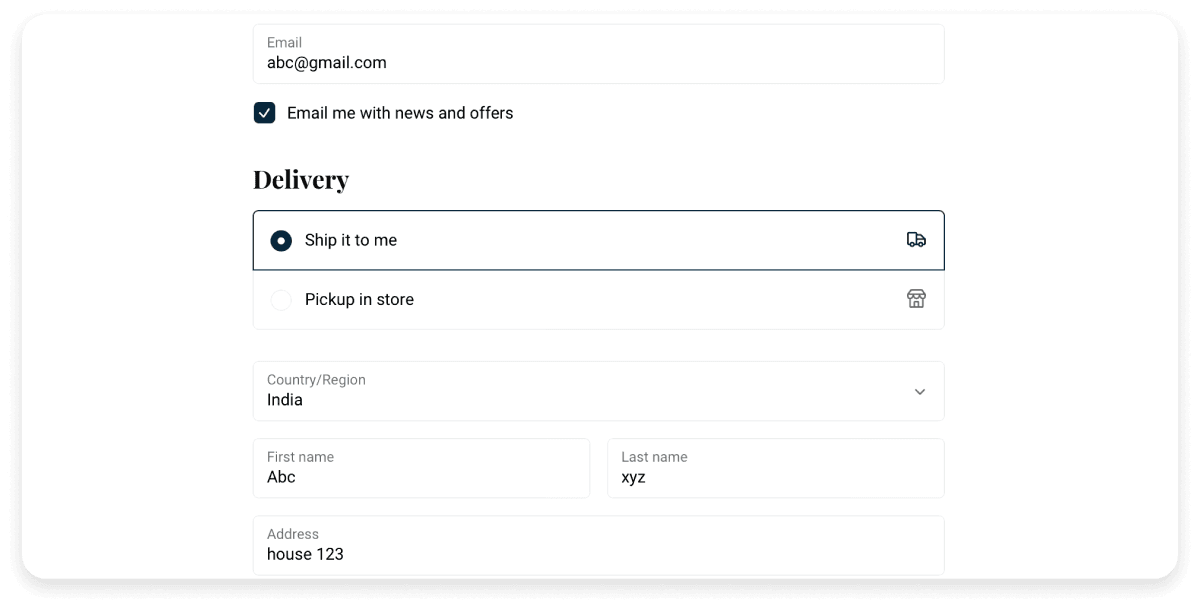
Here is an example of an auto-filled form based on the user's previous activity. The relevant fields are already filled, which the user can recheck and proceed to submit the form.

Once you have created your form, running tests to identify and fix any issues is important. You can also run A/B tests to experiment with different versions of a form , CTA texts, field order, or other elements. Analyzing your test data lets you identify what works best and improve the chances of form submission.
Additional tip: Test your form across different devices and browsers to ensure compatibility and functionality.
💡 Related guide: How to Run A/B Tests on Your Email Marketing Campaigns
Sharing your form on multiple channels can help you to collect the maximum number of responses. For instance, in addition to embedding it on your website or sharing it on email, you can also share it on various social media platforms. Using multiple channels is a great way to help you reach different segments of your audience, which can increase potential submissions.
Additional tip: Ensure that the content that accompanies your form is tailored according to the platform and your target audience on the platform.
Mailmodo allows you to easily send forms through email to your target audience, helping you to boost form submissions. Here is how you can do this:
To send your form via email, go to the templates tab on Mailmodo and choose a template to start with or start from scratch. You can then choose to add a pre-built form from the forms tab and fill in the specifics or create a new form on your own.
You can then customize the rest of the email and save it. Once you've done this, you can test the form and send it to your recipients straight from Mailmodo. Check out the interactive demo below, showing all the relevant steps:
Send forms in emails with Mailmodo
Conclusion
Online forms are the most versatile tools that help you collect user data across various contexts, be it for generating new leads, collecting shipping information, receiving feedback, or ensuring new sign-ups. As we have seen, small but significant changes in your forms can not only invite interaction but also make it easier for your audience to complete and submit your form. By applying the above strategies, you can set up a smooth, user-centric experience that can positively contribute towards achieving your goals. Further, integrating these strategies with powerful platforms such as Mailmodo can provide you with even greater returns.


