How to choose your newsletter color scheme
Choosing the right color scheme for your newsletter can be challenging. Each color has a psychological impact and influences how your message is received. Here are 10 tips to help you choose the right color scheme for your newsletter:
1. Understand color psychology
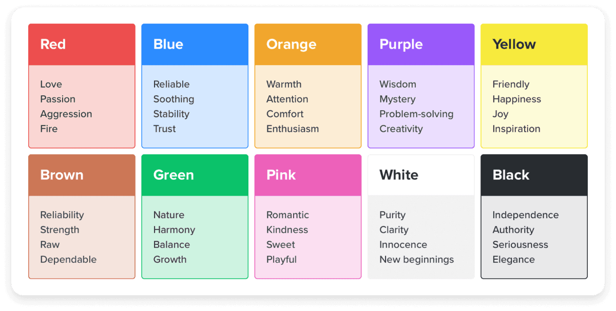
Color psychology studies how colors affect our emotions, behaviors, and responses. It taps into the subconscious impact of colors, influencing everything from our purchasing decisions to shaping our moods. Different colors evoke different feelings—the image below shows what feelings different colors would evoke in a person.

When selecting colors for your newsletter, consider the feelings you want to evoke in your readers. When you align your color choices with the emotions you want to evoke, you create a message that resonates more deeply and connects better with your audience.
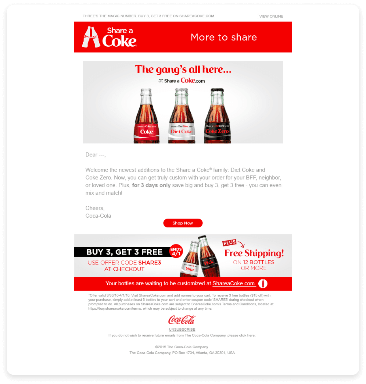
For instance, the image below shows how Coca-Cola uses red to evoke excitement, passion, and urgency, perfect for catching attention and driving action.

2. Align colors with your brand identity
Consistency in color, language, and tone is key to creating a strong brand presence. Your newsletter color scheme must also align with your brand identity, ensuring a cohesive experience across all touchpoints.
Establish clear brand guidelines that outline color codes (e.g., HEX, RGB, Pantone) and provide examples of using colors across various media. This ensures consistency and minimizes discrepancies that can dilute your brand message.
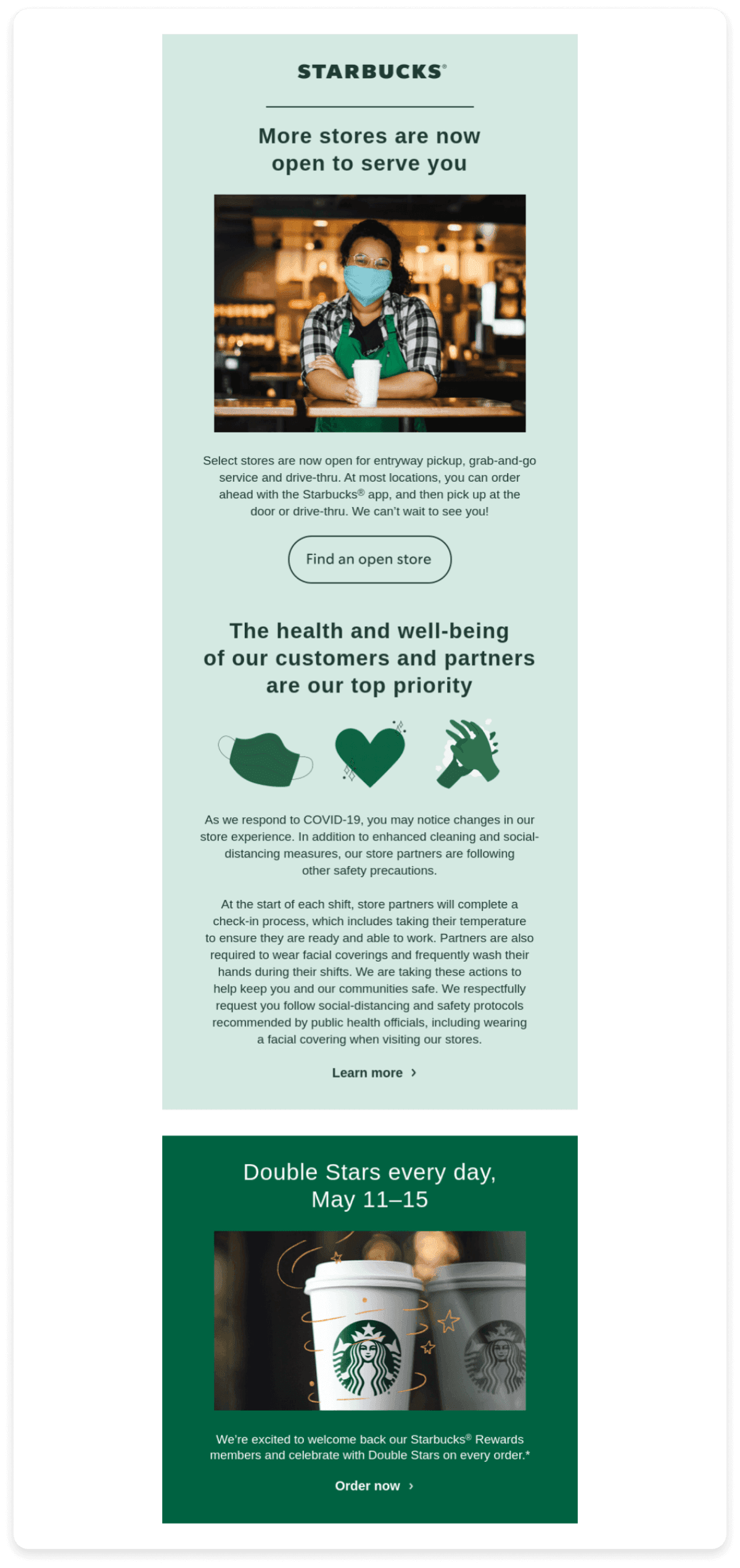
Starbucks is a prime example of effective color branding. Its consistent use of green, from staff uniforms to call-to-action buttons and icons, reinforces its commitment to fresh, green colors that exhibit sustainability. This visual consistency strengthens Starbucks' brand identity, making its marketing materials instantly recognizable and creating a cohesive brand experience.

3. Limit your color palette
Stick to three to four colors to maintain a clean and focused design. Use a dominant color for the background and a secondary color for the text.
Include a neutral color for balance and flexibility, such as white, gray, or black. This can be used for backgrounds, borders, or additional text, enhancing readability and keeping the focus on your primary colors.
Mailmodo is a shining example of how a limited color palette can enhance a design. They primarily use white and blue, creating a bright, inviting atmosphere. White is the background, while blue is used for important elements like text and CTAs, ensuring high readability. Blue is also one of their brand colors, reinforcing their brand identity.

4. Use high-contrast color combinations
Using high-contrast color combinations is essential for ensuring and enhancing readability. Low-contrast colors can make text difficult to read, frustrating users and leading to disengagement. Imagine a newsletter where light gray text sits on a white background. This low-contrast setup makes the text hard to read and can frustrate readers, particularly those with visual impairments.
High contrast between text and background is key to readability. Dark text on a light background—or the reverse—ensures your content is easily read and visually appealing.
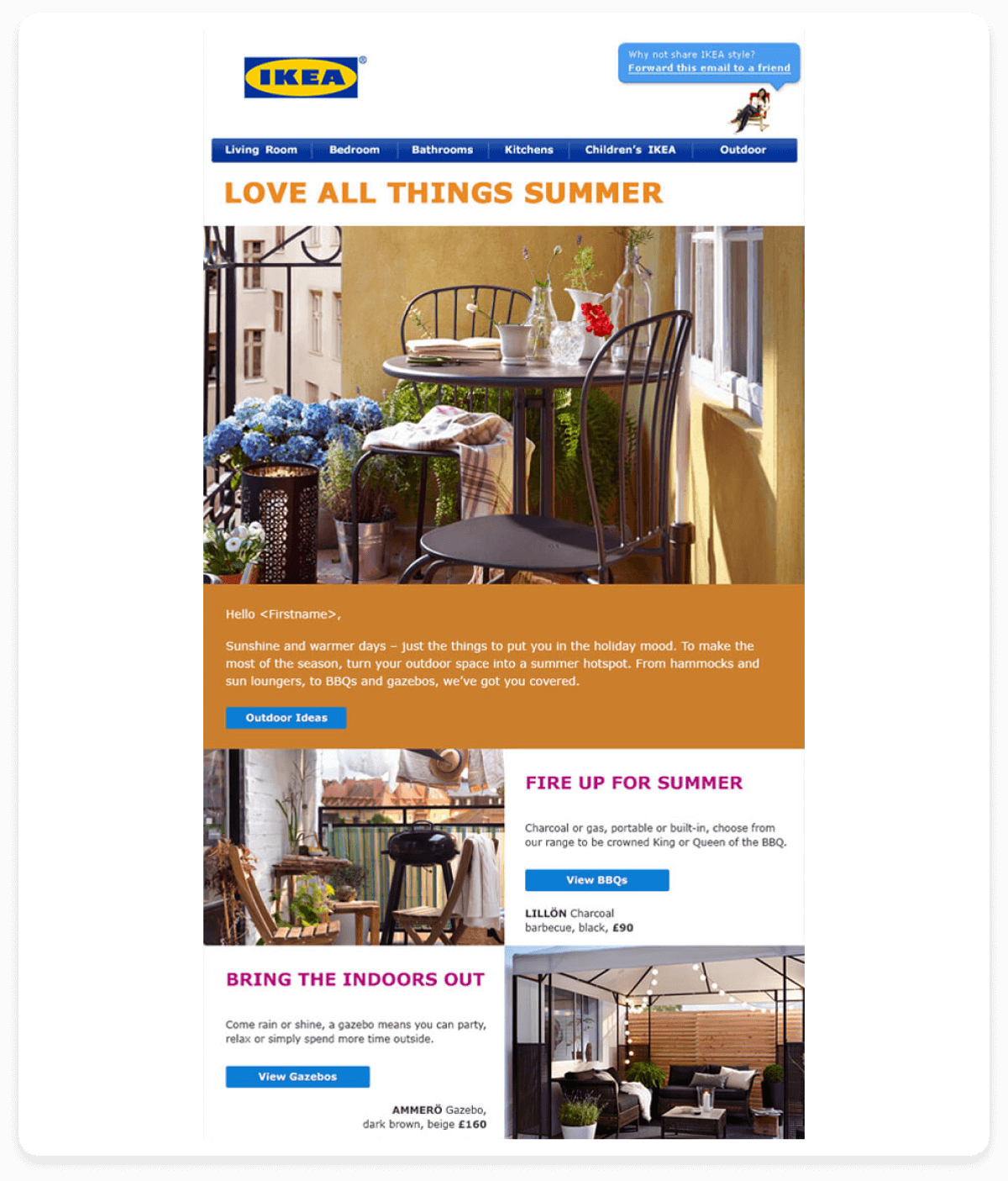
Take IKEA, for example. They use a mix of reds, blues, and greens on a white background, creating a high-contrast look that enhances visibility and clarity. This approach makes their content easy to read and strengthens their brand identity, making their marketing instantly recognizable.

5. Choose the right background color
The background color of your newsletter plays a crucial role in supporting your content without overshadowing it. Opting for neutral tones like white, light gray, or soft pastels often works best, as these colors allow your message to take center stage.
Choose a background color that reflects your brand's personality and values, ensuring a cohesive look across all marketing channels.
Conditions for choosing the right background color
Enhances readability: Choose colors that provide sufficient contrast with your text and other elements to ensure easy readability.
Avoids clutter: Opt for solid, consistent background colors rather than busy patterns or images. This keeps the focus on your content and prevents visual distractions.
Considers accessibility: Ensure that your background color choices have sufficient contrast for visually impaired users or viewing your emails in low-light conditions.
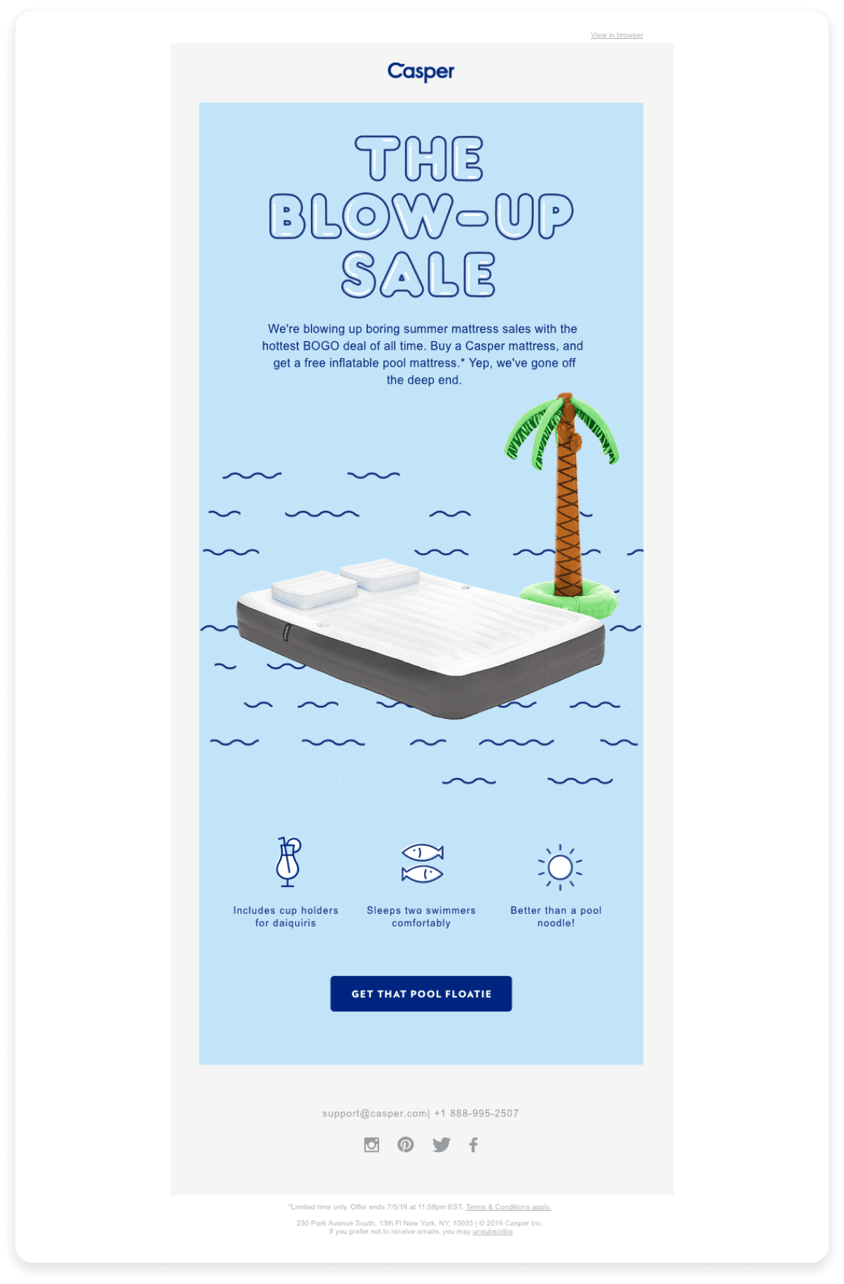
Casper a mattress company, uses a light background in its newsletters. This color perfectly complements the brand's focus on relaxation and comfort, creating a soothing and inviting atmosphere. The neutral tone allows Casper's product images and messaging to take center stage without distractions.

6. Highlight important elements with accent colors
Accent colors should be used sparingly but purposefully, highlighting important elements like headings or special offers without overwhelming the overall design. This pop of color draws attention to these key elements, guiding the eye and emphasizing your most important messages. Avoid using accent colors for less important elements. Save them for the most critical content you want to highlight.
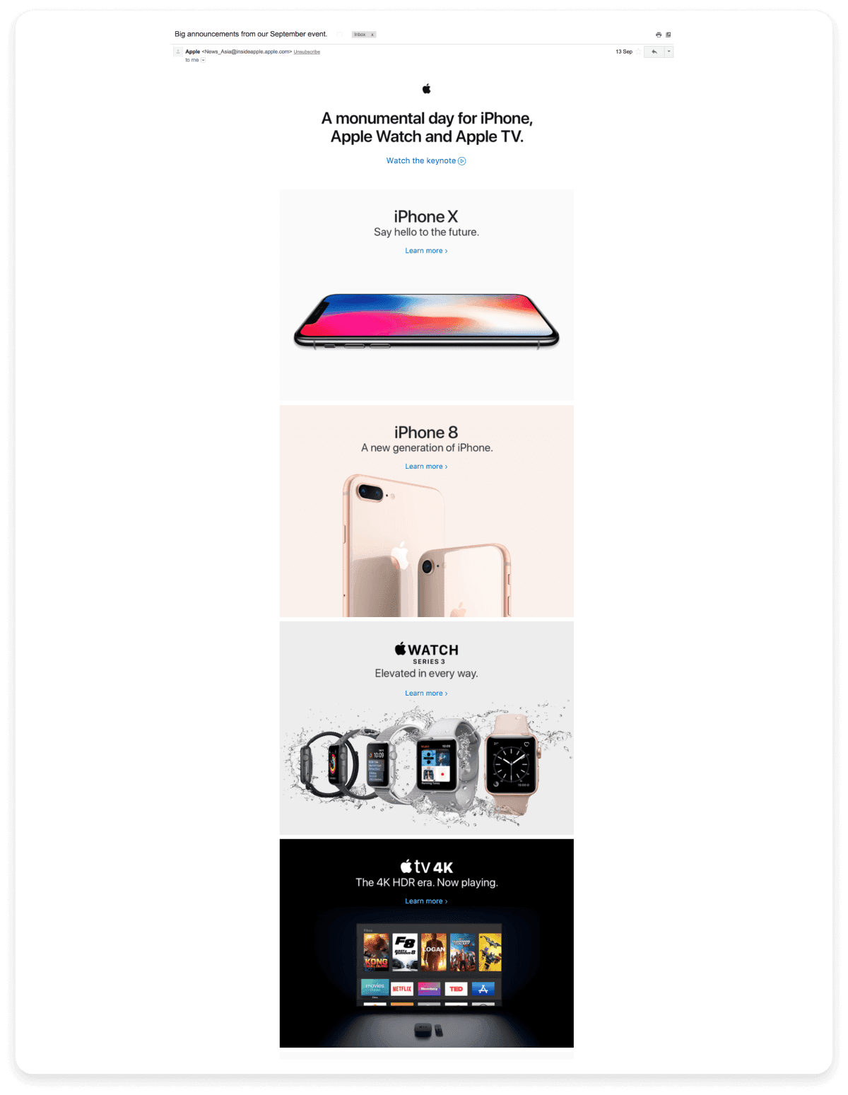
In its newsletters, Apple skillfully uses accent colors to highlight key features and promotions. For instance, they might use a bold, vibrant color for call-to-action buttons or special offers, making them stand out from the rest of the newsletter. This strategic use of color draws the reader's eye to the most important sections, ensuring that these elements are easily noticed and engaging.

7. Consider the cultural implications of color
If your newsletter has a global audience, be mindful of the cultural significance of colors. What works in one region may have different connotations in another. For example, while white is often associated with purity in Western cultures, it represents mourning in some Asian cultures.
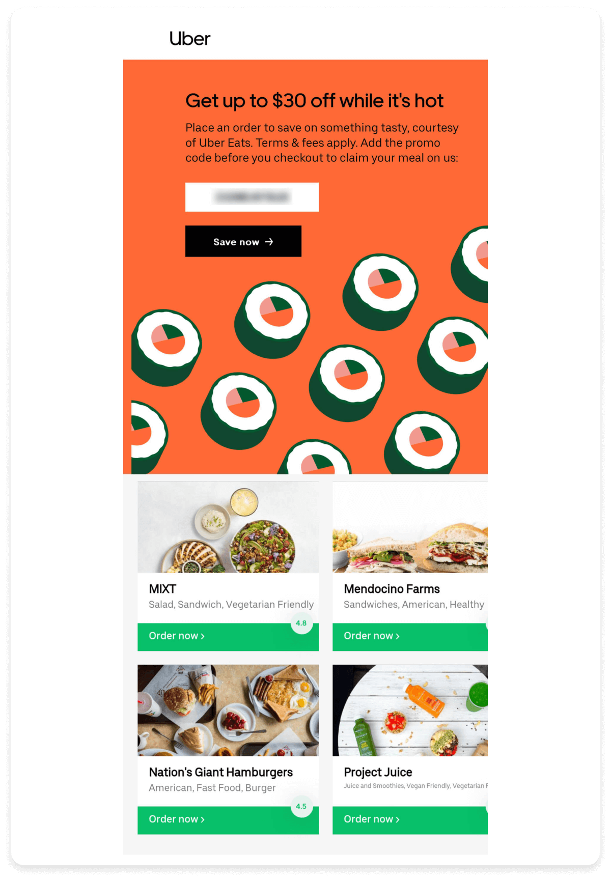
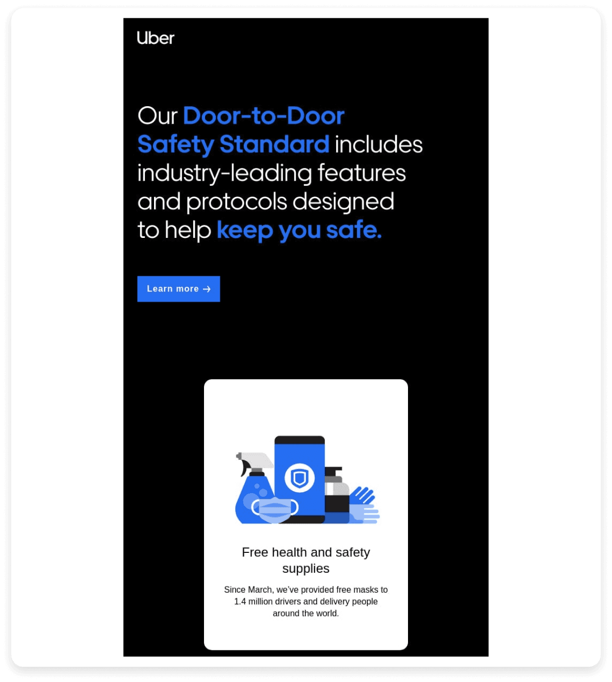
Uber uses a flexible color strategy, adapting its brand identity to different regions by customizing colors, patterns, and illustrations based on local cultural significance and associations.
- Uber uses a red color scheme in China, as red is considered lucky.

- In the United States, a dark color is used, which feels more premium and sophisticated.

This cultural sensitivity allows Uber to create a locally relevant brand identity that resonates with audiences in each market.
8. Test your color scheme across devices
To ensure your color scheme looks great on all devices, it's essential to test it thoroughly. Here are some tests you should do:
Dark mode and light mode: Test your color scheme in both dark mode and light mode to ensure it provides sufficient contrast and looks visually appealing in both settings.
Different devices: Test your color scheme on various devices, including smartphones, tablets, and desktops, with different screen sizes, resolutions, and pixel densities.
Email clients and browsers: If you're using your color scheme in email campaigns, test it across major email clients like Gmail, Outlook, and Apple Mail. For web-based color schemes, test across popular browsers like Chrome, Safari, Firefox, and Edge.
Operating systems: Test your color scheme on the most popular OS versions, including Windows and Mac OS, to ensure consistency.
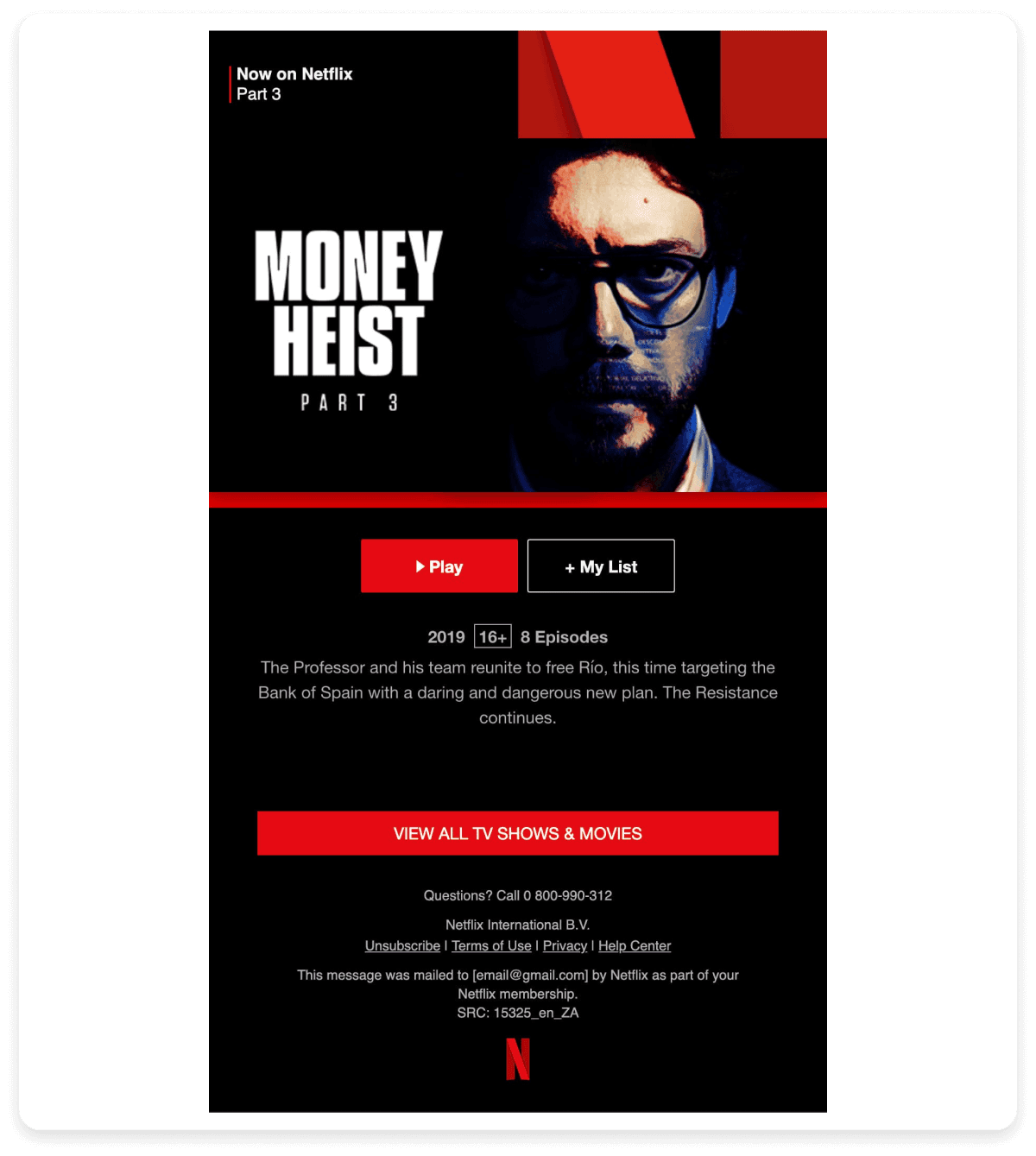
Netflix, known for its bold designs, rigorously tests its layouts to maintain visual appeal across devices, browsers and email clients, ensuring its emails look perfect everywhere. Take a look at this, which looks perfect on both desktop and mobile.

9. Adjust colors for seasonality and themes
Refreshing your color scheme to align with seasonal events or specific newsletter themes keeps your newsletters relevant and engaging. By adjusting your colors to reflect the time of year or the theme of your content, you can create a stronger connection with your audience and enhance the overall impact of your message.
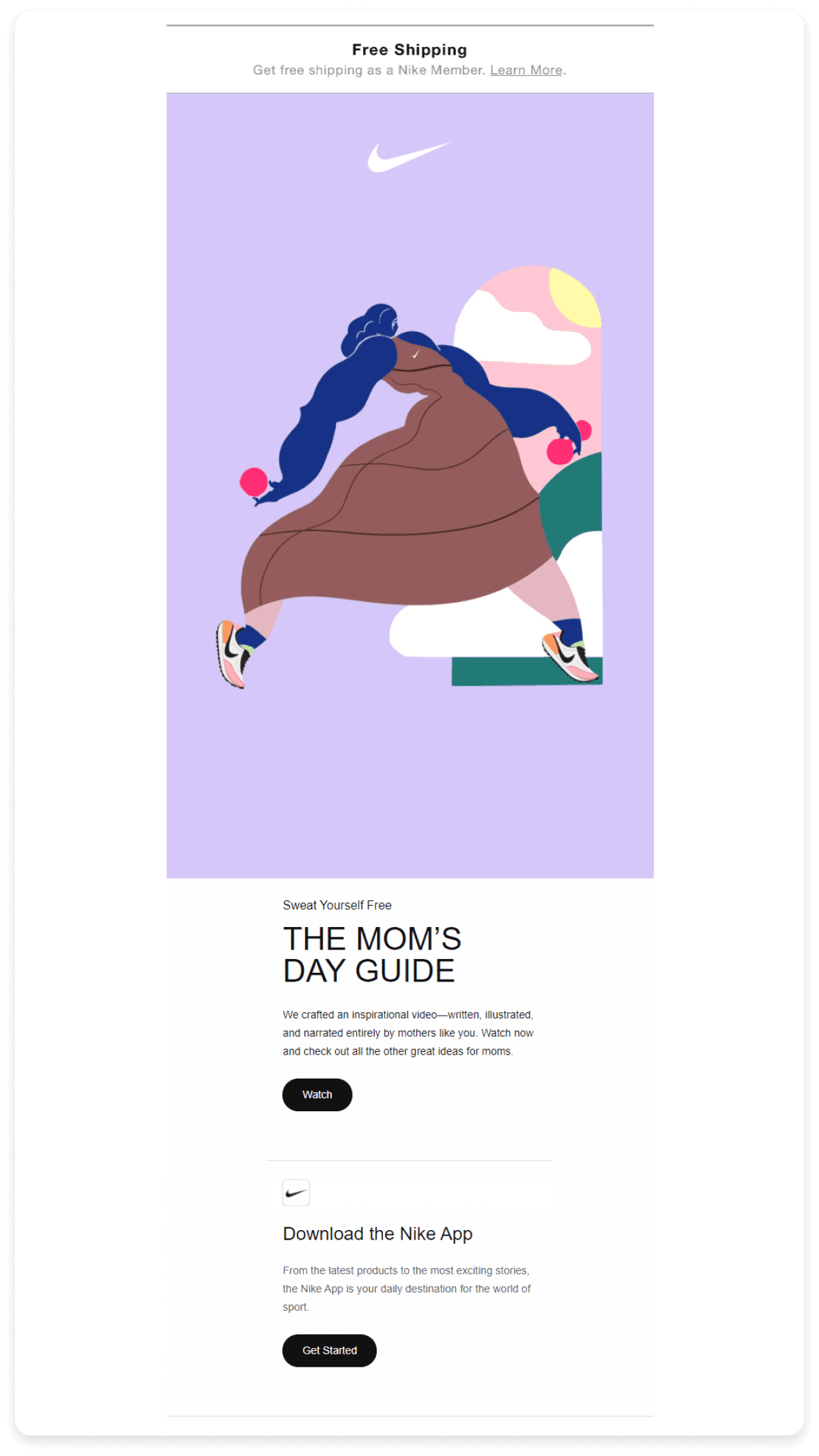
Nike adapts its color schemes in newsletters and marketing campaigns to align with festive events, as seen in a recent newsletter promoting its Mother’s Day collection. This newsletter featured a palette that perfectly captured Mother’s Day’s essence.

10. Utilize whitespace effectively
Whitespace, also known as negative space, is the unmarked area between elements in a design. It's more than just space; it's a vital component that enhances a layout's overall aesthetic and functionality. Effective use of whitespace improves readability, creates a clear visual hierarchy, and helps restrict or separate different elements from each other, guiding the reader’s eye to the most important content.
Tips for utilizing whitespace effectively:
Maintain consistent margins and padding to create a balanced and organized layout.
Use whitespace to group related elements together, making it easier for readers to understand the content's structure.
Limit the text and graphics in your design to avoid overcrowding, allowing key elements to stand out.
Implement grid systems to align elements consistently, ensuring that whitespace is evenly distributed.
Play with the scale of elements and whitespace to create emphasis and draw attention to specific areas of your design.
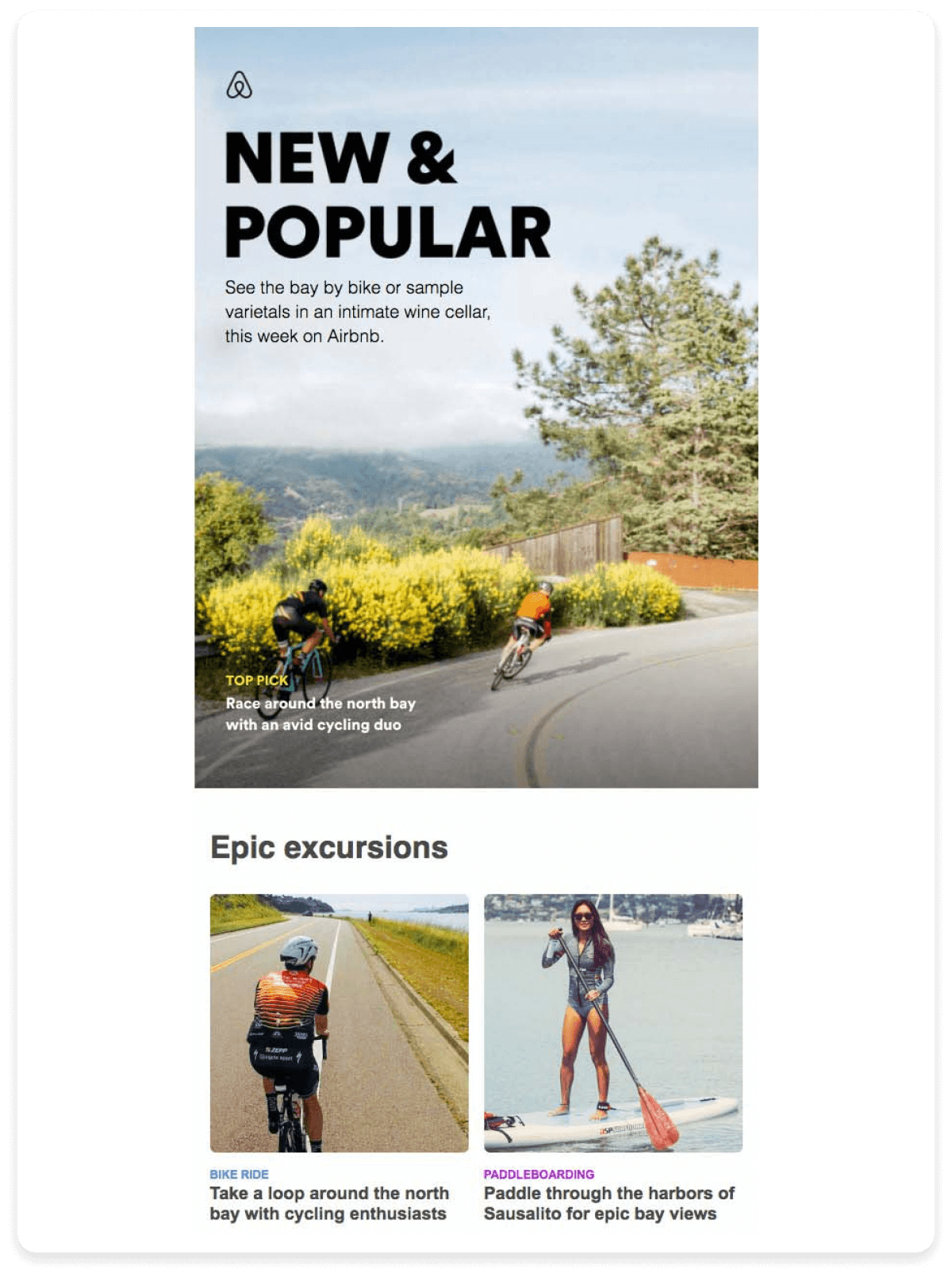
For instance, Airbnb's newsletters use whitespace excellently, grouping the content and making the layout easy to navigate.

Conclusion
The colors you choose for your newsletters significantly impact engagement and shape how your brand is perceived. Choosing the right newsletter color schemes begins with a deep understanding of color psychology, staying true to your brand’s identity, and being mindful of cultural nuances. The ultimate goal is to use color to convey your message clearly and foster a lasting connection with your readers.
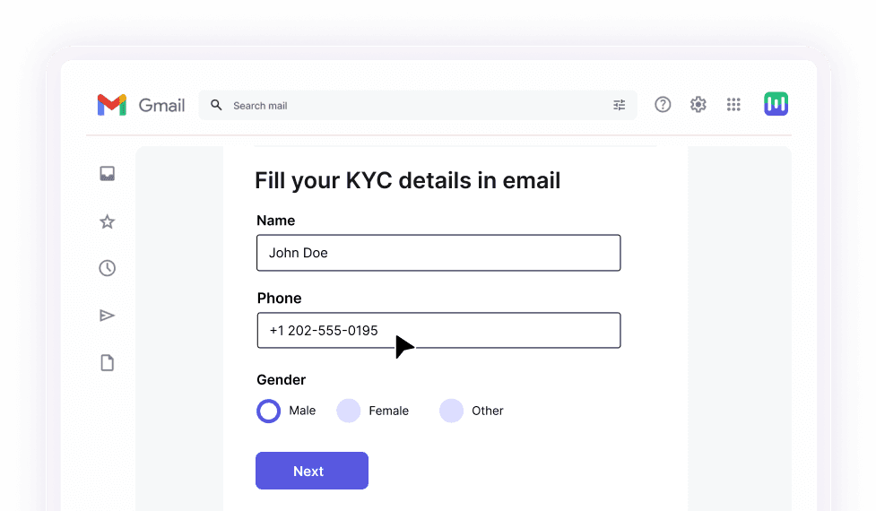
If designing your newsletters is difficult, try Mailmodo. Mailmodo offers an intuitive platform that seamlessly incorporates colors of your choice and interactive elements like GIFs and polls into your newsletters to keep your audience engaged. With Mailmodo, you can design visually compelling newsletters that capture attention and reinforce your brand identity, ensuring your message stands out in crowded inboxes.
Create and send newsletters without coding in minutes


