What is an unsubscribe page?
An unsubscribe page is an opt-out webpage that allows users to stop receiving emails from a particular sender. These are most relevant while sending broadcast emails such as newsletters, digests or promotional emails.
Including an unsubscribe button in your emails is also essential to ensure legal compliance with privacy and data protection regulations such as CAN-SPAM (United States) and GDPR (European Union).
What makes a good unsubscribe page?
Below are a few key elements that make up a functional and effective unsubscribe page.
Convenience
If a user clicks on the Unsubscribe button, they must be able to unsubscribe in the least number of clicks. Some companies get tempted into making elaborate pages in a last attempt to retain their subscribers. However, this can only make the subscriber frustrated and lose trust in the company.
User Interface (UI)
A good UI includes elements such as page design, layout, and copywriting. The UI of an unsubscribe page should be such that it is easy to navigate. The final unsubscribe button should be clearly visible so the user can find it at first glance. Paying attention to UI is important as it can influence how the user perceives your company.
Preference management
Sometimes, the subscribers may only want to unsubscribe because they feel they are receiving too many emails from you. Such subscribers can be retained if they are given the option to receive fewer emails or choose the kind of emails they receive
11 unsubscribe page examples to learn from
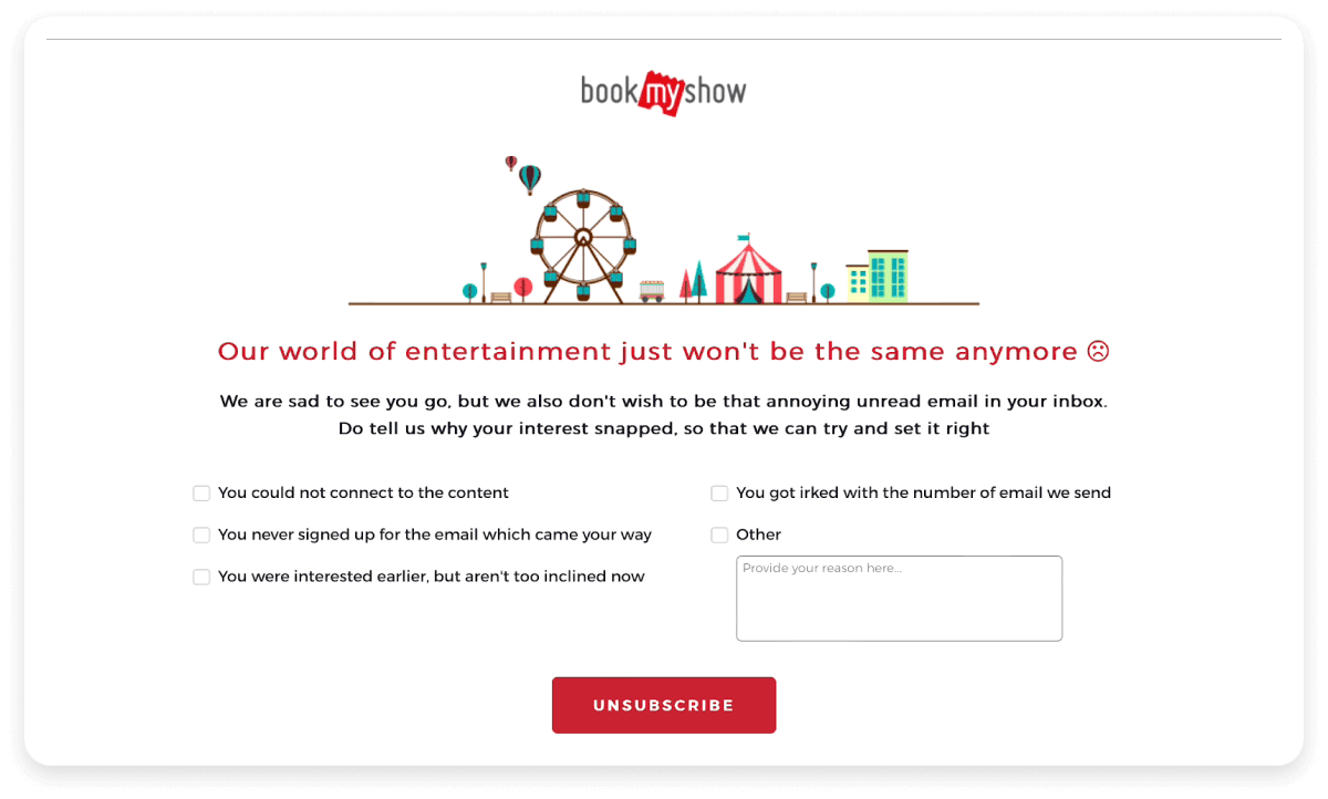
1. BookMyShow
Score: Convenience: 8/10 | UI: 7/10 | Preference management: 3/10

What we like: The BookMyShow unsubscribe page allows you to unsubscribe from their emails with just a single click. The UI is simple, with a well-written and emotional goodbye message. It also includes a checkbox feedback form that allows the company to collect feedback and improve its email strategy based on what its users feel.
What could be better: The page does not have an option for preference management and the company may end up losing subscribers who would have been happy if they just received fewer emails from them.
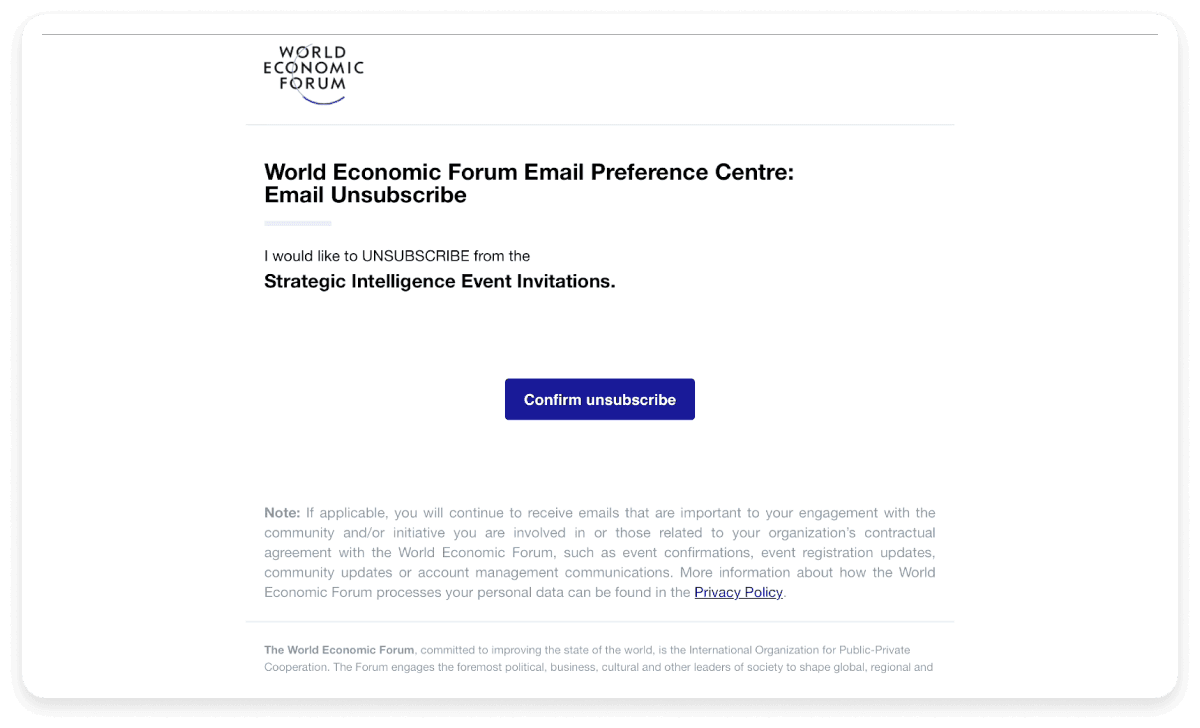
2. World Economic Forum
Score: Convenience: 9/10 | UI: 6/10 | Preference management: 4/10

What we like: The World Economic Forum uses a clean and simple layout with a single ‘Confirm unsubscribe’ button, which allows a single-click unsubscribe on the page. The page also provides the link to their privacy policy and notifies you that you will still receive important emails that are directly related to your engagement with the platform.
What could be better: The page does not let you manage preferences and only lets you unsubscribe to one particular type of email that the organization sends. The copywriting and design are also not very engaging.
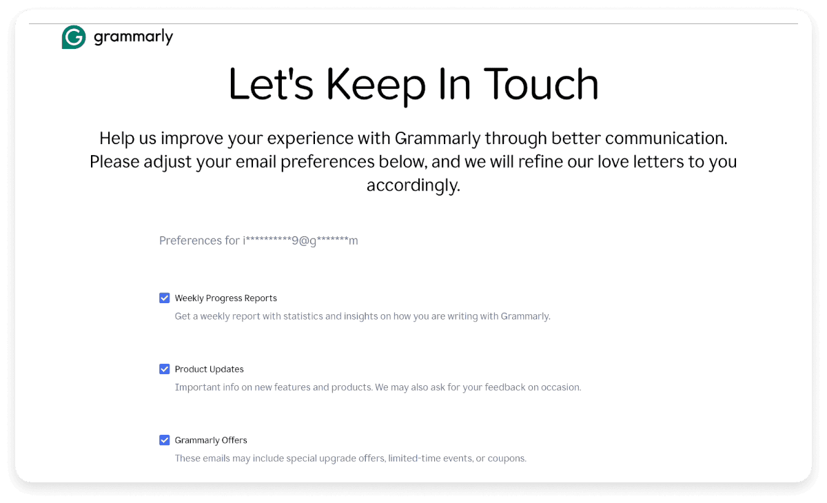
3. Grammarly
Score: Convenience: 6/10 | UI: 7/10 | Preference management: 9/10

What we like: The Grammarly unsubscribe page is a preference management page that lets you choose the kind of emails you would like to receive or unsubscribe to all emails in one go. The clear descriptions under each email category help you to decide if you want to receive them. The copywriting is also clear, and referring to their emails as love letters is a nice touch that gives their messaging an affectionate tone.
What could be better: The preference management form is long and makes you scroll down to find the unsubscribe button. The page could have been better organized by shifting to a multi-column layout with more options visible in the same fold.
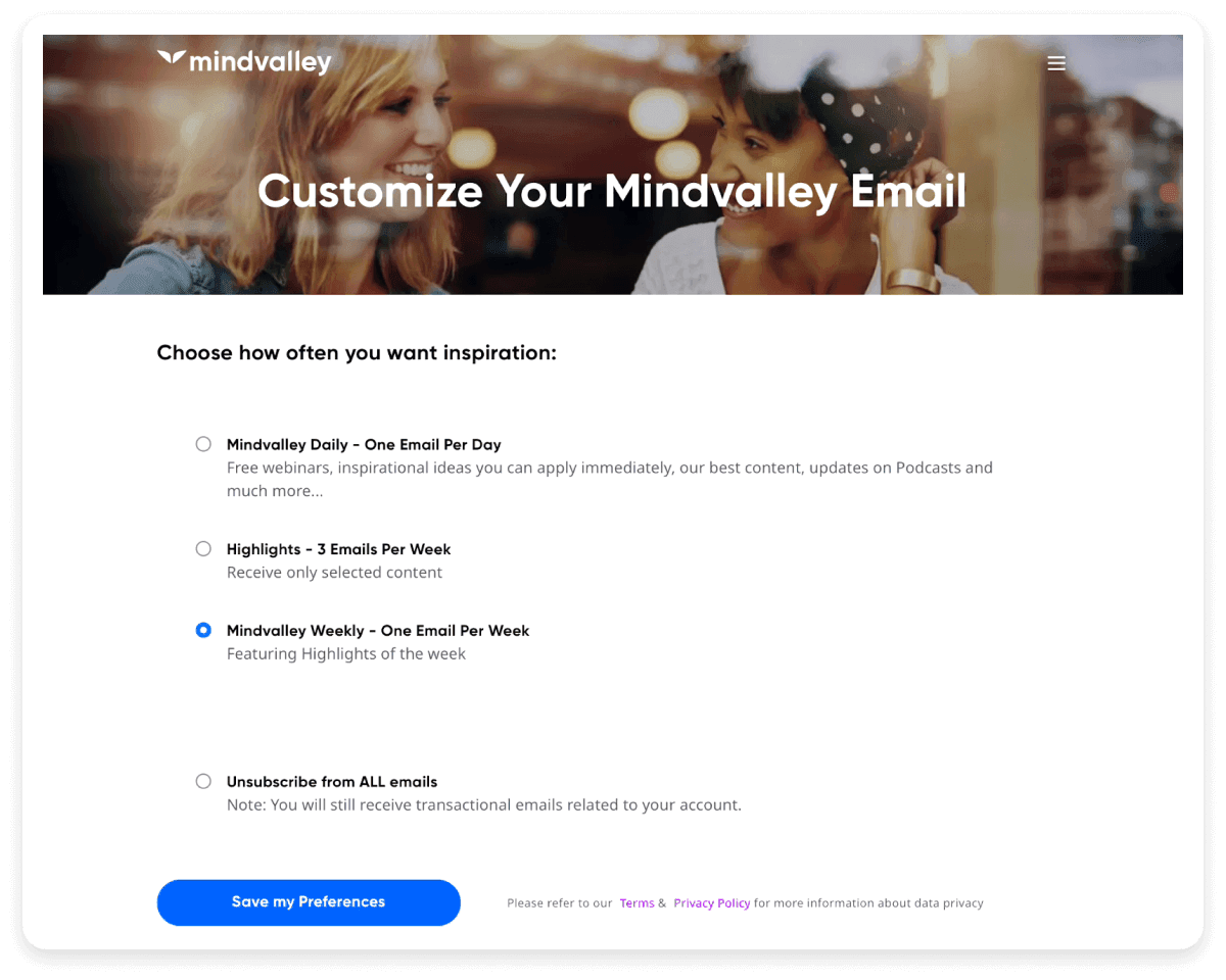
4. Mindvalley
Score: Convenience: 8/10 | UI: 8/10 | Preference management: 10/10

What we like: Mindvalley’s unsubscribe page is a great example of a well-organized page. It provides the user with limited but definite options to manage the frequency of the emails that they receive. The copywriting is to the point, as the descriptions clarify what emails you will receive if you choose a particular option. The page also provides links to the company’s terms and privacy policy.
What could be better: While the page ranks high on all our metrics, The design still has scope for improvement. For instance, the background could have been made a different color to improve the contrast on the page.
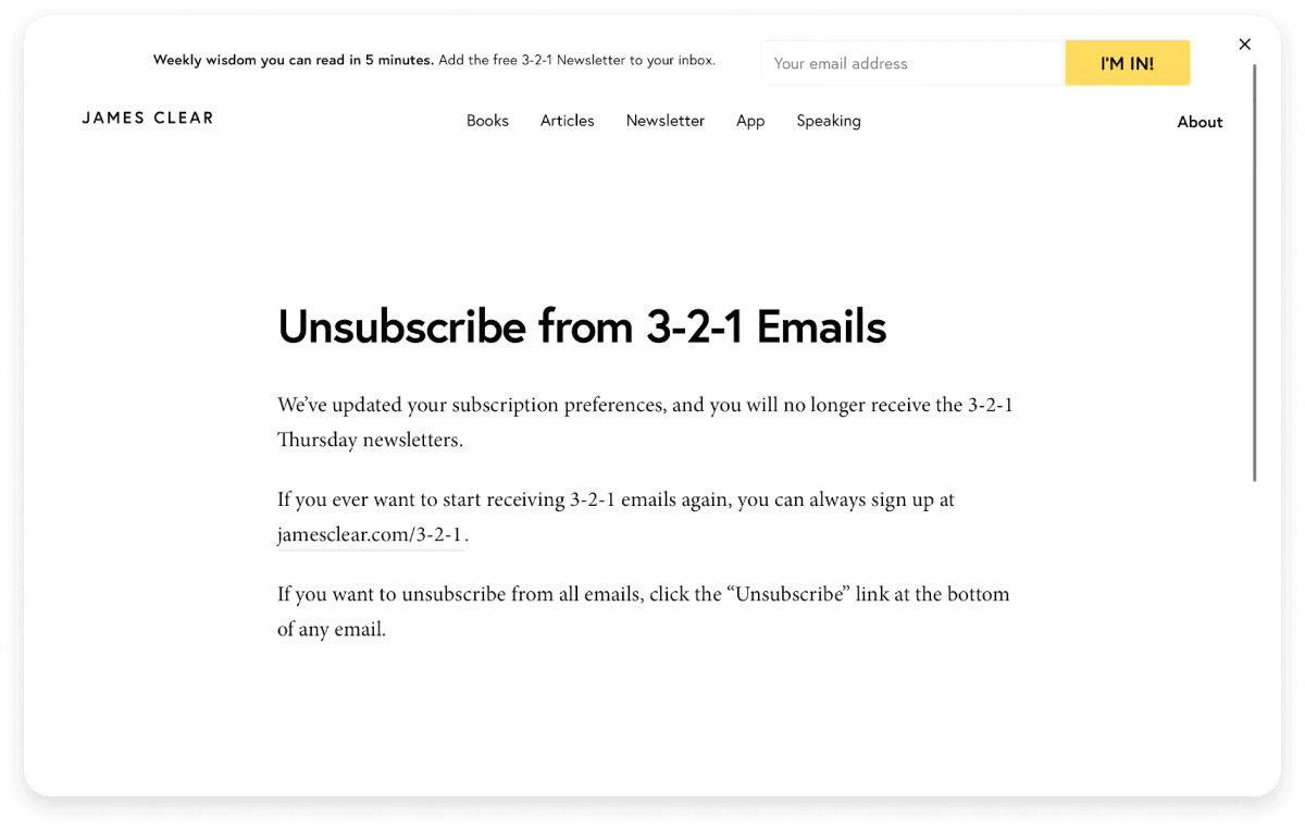
5. James Clear
Score: Convenience: 10/10 | UI: 8/10 | Preference management: 6/10

What we like: The James Clear unsubscribe page is an excellent example in terms of convenience. The unsubscribe button on the email redirects the user to a minimalistic page informing them that they have been unsubscribed. There are no additional steps. The page also concisely describes the newsletter (Weekly wisdom you can read in 5 minutes) and a link to resubscribe.
What could be better: The page does not have an option to manage preferences. Additionally, to unsubscribe from other emails from the sender, the recipient must go to one of those types of emails and click on another unsubscribe button. The design of the page can also be made more visually appealing by using illustrations or images.
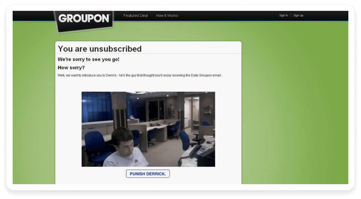
6. Groupon
Score: Convenience: 7/10 | UI: 9/10 | Preference management: 5/10

What we like: A humorous touch can be a welcome relief given how serious our lives can sometimes get. The creative unsubscribe page of Groupon uses a picture of a sad employee and uses a “Punish Derrick” button instead of an unsubscribe button. This page is designed to prompt the user to rethink their decision in a light-hearted way.
What could be better: The light-hearted nature of the page may not be appreciated by some users, who may prefer a quick and clear way to unsubscribe. It is important to put yourself in the shoes of your target audience while designing an unsubscribe page.
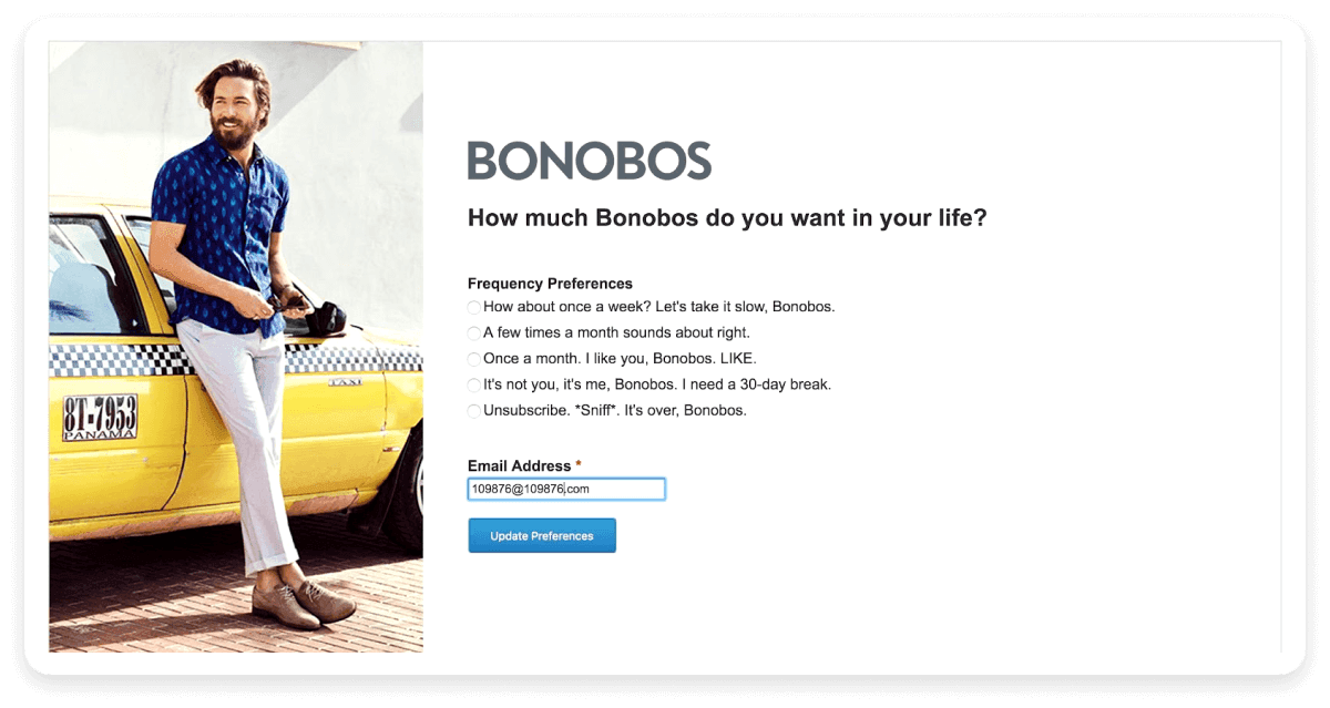
7. Bonobos
Score: Convenience: 4/10 | UI: 8/10 | Preference management: 8/10

What we like: Bonobos uses humor on their unsubscribe page to allow users to manage their preferences. The options are quirky and suggestive, making it seem like the user is trying to break up with Bonobos. The repetition of the word ‘Bonobos’ makes the messaging even more amusing.
What could be better: The page makes it difficult for the user to unsubscribe. Not only does it force you to read through more text, but it also asks you to re-enter your email to update your preferences. This might put off a lot of users.
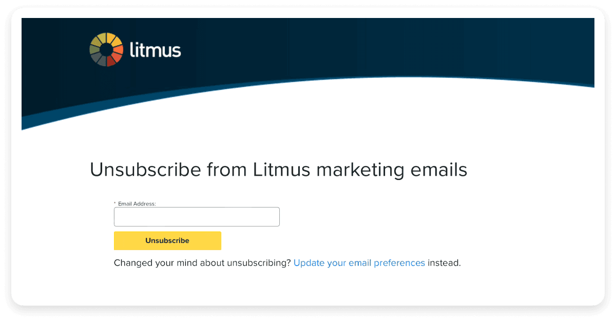
8. Litmus
Score: Convenience: 4/10 | UI: 7/10 | Preference management: 7/10

What we like: The unsubscribe page of Litmus has a clean and simple layout with contrasting colors. They also provide a link to their preferences page, a great way to keep an unsubscribe page decluttered and simple.
What could be better: The user should not be asked to re-enter their email on an unsubscribe page due to the inconvenience it can cause. A simple checkbox followed by the unsubscribe button is far more convenient.
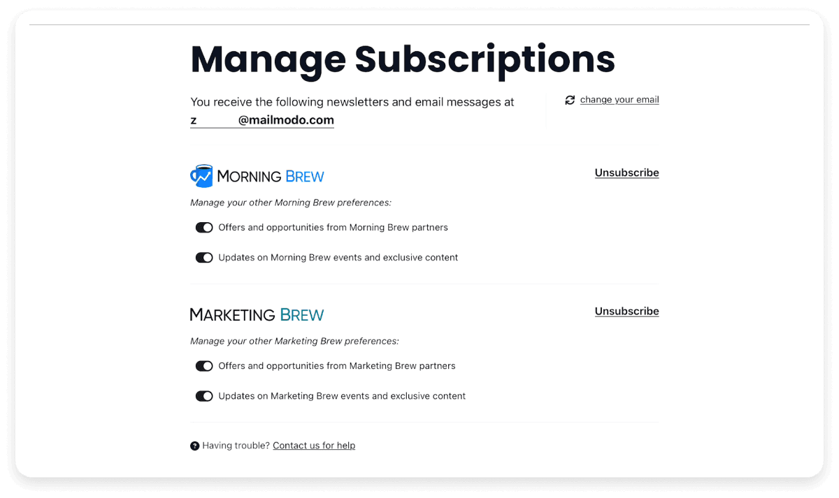
9. Morning Brew
Score: Convenience: 8/10 | UI: 8/10 | Preference management: 10/10

What we like: Morning Brew’s unsubscribe page is a great example of a well-organized and clean preference center. It allows the user to separately unsubscribe from the different categories of emails with a single click. The toggle buttons are a convenient way to manage the different options. A link to the brand’s support page is also included if the user needs any help. The option to change your email is also a great addition to the page.
What could be better: The page layout could be confusing for some users, especially because of the two unsubscribe buttons. The different categories could have been put into boxes with a clear separation. Overall, the UI of the page can be improved.
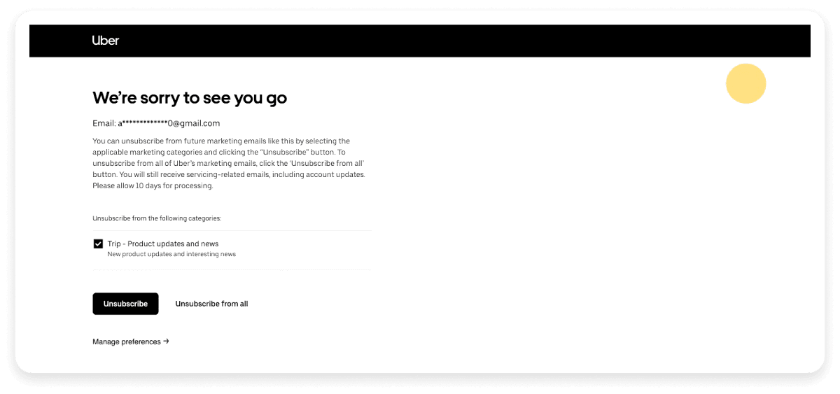
10. Uber
Score: Convenience: 9/10 | UI: 8/10 | Preference management: 9/10

What we like: Uber’s unsubscribe page is well-designed and allows users to select and unsubscribe to emails easily. The page also displays a great way to incorporate preference management without providing the user with a long and cumbersome list. The ‘Unsubscribe from all’ is also an instant and convenient feature.
What could be better: The page includes a link to a manage preferences page and options to unsubscribe from all emails on the same page. This can be a little confusing for the user to navigate. Instead, the preference center could have been included in the blank space on the right.
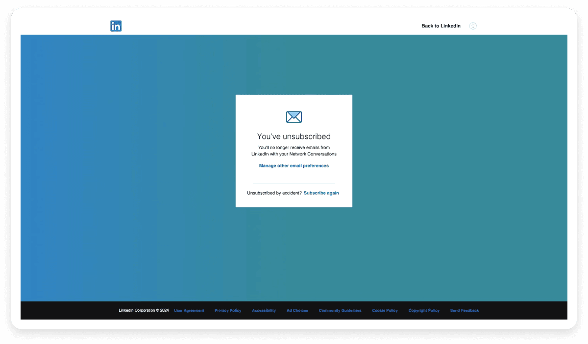
11. LinkedIn
Score: Convenience: 10/10 | UI: 9/10 | Preference management: 9/10

What we like: LinkedIn’s unsubscribe page is clear, simple, and professional and does not require you to click any additional buttons. The page provides a clear link to a preference management page and an option to resubscribe. The page’s color scheme instantly draws the user’s attention to the white message box due to its contrast with the blue background.
What could be better: LinkedIn’s unsubscribe page completely suits their purpose and is a fine balance of convenience, great UI and preference management. A minor addition that can make the page better is a personalized message. However, this is still our favorite example!
Conclusion
As you can see from the above examples, the perfect unsubscribe page is a fine balance between various elements. They are definitely one of the most overlooked aspects of email marketing. However, if designed right, they can be a great opportunity to provide a better user experience, increase customer satisfaction and even retain some leaving subscribers. So use them wisely and efficiently.
If you like the tips in this guide, you will love our Idealetters that talk about everything related to email marketing.


