What makes an email bad?
Any email that is difficult for the recipients to access and understand can be called a bad email. Broadly, an email can be bad due to the following factors:
Technical issues: This includes emails with problems related to attachments, links, compatibility, or other technical issues that make it difficult for the recipient to access or understand the email.
Content: Elements in the email content that lead to ineffective communication, such as grammar issues, wrong tone, irrelevancy, or lack of clarity, are major factors that make emails bad.
Design: In the age of interactive emails and innovative email design, neglecting certain basic design principles can become a recipe for bad emails. These could be emails with too large a font size, low color contrast, etc.
Accessibility: Inaccessible emails are the most overlooked bad emails. These are emails that pose challenges to various groups of people, such as those with marginalized identities, disabilities, and varying technological literacy.
These factors are not water-tight categories. In most cases, a bad email exhibits a combination of these. For instance, an email might be inaccessible to someone with disabilities because of its bad design or content.
Email etiquette vs. bad emails
Most people associate bad emails with improper email etiquette. However, this correlation may not be entirely true.
Email etiquette refers to a code of polite behavior while sending emails. These rules can be helpful, especially in professional contexts. However, some people may consider them unnecessary formalities to be discarded. As long as you communicate clearly and effectively in a given context, you can write a good email regardless of email etiquette.
Some basic rules of email etiquette include:
- Using formal greetings like ‘Dear [Name]’ or ‘Sir/Madam’
- Correct grammar and spelling
- Professional tone
- Clear and concise message
- A formal closing phrase such as ‘Sincerely’ or ‘Best regards’
Impact of bad emails
Bad emails can negatively impact both the recipient and the sender of such emails. For the recipient, these emails can be a waste of time and a source of confusion. These emails can also make them feel that the sender does not value them.
On the other hand, these emails also affect the sender, hurting their relationship with the recipient. If a bad email is sent out as part of an email marketing campaign, it can harm your sales instead of improving them due to the negative impression it creates. Bad emails are also more likely to be reported as spam by recipients. This may lower your email deliverability as your emails can end up in the recipient's spam folders, and email service providers may block your IP address.
8 mistakes that make emails bad
There are a few mistakes that are commonly seen in bad emails. In this section, we have analyzed these mistakes using some bad email examples so you can avoid them. We have also discussed what you should do instead.
1. Non-functioning links
Emails are often used to share links for various purposes. However, sending emails without linking the concerned page to the anchor text is a common mistake.
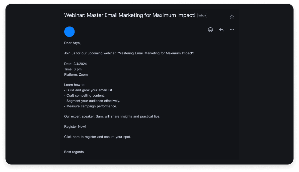
Below is an example of an invitation that asks the recipient to join a webinar on email marketing. The text of the email says “Click here” but does not include the webinar link. Additionally, the text in the email is badly formatted.

Do this instead: While sending links on emails, double check if your anchor text is visible and redirects the user to the desired page.
2. Emails with multiple CTAs
A call to action (CTA) is a common tool in marketing emails that prompts the recipient to take immediate action. However, including multiple CTAs in an email can overwhelm the recipient and confuse them. It can also prevent them from taking any action at all.
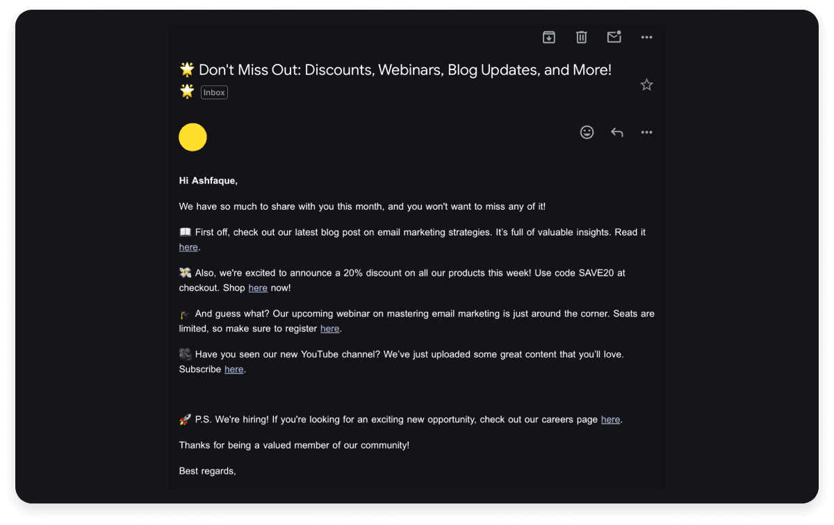
In the below example, the email has so many CTAs that it is impossible to take the sender seriously. The recipient is being asked to check out the company blog post, YouTube channel, webinar and a sale all in a single email. This is a great example of an email so bad that it makes you laugh.

Do this instead: Use a single CTA in your email that is relevant to the content and context of the message. Also, make sure that your CTA stands out visually using contrasting colors, buttons, or links
3. Grammar and syntax issues
Grammar, syntax, and spelling mistakes are generally pointed out as bad email etiquette and seen as unprofessional. This does not mean that all emails with grammatical errors are always bad, especially if they convey their message clearly.
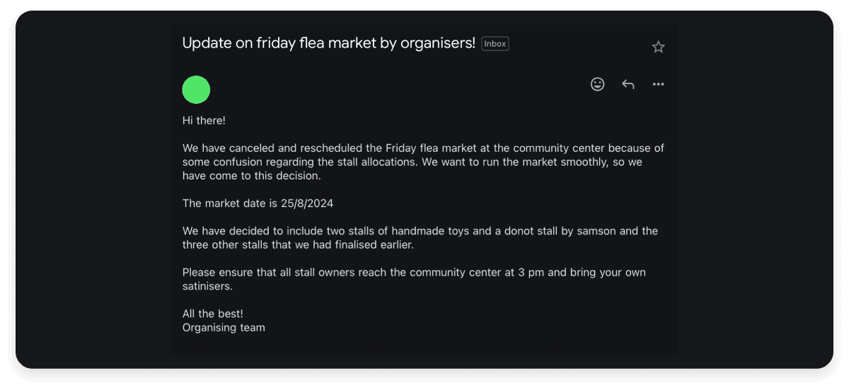
However, in some cases, unclear grammar and punctuation can completely change the meaning of a sentence and result in misunderstanding. As you can see in the example below, the email says that a planned flea market has been both canceled and rescheduled. The misspellings of the words “donut” and “sanitizers” make the email even more unclear.

Do this instead: Always ensure your message means what it is supposed to mean. You can use an online grammar and spelling checker or ask someone to proofread your email.
4. Bad design
Email design can be vital in building your brand identity and enhancing user experience. However, email design is not just about visual appeal. It is also an important tool to ensure that your email is accessible to all audiences.
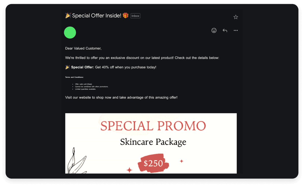
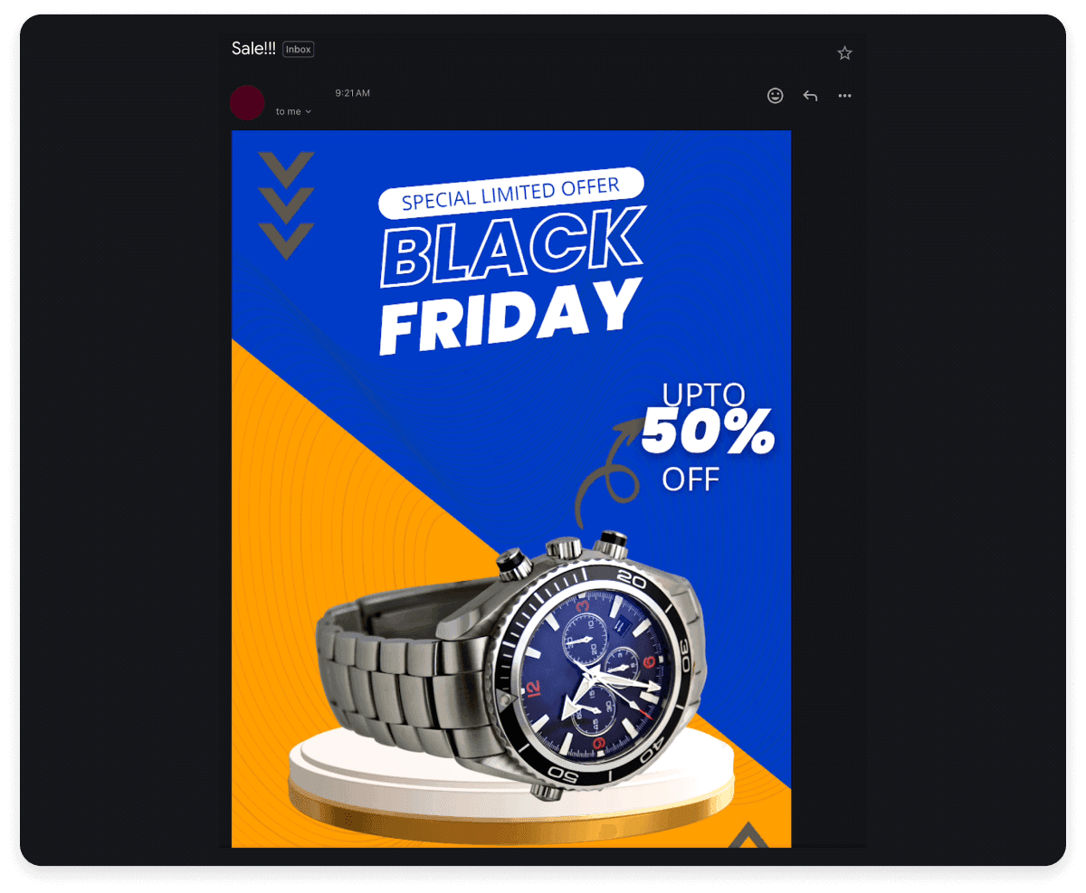
Below is an example of a poorly designed email lacking visual appeal and accessibility. The email uses fine print that is hard to read and does not include any details about the product or the offer in the text portion of the email. The email is thus inaccessible for people with visual disabilities using screen reader software.

Do this instead: While designing your email, ensure that you use elements that make the email accessible to all recipients. This includes using high-contrast colors, readable fonts, avoiding flickering animations, etc.
5. All-image emails
While images can often add value to your emails, sending emails with only images in them is a bad practice. All-image emails can cause accessibility issues as screen readers cannot read them. These emails can also pose mobile optimization challenges as they may not render correctly or take longer to load on devices with slow internet connections.

Do this instead: Ensure all your emails contain your main message as text. When using images, follow best practices such as including alt-texts that screen readers can read.
6. Improper personalization
Personalization in emails is important as it makes the recipient feel valued. This is why most brands send emails by addressing you by your name, even when they send bulk emails. These emails are often sent by using various automation tools. However, this can go wrong in some situations.
As you can see in the example below, the recipient is addressed by a part of their email address (rajrocks2174). The resulting email appears odd as the recipient is not addressed by their actual name. In some cases, emails may address individuals by their deadnames as the sender may not provide an option to change names.

Do this instead: If you are sending automated personalized emails, ensure that you use the recipient's correct name. This can be done by adding an extra field for the user’s name while collecting their email addresses. You should also provide them an option to change their name on your email list if they wish to do so. Additionally, make sure to use inclusive language in your emails!
7. Wrong tone
Tone is an important aspect of any communication and can often convey more than the actual message. While there is no single “right tone” for all emails, using an inappropriate tone in any situation can make your email a bad one.
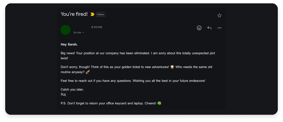
Here is a rather amusing example of an email that uses a completely wrong tone for the situation. The email informs the recipient that they are terminated from their job in a cheerful and casual tone. This makes the email appear as if it is mocking the recipient.

Do this instead: Use the appropriate tone for your email's context. If you are a company that seeks to build a professional and serious brand image, make sure that all your emails to customers use a professional tone. On the other hand, if you are an organization that has a more cheerful and laid-back brand image, you may use a more casual tone in your emails.
8. Inappropriate subject lines
The subject line is the first thing the recipient notices about your email. It allows them to decide if the email is an immediate priority or how much time they expect to spend on it.
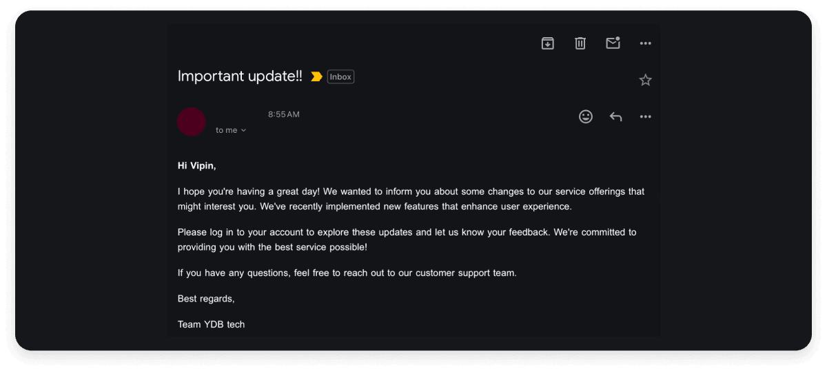
The example below is an email requesting customer feedback on a feature update. However, the subject line, “Important update!!” does not provide any information about the email. The recipient must read through the entire email before knowing whether it is worth their time.

Do this instead: Always include a clear and concise subject line and never leave the subject field blank. Avoid vague subject lines such as “URGENT!!” or “Take a look at this…” as they only waste the recipient’s time.


