Creating your first email campaign can be difficult considering that creating an effective email marketing campaign requires both creativity and a strong strategy. This guide covers some creative and successful email marketing examples that are super easy to implement and can inspire you to create effective email campaigns.
15 Creative and Successful Email Marketing Examples
15 Best email marketing examples
Looking for some creative and out-of-the-box email marketing campaigns that you can get inspired from? Below are some of the best and popular email marketing examples you can get started with:
1. Mailmodo
Type: Value email
Goal: Getting more report downloads
Value emails are one of the best types of emails that can help you engage with your customers by providing value to them. In this email marketing , Mailmodo sent an email announcing the State of Emails Report to their customers in this way:

Why it works:
A glimpse into the report to give a preview of what’s inside the email
The success of the resource is clearly mentioned which urges the user to download it.
Use of appealing brand colors and minimal content structure.
offering resource free for email geeks
Maximize your email performance with our free ebook
Optimize the right email metrics for higher ROI


2. Pulp & Press
Type: Promotional email
Goal: Creative sale announcement for Valentine’s Day
Promotional emails are sent to your customers to communicate with them about your products, offers, announcements, etc. Pulp & Press has a specialty in juices and smoothies. This is how they created a Valentine’s Day email campaign to announce sales.

Why it works:
Adding Valentine’s Day themes with a great use of their products as a heart and red and pink color palette to set the theme. .
The visuals and copy of the email clearly communicates the idea and are pleasing to the eyes.
3. HeadSpace
Type: Newsletter
Goal: Generating more subscriptions
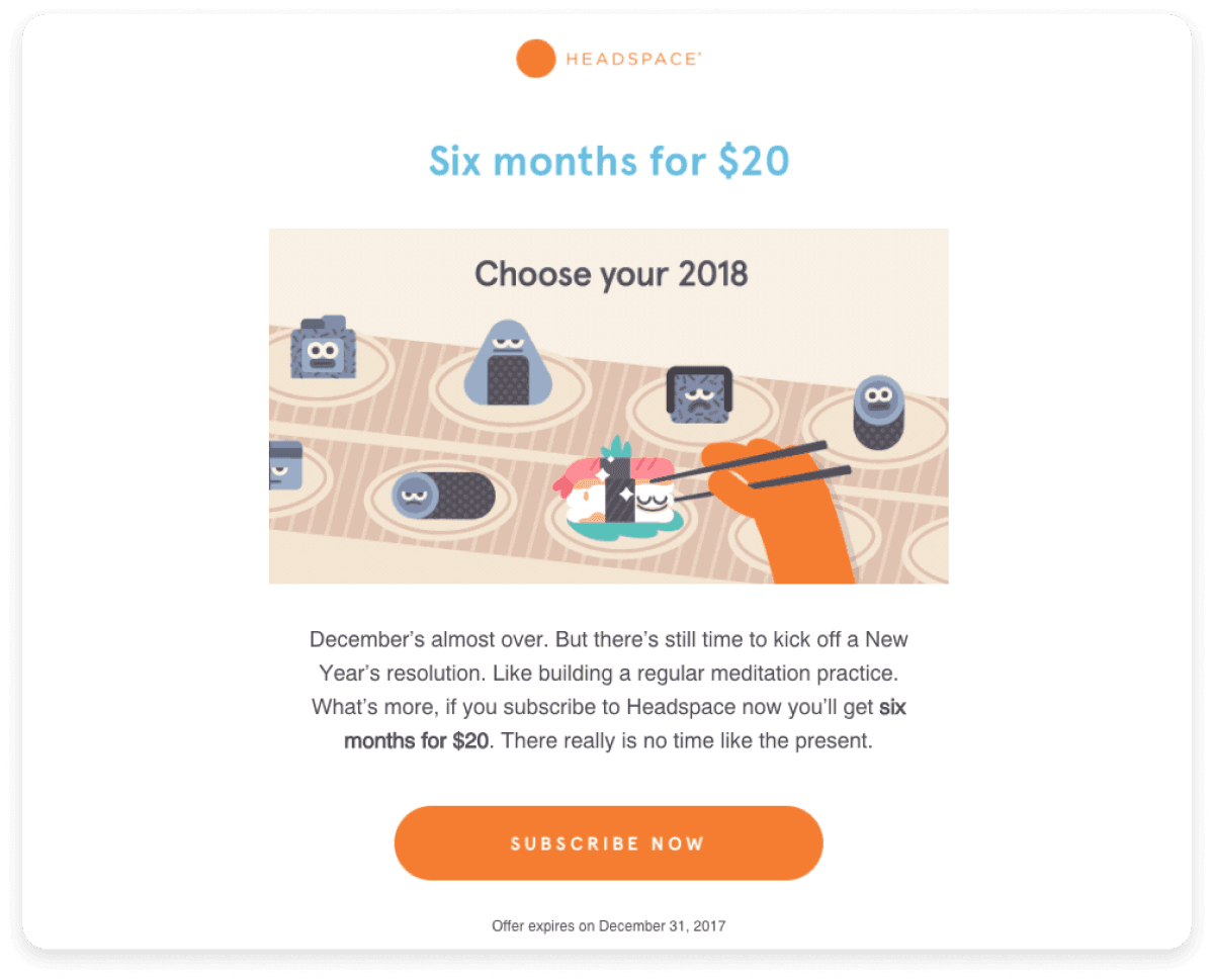
Newsletters are a very common type of email marketing campaigns and are sent weekly or monthly. Headspace is a meditation and well-being app that helps you sleep and live mindfully. Since they wanted some more subscriptions, they sent out these beautiful and creative emails to their subscribers.

Why it works:
Used storytelling to make their newsletter engaging and interesting.
Use of clear CTA and visually appealing color palette.
The overall content of this newsletter is interesting with the phrases like “Kick off new year’s resolution” that urges users to take action.
Added expiry date for urgent action (six months for 20$) that creates engagement and entices the readers .
4. Root Houseplants
Type: New Arrivals
Goal: Showcasing new arrivals
New or fresh arrivals are emails that showcase a new product and lets your customer know about its features. Root Houseplants is a plant store delivering all kinds of houseplants at home. Here’s how they announced their new arrivals with this email.

Why it works:
Brand consistency throughout the email through the use of brand colors and plant visuals.
Clear visuals of the product within the email.
Clear and concise headline and product description in the email
Background is consistent with the offered products
5. Medium
Type: Membership email
Goal: Welcoming and communicating platform features to the user.
Medium, being one of the most popular newsletter platforms, has a great way to communicate with their audience through emails as well. Look at this example where medium sent membership email to their subscribers urging them to upgrade their plan.

Source: Medium
Why it works:
Excellent use of visuals of books that entices the subscribers.
Use of a long reading format that their subscribers are keen and are used to reading
Clear CTA and representation of in-app features
6. Pizza Hut
Type: Birthday wish
Goal: Wishing happy birthday and rewarding the customer
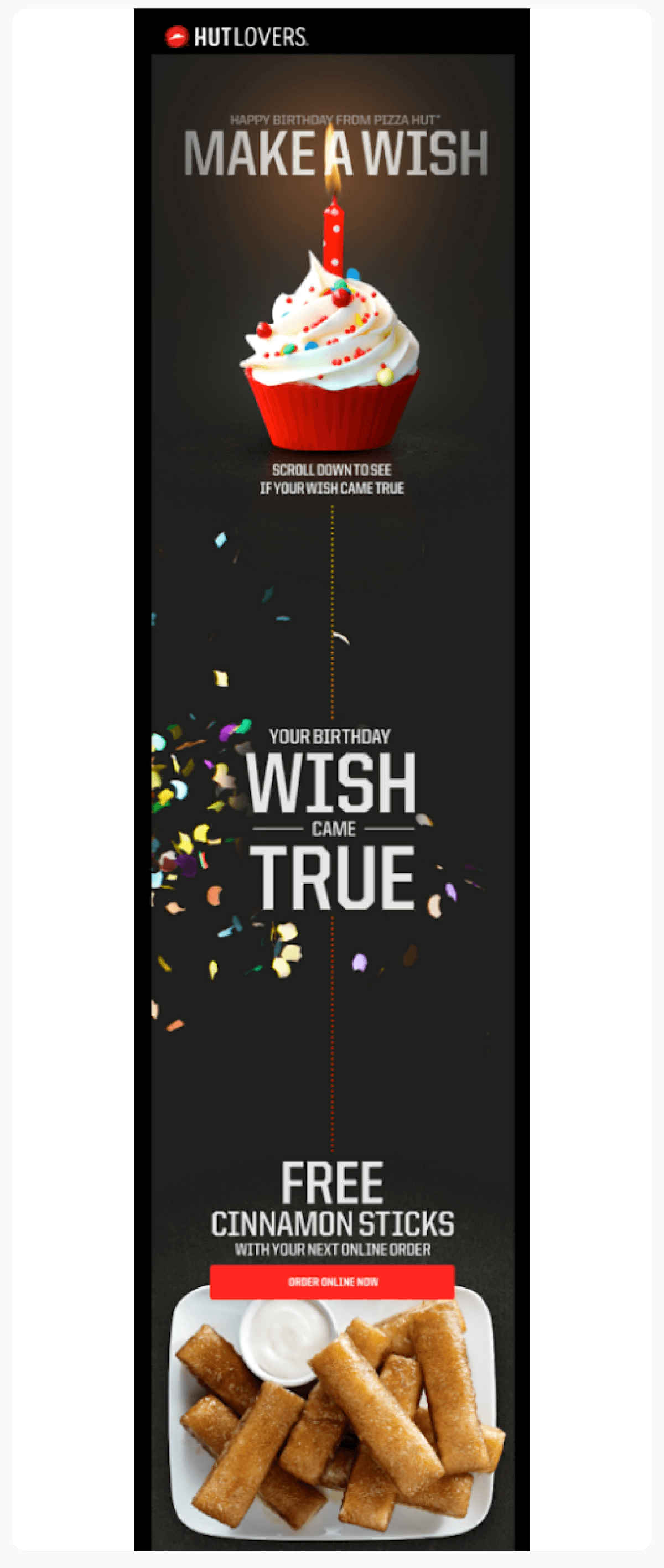
Birthdays and anniversaries are perfect for building trust, showing appreciation, and driving sales by offering offers to your subscribers. Here’s how Pizza Hut incorporated this type of campaign:

Why it works:
Dark-themed birthday email wishing subscribers with a cupcake and candle, asking them to make a wish
The whole email creates perfect birthday vibes by bringing fun and excitement into play
Highly personalized, making it look like it is coming from a friend rather than a brand
💡Related guide: 7 Email Newsletter Design Tips and Examples to Inspire You
7. Fortnum & Mason
Type: Holiday email
Goal: Showcasing gift hampers for Halloween
Holiday emails are sent mostly to announce a sale or showcase personalized products during holidays like Halloween and Christmas. Fortnum & Mason, with their variety of gifting options communicated their personalized gift hampers in an interesting way:

Why it works:
Use of storytelling to engage the subscribers
Exciting visuals of the product
Well-presented holiday theme throughout the email.
2 different CTAs for people who want to buy for Halloween and/or for regular Hampers
8. Off Court
Type: Referral program email
Goal: Increase the number of referrals by providing rewards to the subscribers
Most referral programs need to be communicated well in order to spread the word and what’s the better medium than emails? In this email marketing campaign, Off Court, a skincare brand for men and women in athletics. offered rewards for their referral program with this interesting email:
 Why it works:
The brand identity and tone is consistent (use of words like Alley-oop)
The image used represents the referral program idea well.
The rewards are highlighted very clearly and are appealing to attract the customers.
Actionable text in CTA
💡Related guide: 16 Email Copywriting Templates to Use in 2023
9. Starbucks
Type: Welcome email
Goal: Welcoming the user and communicating app features
Welcome emails are the first email your customers receive when they sign up with you. Starbucks is a well known coffee brand known for its super engaging marketing style.This example of Starbucks highlights how Starbucks uses appreciative expressions to welcome their customers while communicating the features and benefits.

Source: Starbucks
Why it works:
Well-thought, warm and appreciative email copy.
The way the app features and next steps are communicated clearly.
10. Apple
Type: Promotional email
Goal: Communicating product features and benefits
Apple is known for its simple yet extraordinary branding and the same is true for their emails. Look at this example of this promotional email by Apple.

Why it works:
Consistently features their signature minimalist style and clean fonts that define their brand identity.
Brand recognition simplifies the identification of the sender for recipients and strengthens their perception of the brand.
Clearly depicted features with images for each feature
11. The Skimm
Type: Win-back email
Goal: Reengaging customer through emails
TheSkimm is a popular daily newsletter that excels in delivering information without overwhelming the reader. In this example, The Skimm wanted to re-engage the user by sending them an email:

Why it works:
Minimalist design with huge visuals.
Clutter-free email with clear-cut information.
Use of copy which is friendly and concise.
Copy of the CTA is personalized to the brand
12. The New York Times
Type: Newsletter
Goal: Sharing curated content with subscribers to engage engagement.
The NY Times is a newsletter platform that offers information in a concise and minimal manner with excellent user mobile experience even in their emails. To send curated content to their subscribers, they sent this email:

Why it works:
Provides easily digestible content.
Content is optimized for various devices, ensuring that readers have a seamless reading experience whether they open the email on a smartphone, tablet, or desktop.
13. Airbnb
Type: Product email
Goal: Sharing in-app features, compelling users to visit the platform.
Airbnb is one of the most popular travel and hotel booking websites. This email marketing example shows a product email by Airbnb that consists of in-app features and makes the user re-engage with the app/website:

Why it works:
Features compelling CTA buttons. They use action-oriented language like "Book Now" or "Explore Destinations" and employ contrasting colors to make these buttons pop.
Minimalist and simple email design that is pleasing to the eyes.
Use of beautiful travel images and scenes to entice the subscribers.
14. TED
Type: Newsletter
Goal: Sharing educational content to gain more traction.
TED's newsletter shares thought-provoking talks on diverse topics. It empowers subscribers with a daily dose of knowledge and inspiration. In this example, TED Ed@Home used interesting visuals and content from their stories to send to their subscribers.

Why it works:
Categorisation for each school and university tier.
Use of interesting illustrations and visuals according to the understanding and level of education.
15. Missguided
Type: Re-engagement email
Goal: Urge the customer to visit the website and shop
Missguided is a clothing store that sells contemporary clothes for modern women. To re-engage with their dormant customers, they decided to send this email:

Why it works:
Fantastic and context-driven copy.
Rewarding the customer for re-engaging.
Using emojis to divide content.
Highlighting the word FREE
Use of puns like 'solemates'
How can you create your own email marketing campaign?
So, how do you make these examples actionable? We are here to help you create your first email marketing campaign that can get you started. Here are some steps that you can start with:
Define the goal or ‘why’ for the email marketing campaign.
Create a senders’ list for the campaign.
Design the email campaign: This includes creating email templates, writing email copy and optimizing for mobile.
Schedule your email campaign.
Measure, iterate and improve.
You can also look for pre-made email templates by Mailmodo and get started with email marketing immediately.
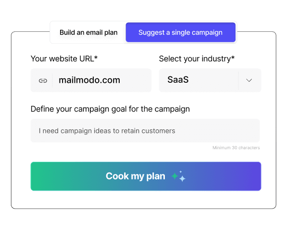
Create campaign ideas with
AI Email Campaign Planner

Wrap up
These were some creative and super interesting email marketing examples that will inspire and get started with designing your first email campaign. Remember to be sure of your goal and target audience before designing your email marketing campaign.
FAQs
Email marketing aims to communicate directly with customers or subscribers to promote products, share updates, or provide valuable content regarding new product launches. It helps businesses build relationships, drive engagement, and ultimately increase sales or conversions.
To enhance your email marketing effectiveness, define clear goals, segment your email list for targeted messaging, and create compelling content with strong calls to action. Additionally, ensure your emails are visually appealing and mobile-friendly.
A well-rounded email marketing strategy can include various types of emails, such as newsletters, promotional emails, welcome emails, re-engagement emails, and value-driven content. Diversifying your email types helps keep your audience engaged and informed.
You can measure the success of your email campaigns using key performance indicators (KPIs) such as open rates, click-through rates, conversion rates, and unsubscribe rates. Analyzing these metrics helps you understand what's working and where improvements are needed.
Common mistakes in email marketing include not segmenting your audience, neglecting mobile optimization, failing to personalize content, and sending emails too frequently or infrequently. Avoiding these pitfalls can lead to better engagement and lower unsubscribe rates.
What should you do next?
You made it till the end! Here's what you can do next to grow your business:

Get smarter with email resources
Free guides, ebooks, and other resources to master email marketing.

Do interactive email marketing with Mailmodo
Send forms, carts, calendars, games and more within your emails to boost ROI.

Consult an email expert
30-min free email consultation with an expert to fix your email marketing.
Table of contents
Fresh Marketing Ideas, Every Week.
Get the latest marketing roundup & news
Related articles
Related resources
Popular Categories
You might also like
Get 3X email conversion
with Mailmodo

Create & send interactive emails without coding

Put revenue on auto-pilot with pre-built journeys

Save time with AI-powered email content creation
Experience world’s only interactive email marketing platform
Trusted by 10000+ brands


